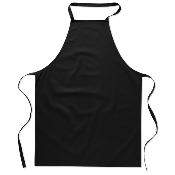
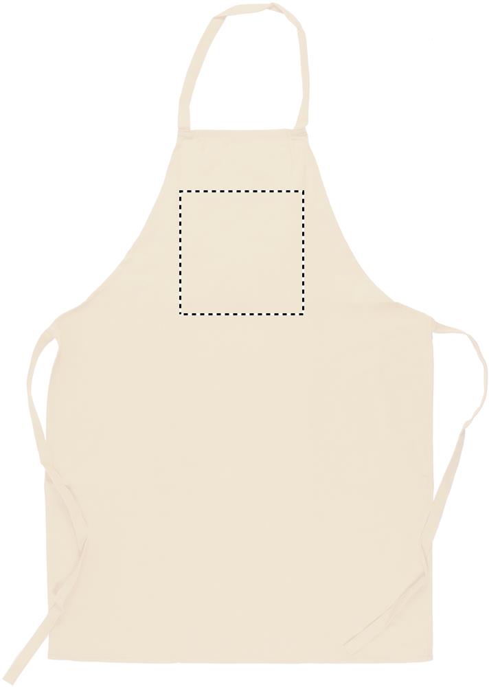
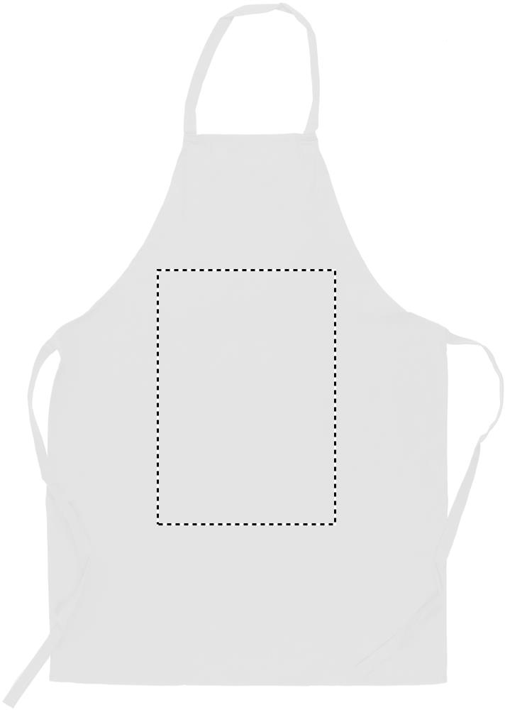
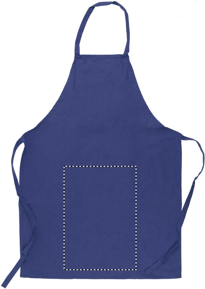
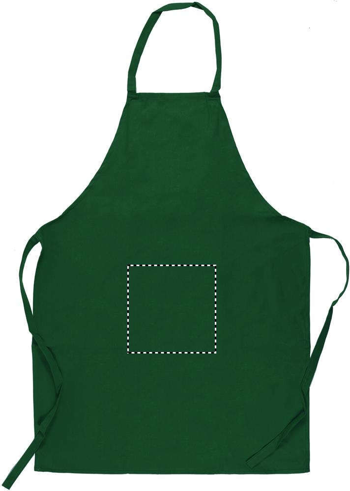
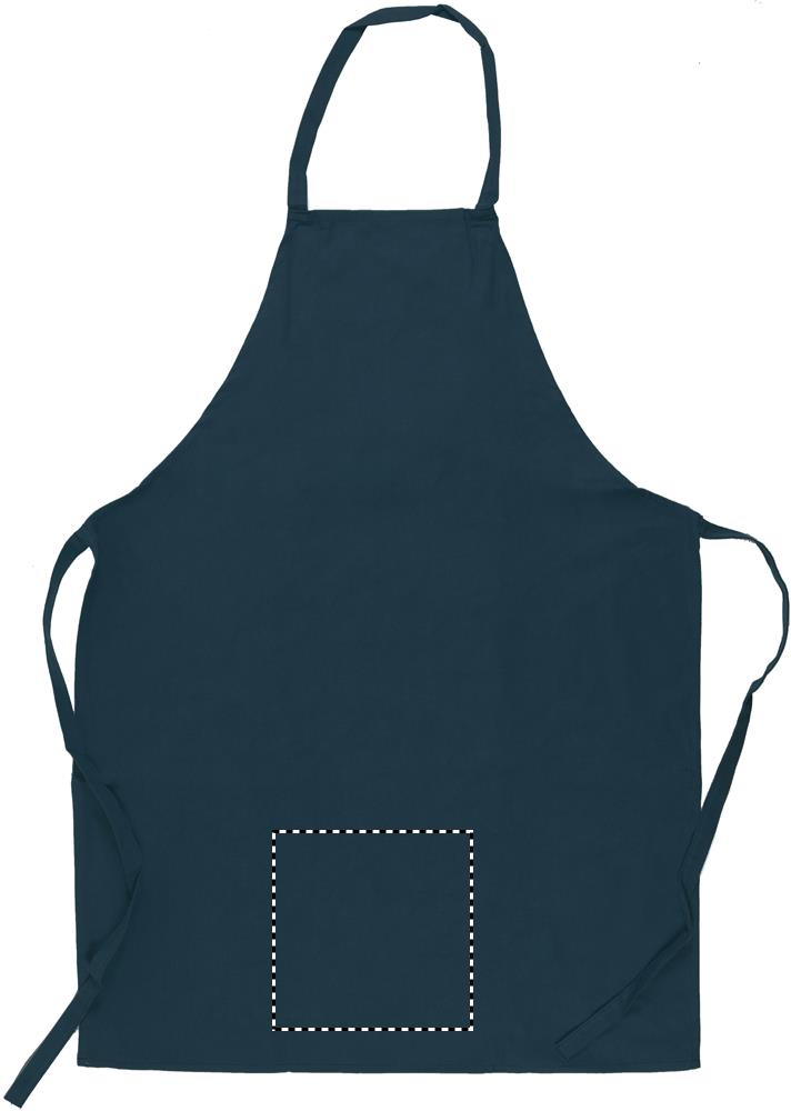
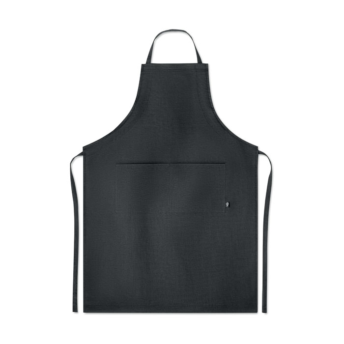
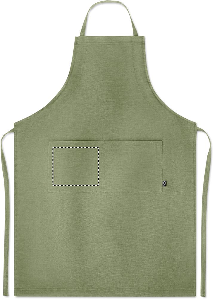
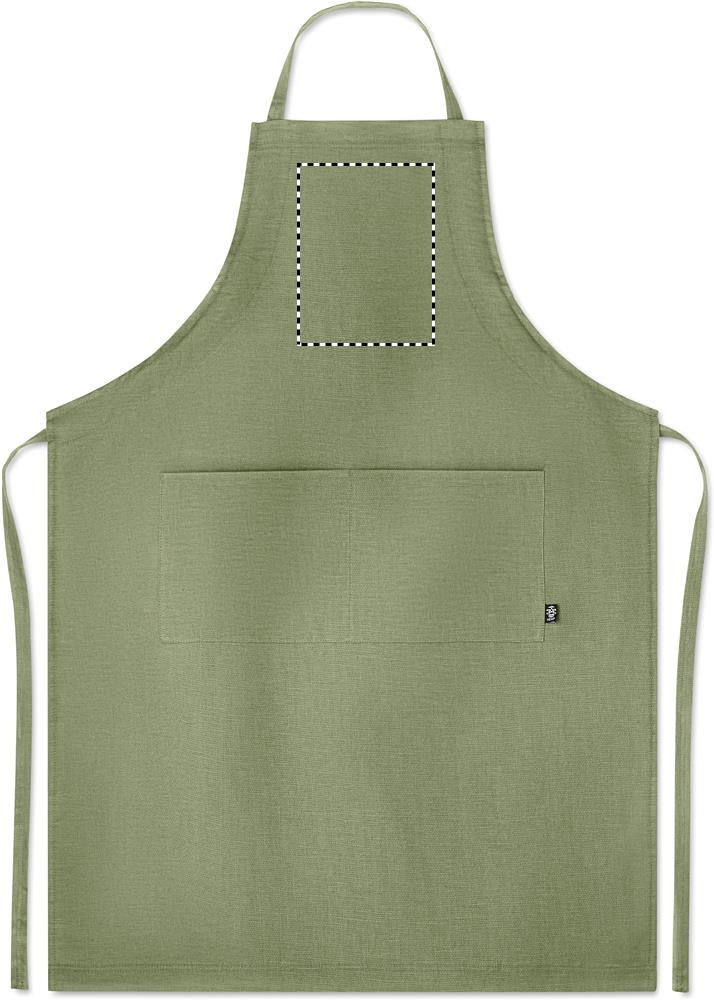
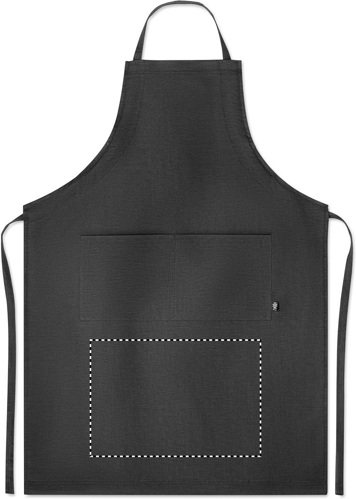
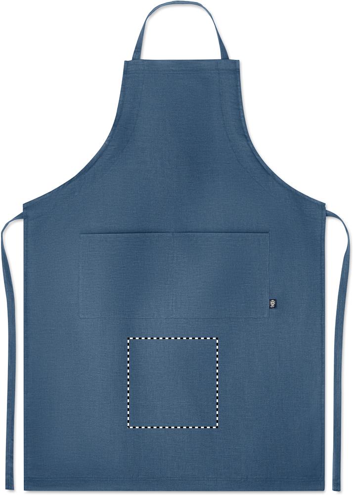
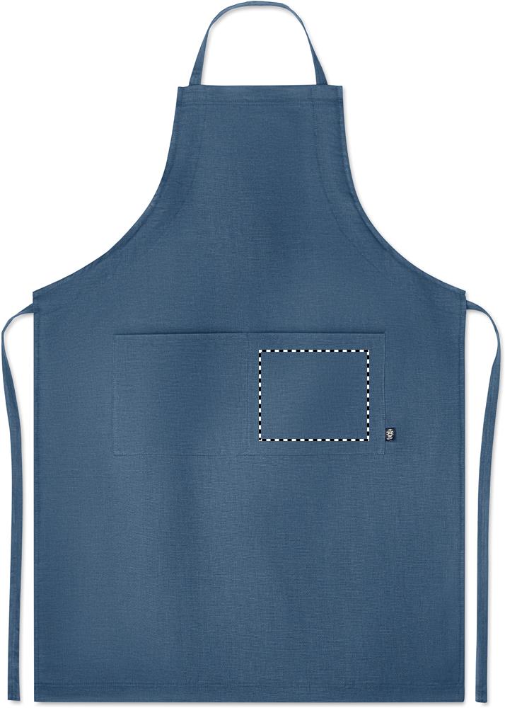
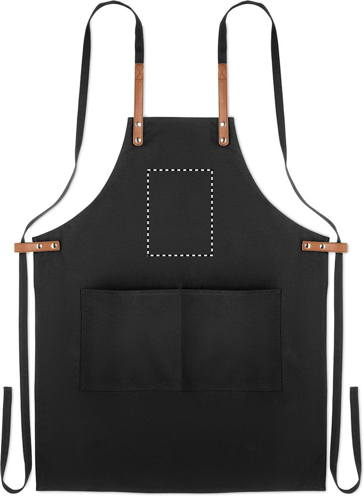
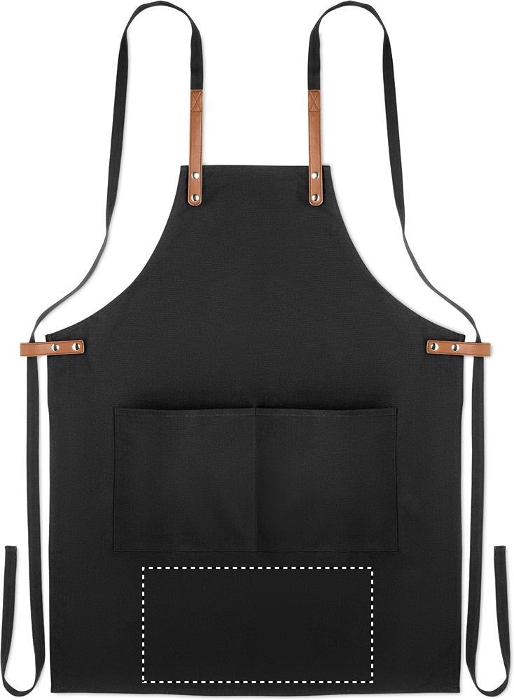
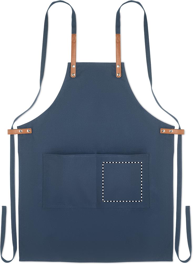
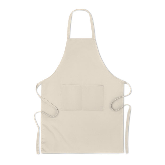
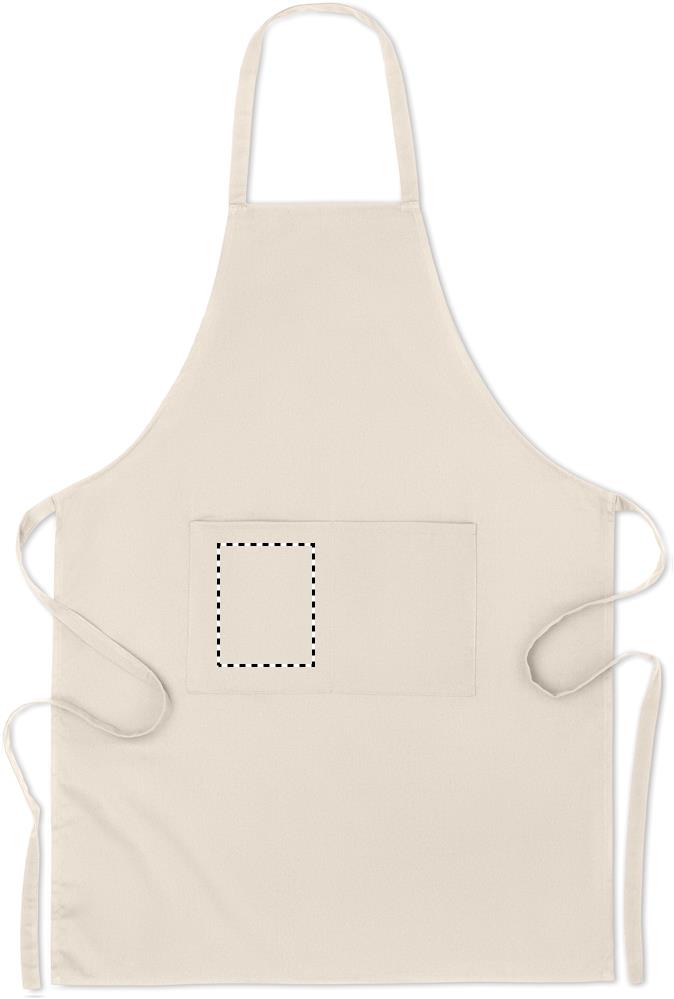
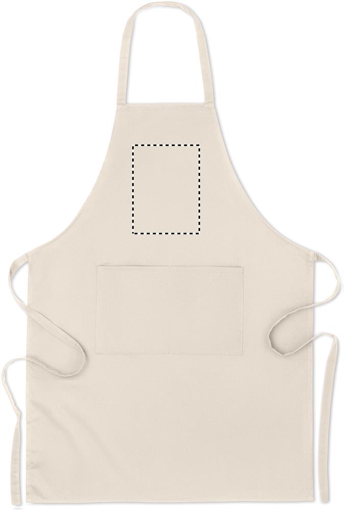
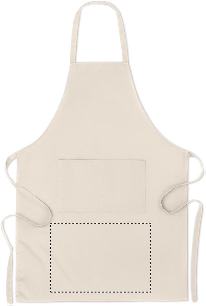
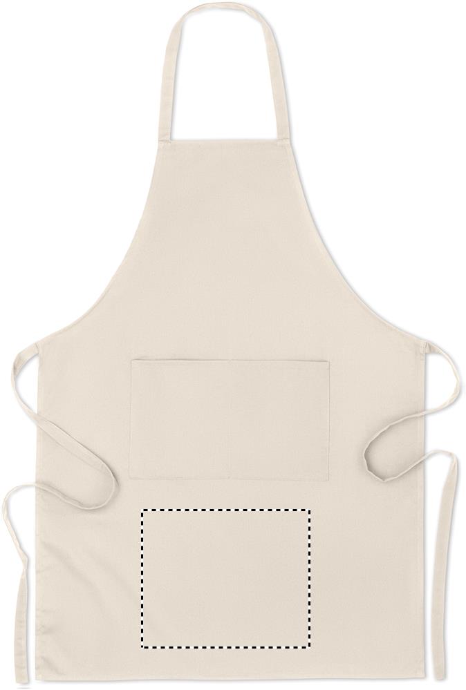
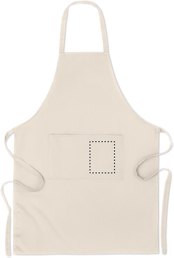
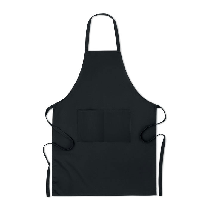
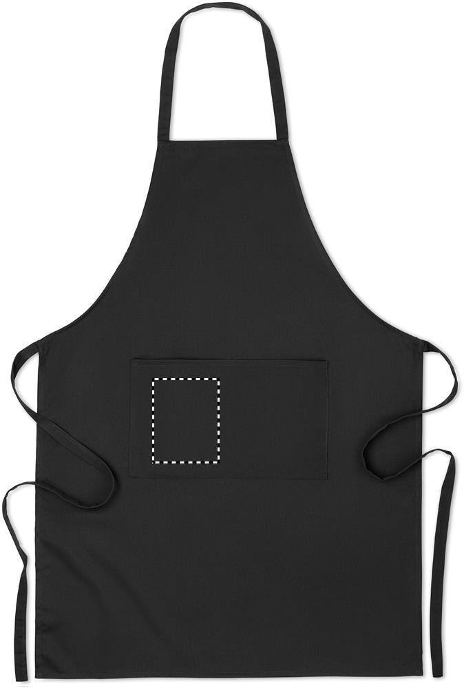
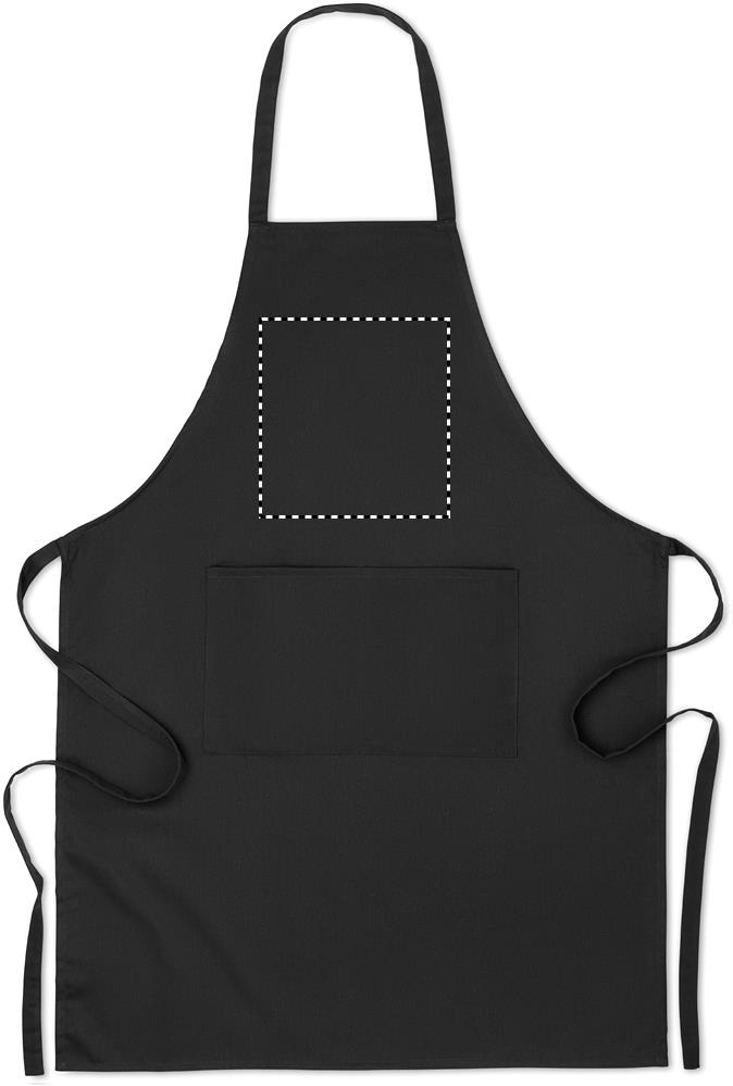
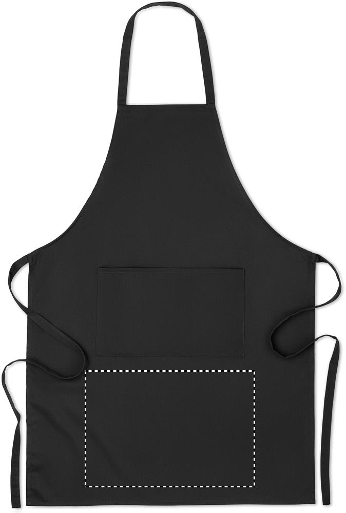
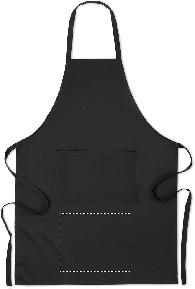
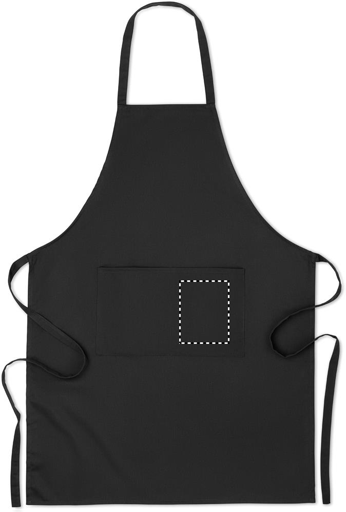
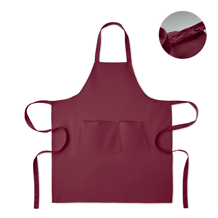
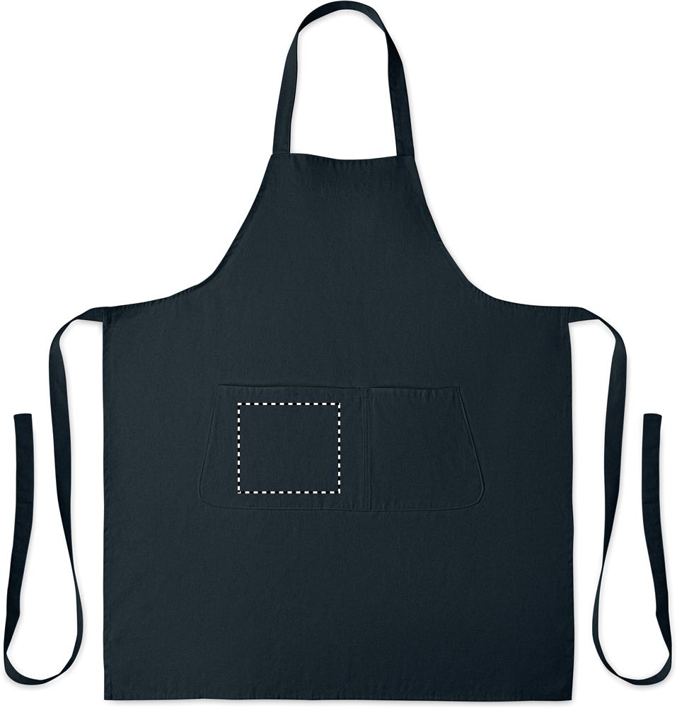
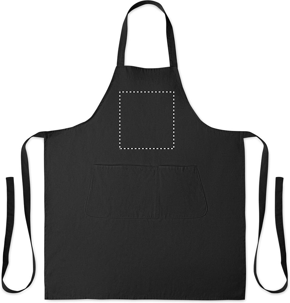
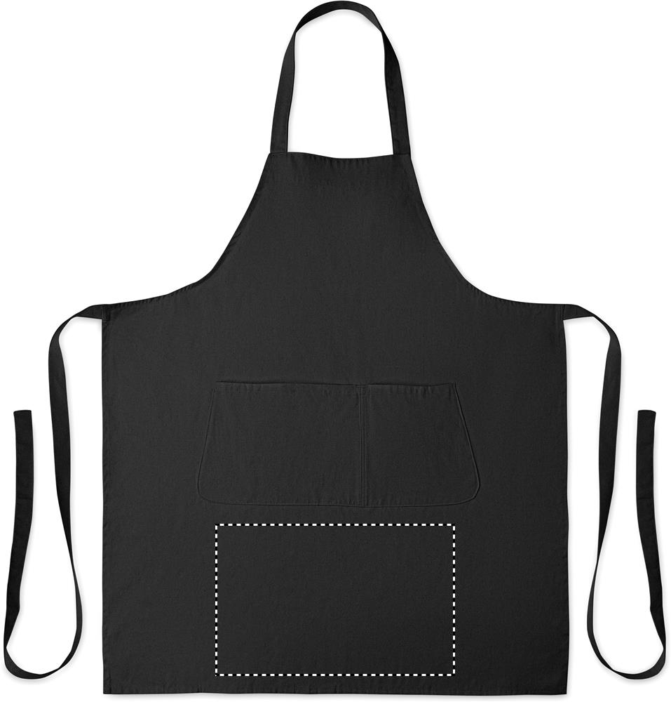
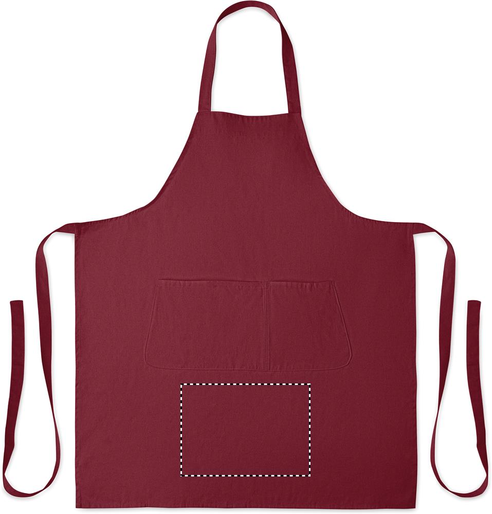
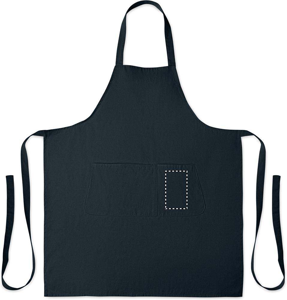
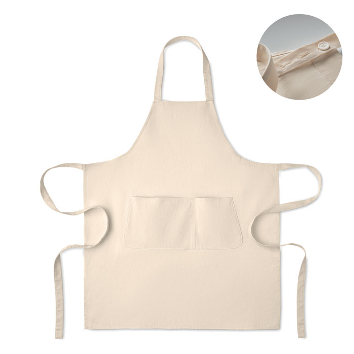
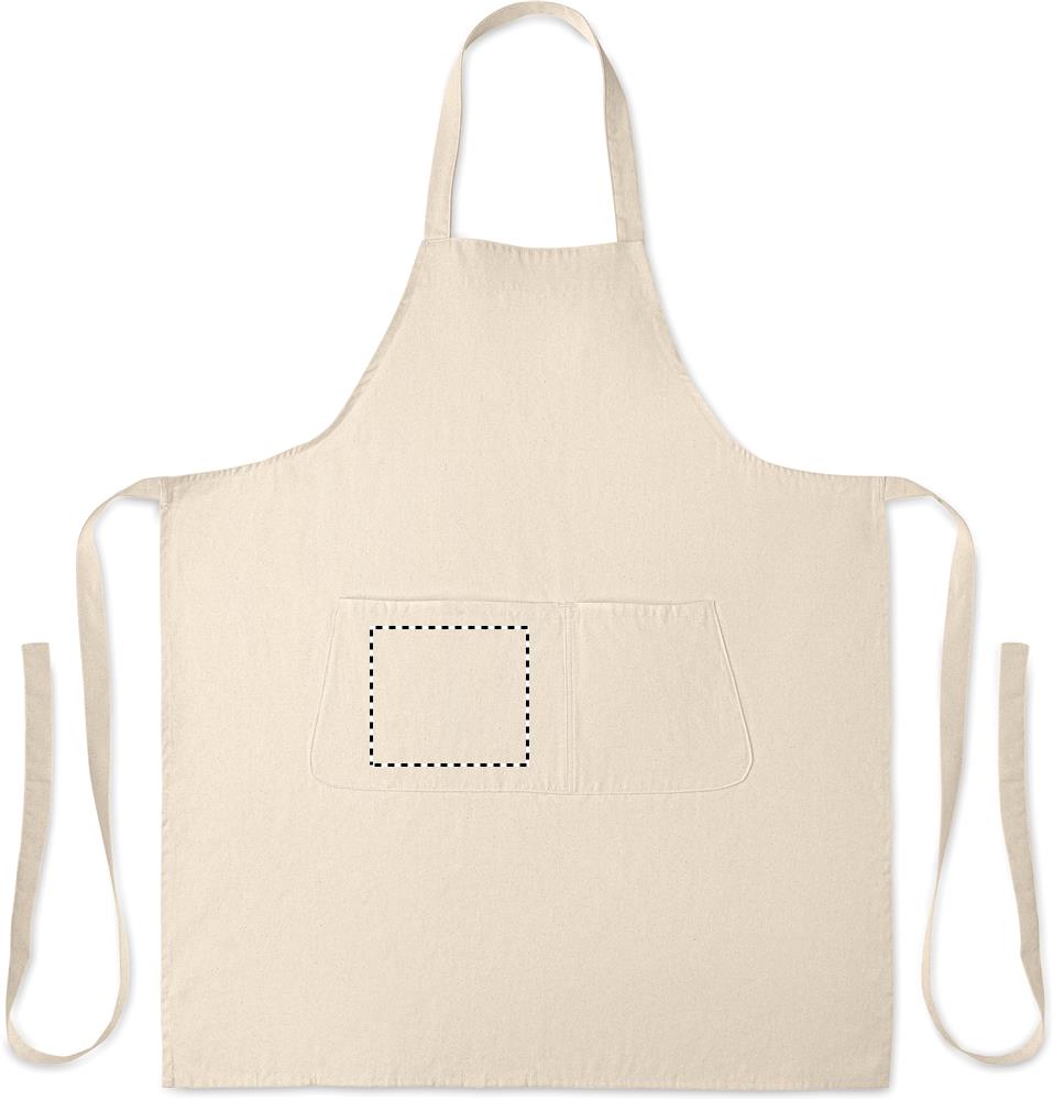
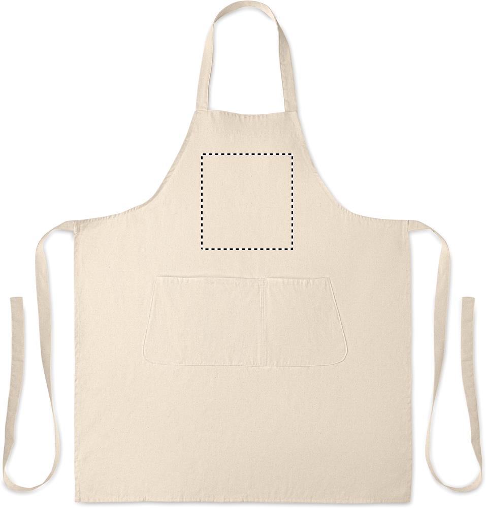
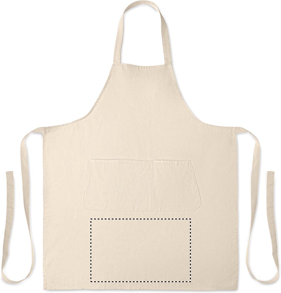
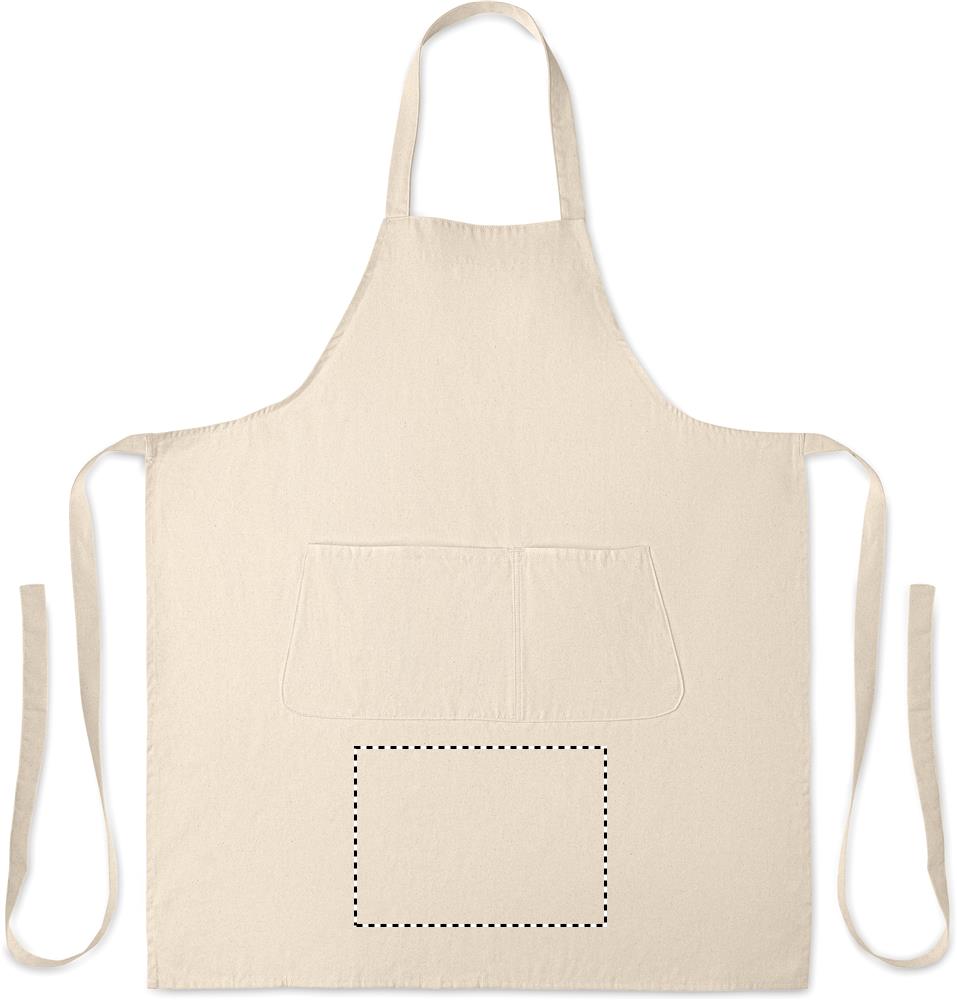
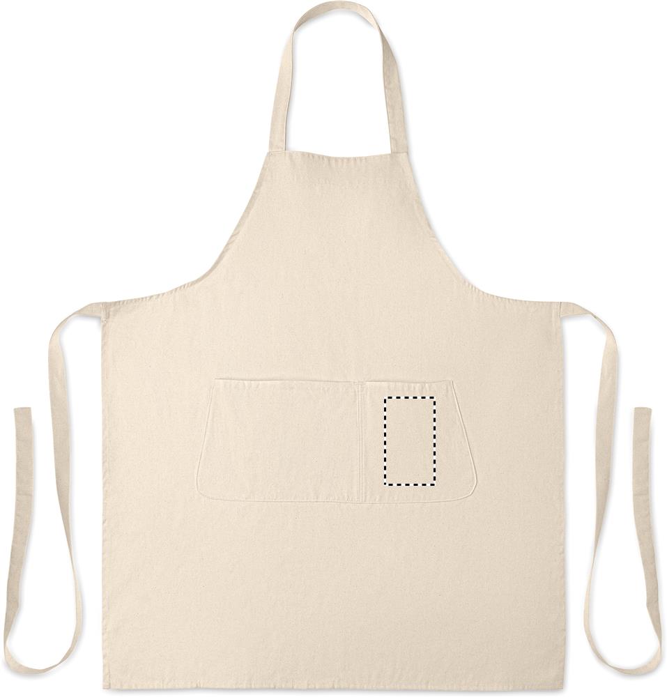
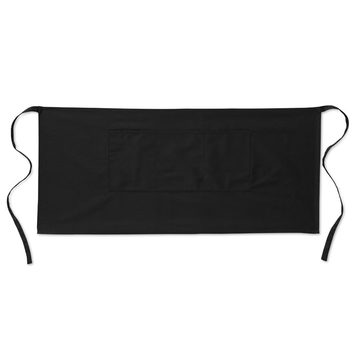
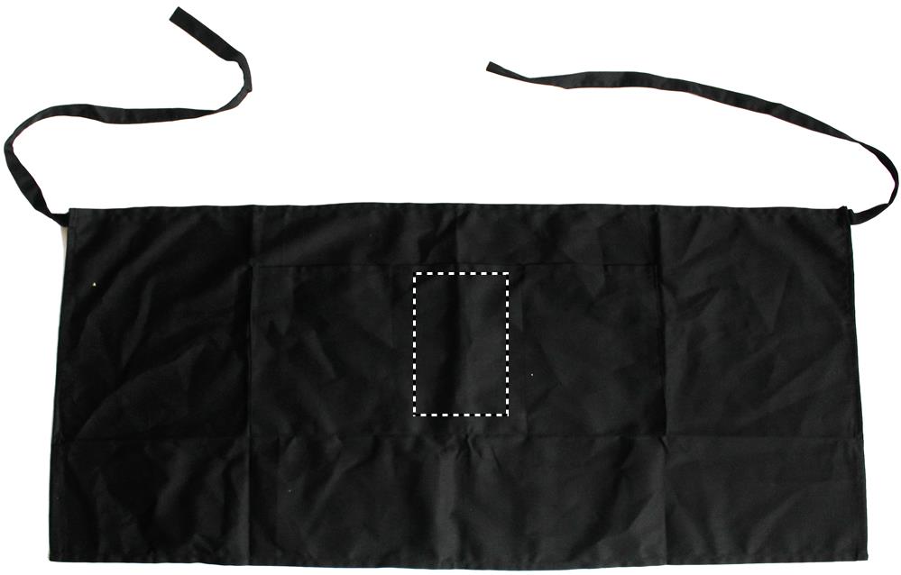
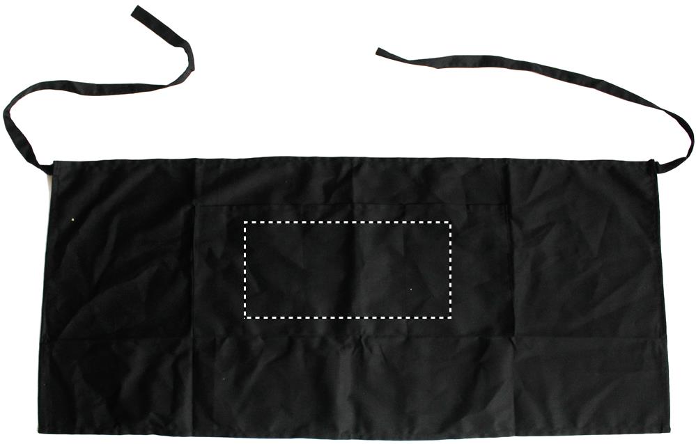
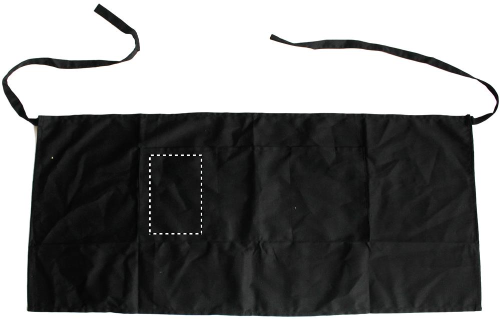
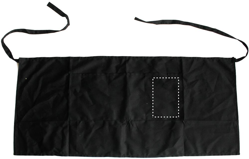
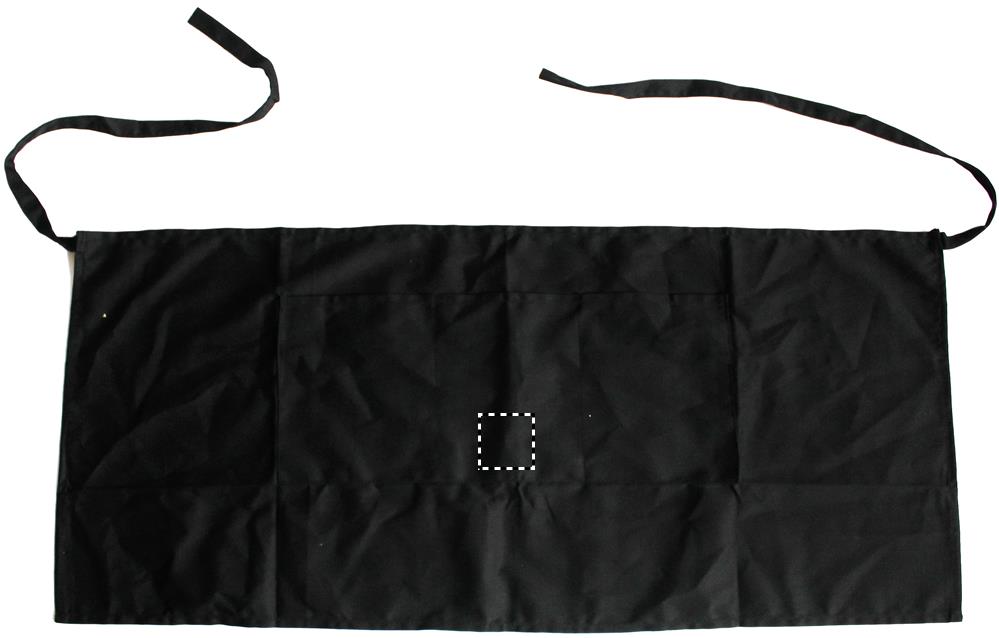
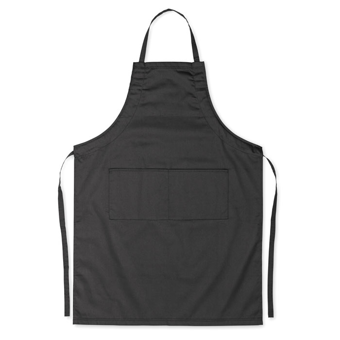
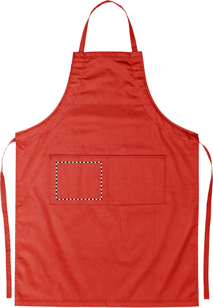
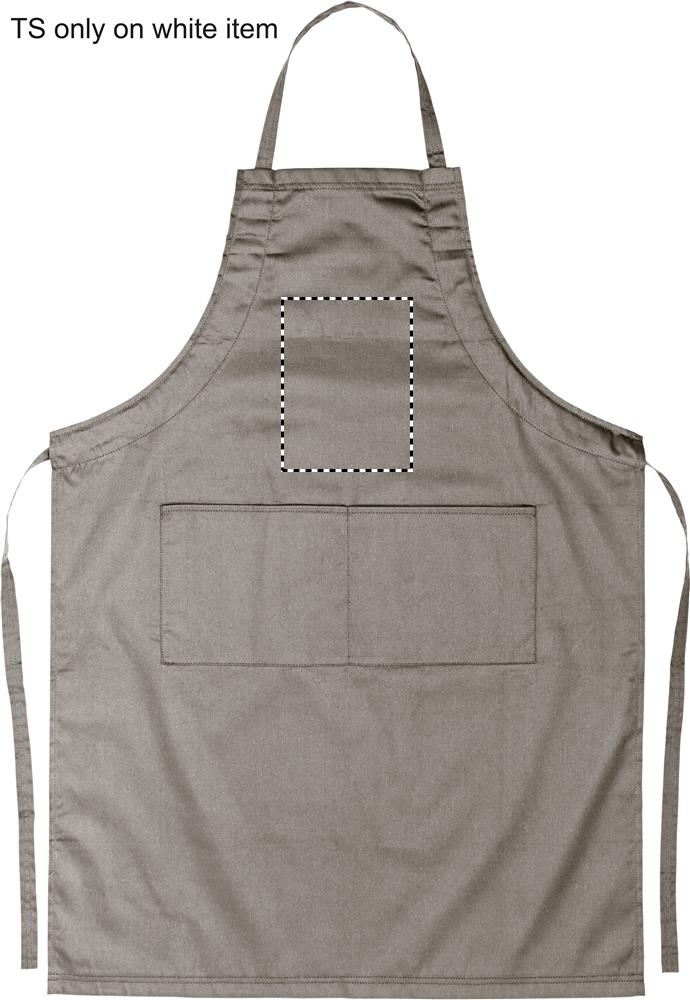
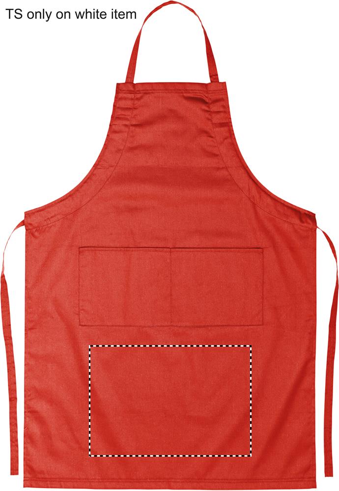
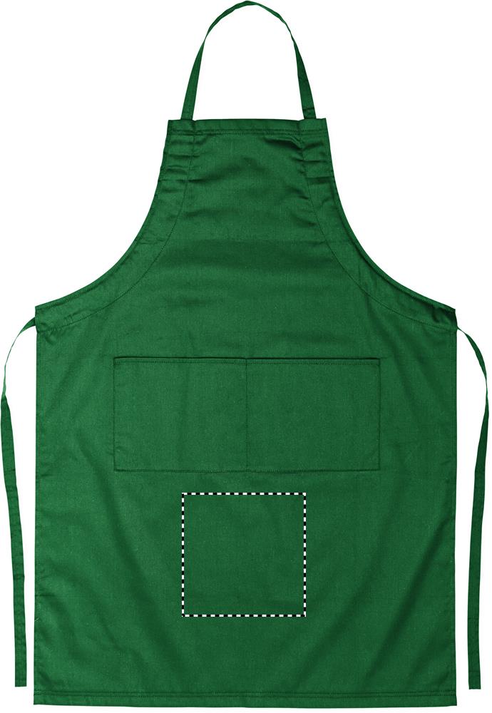
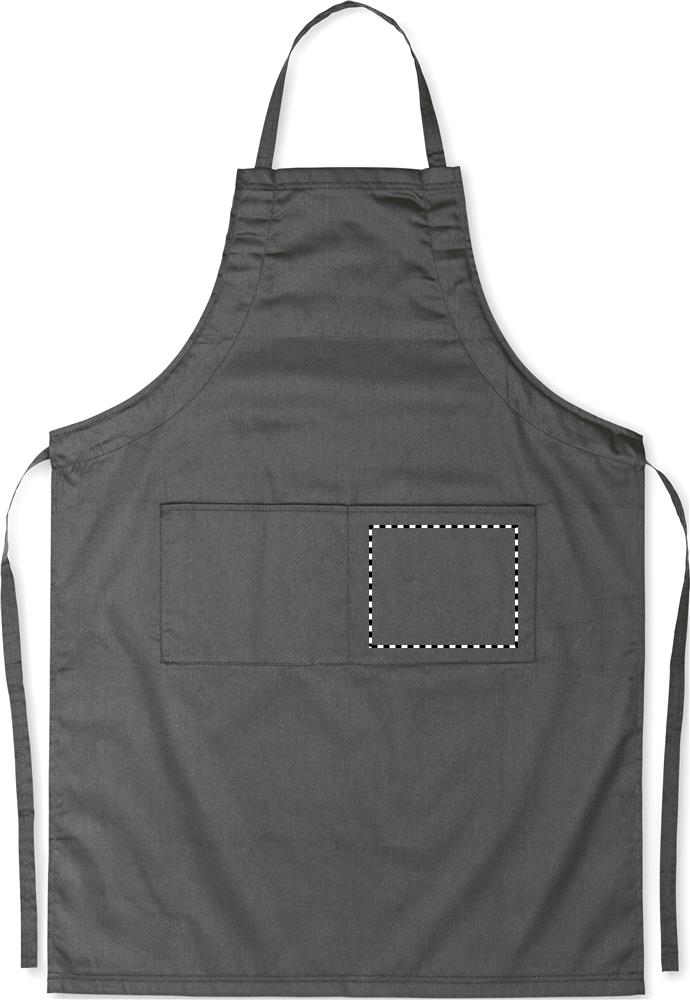
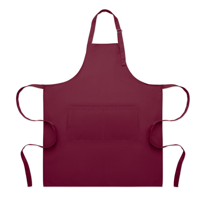
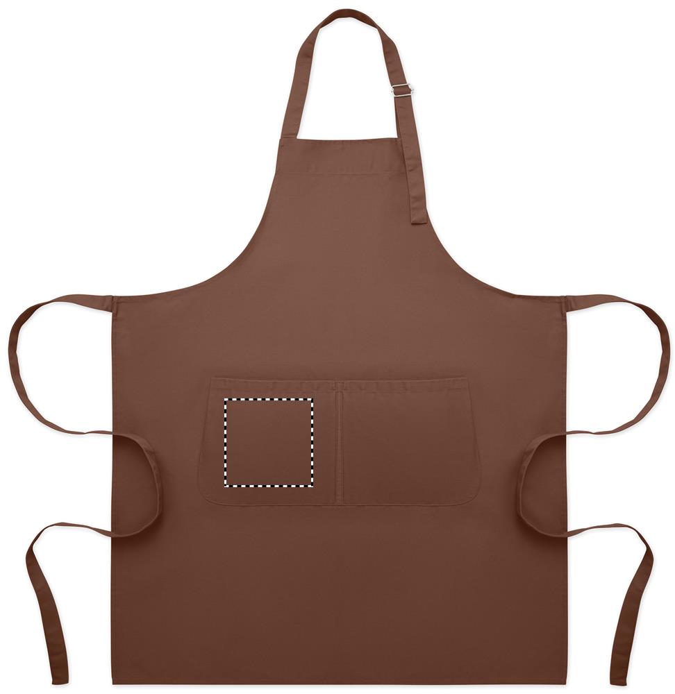
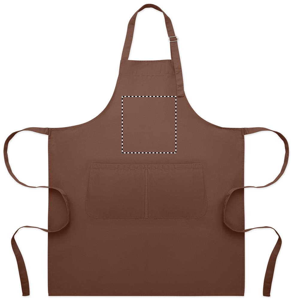
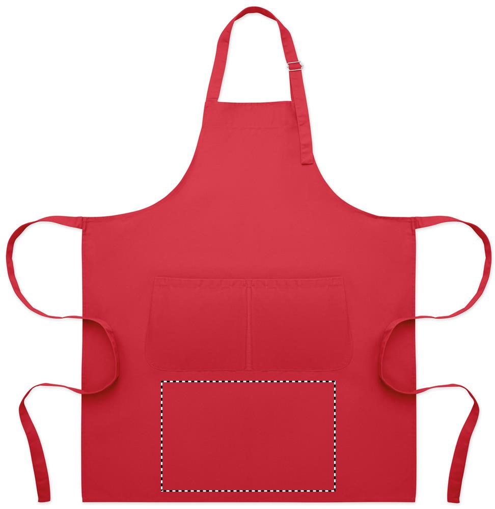
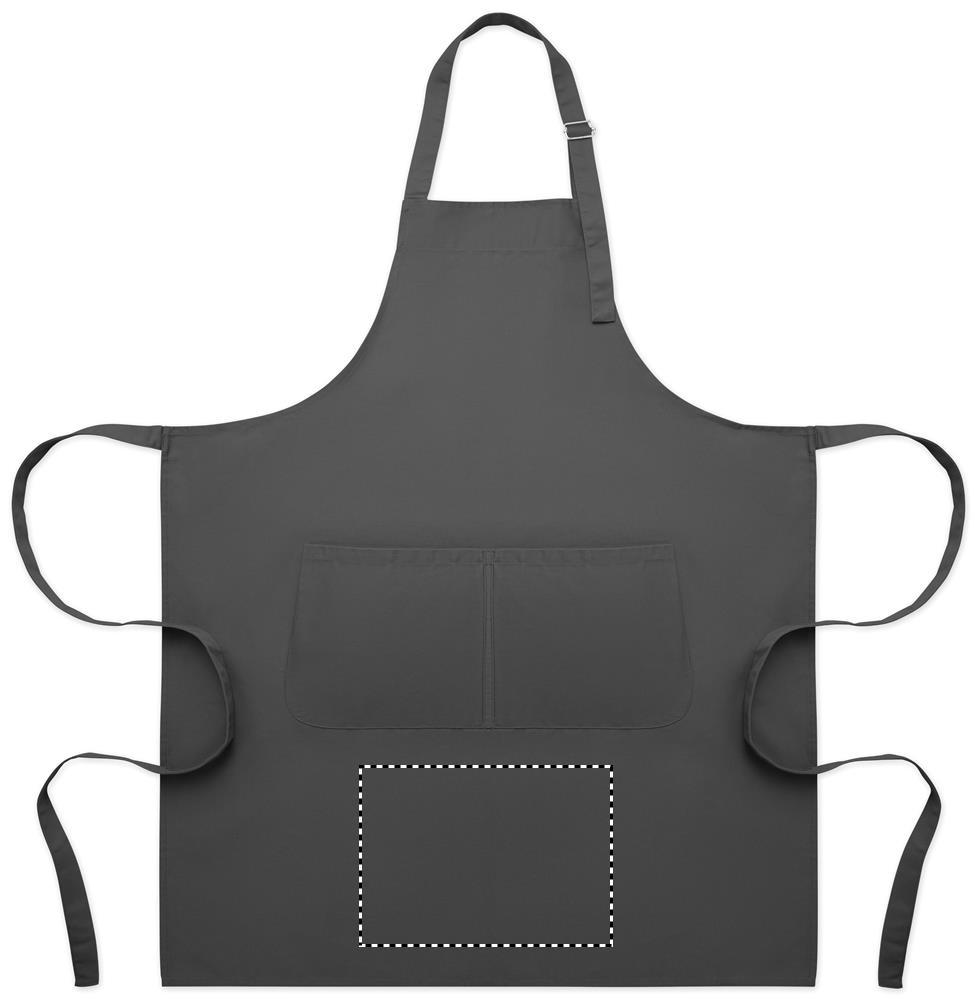
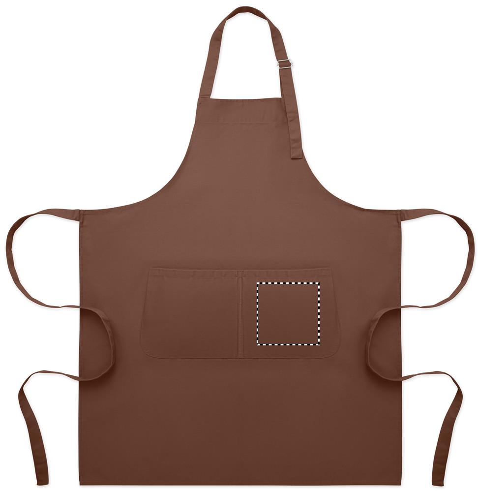
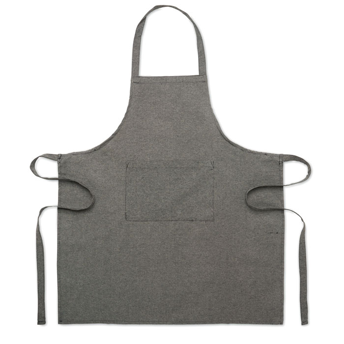
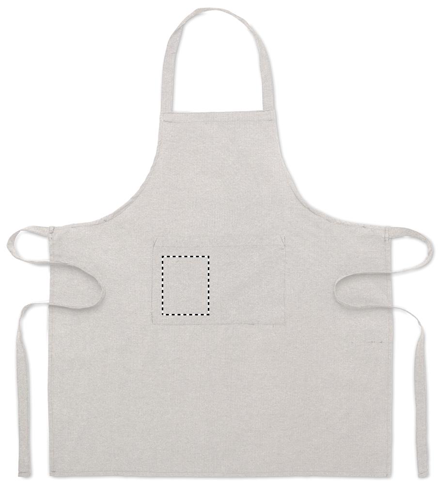
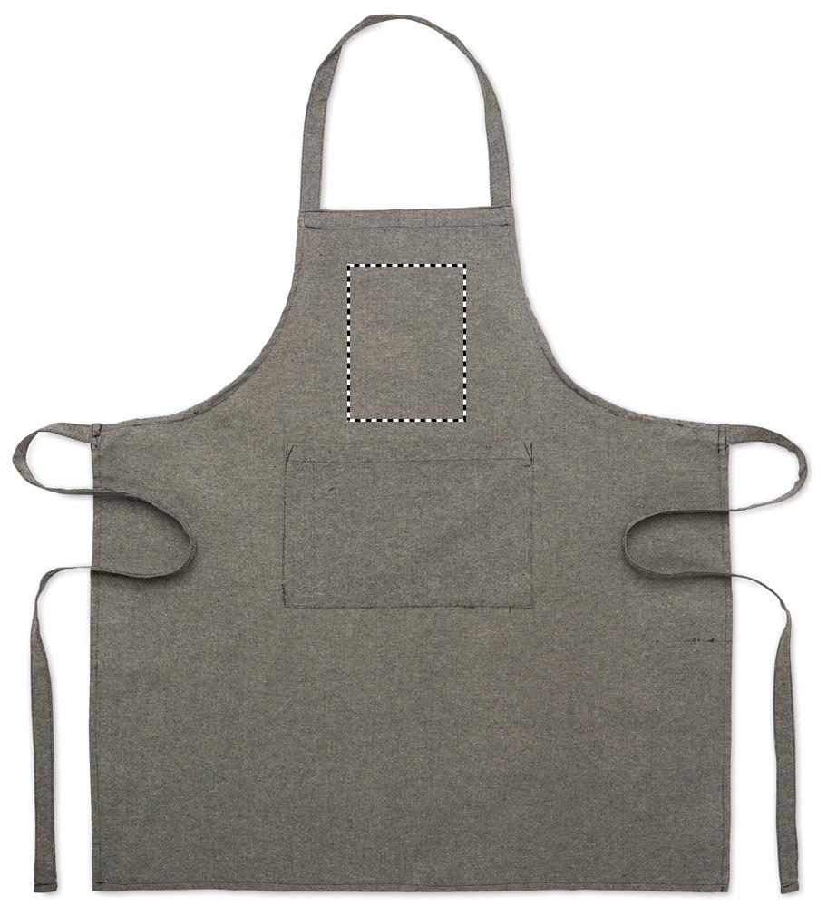
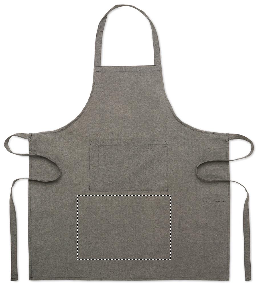
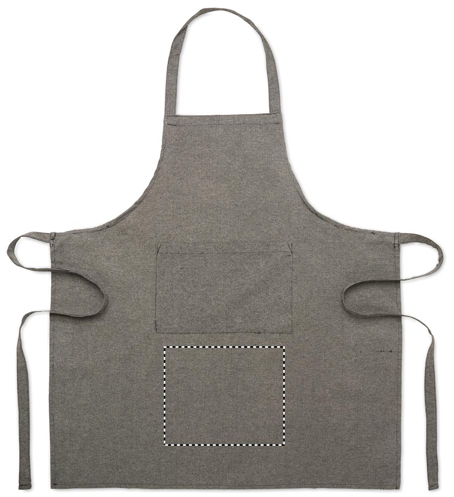
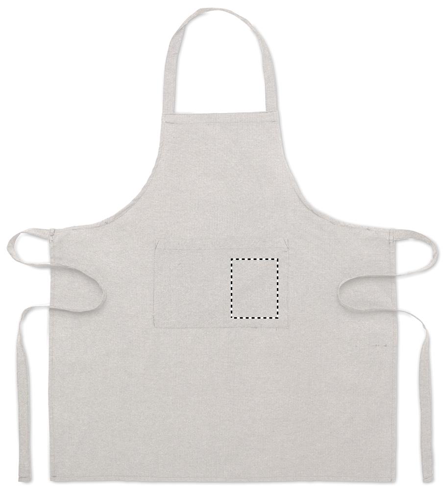
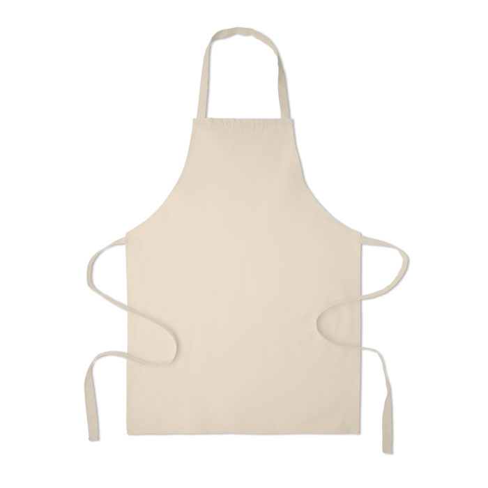
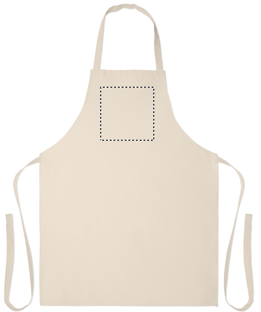
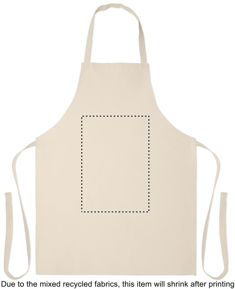
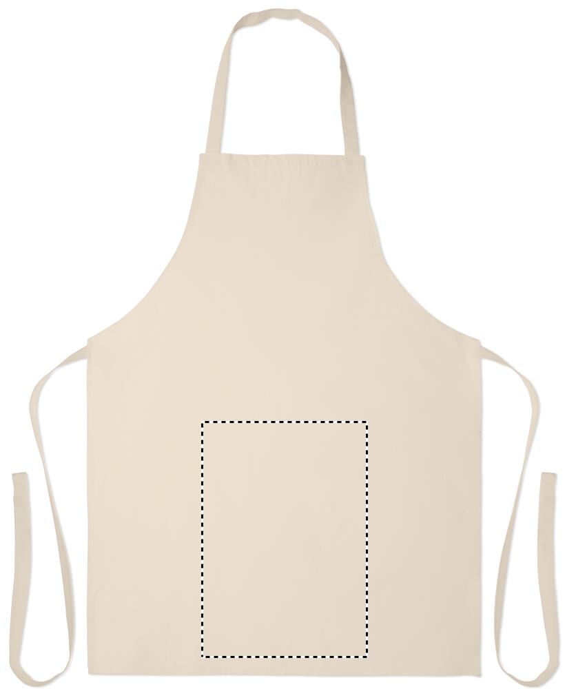
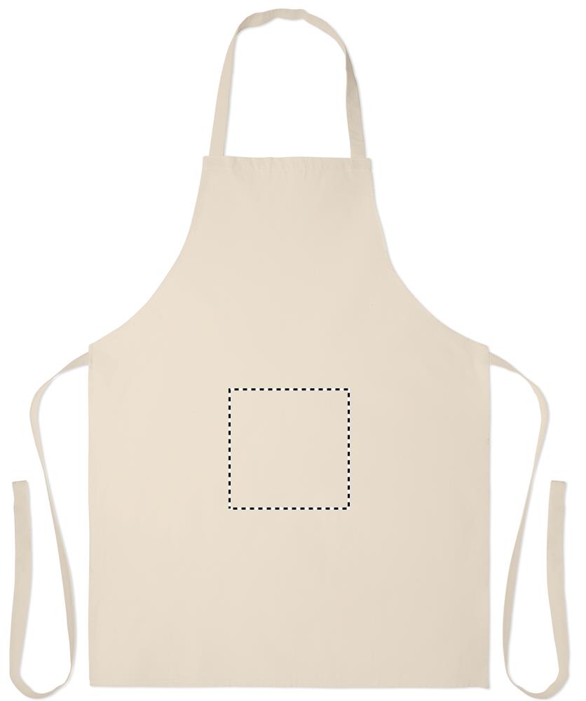
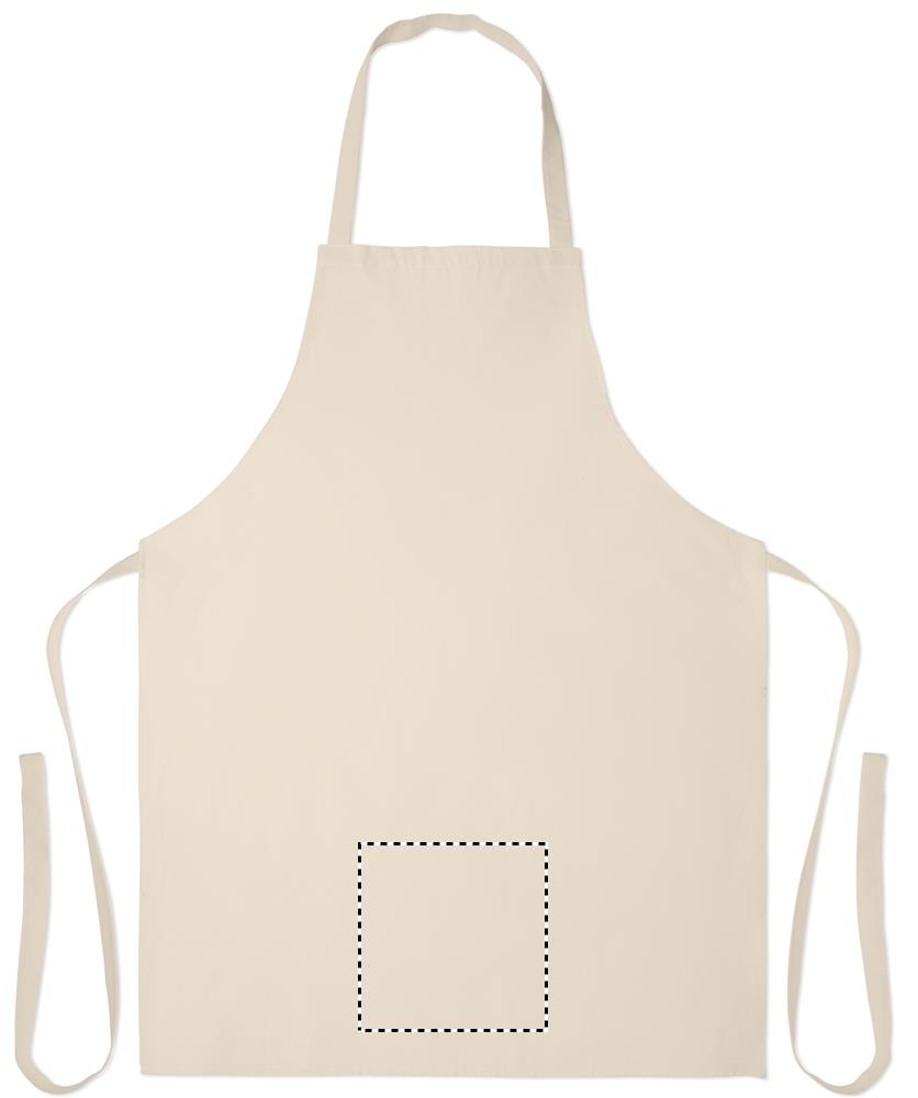
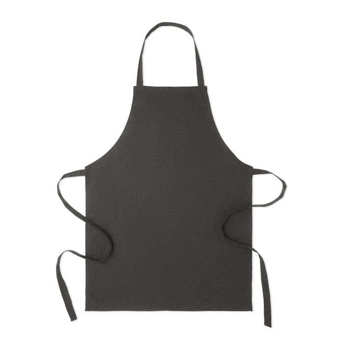
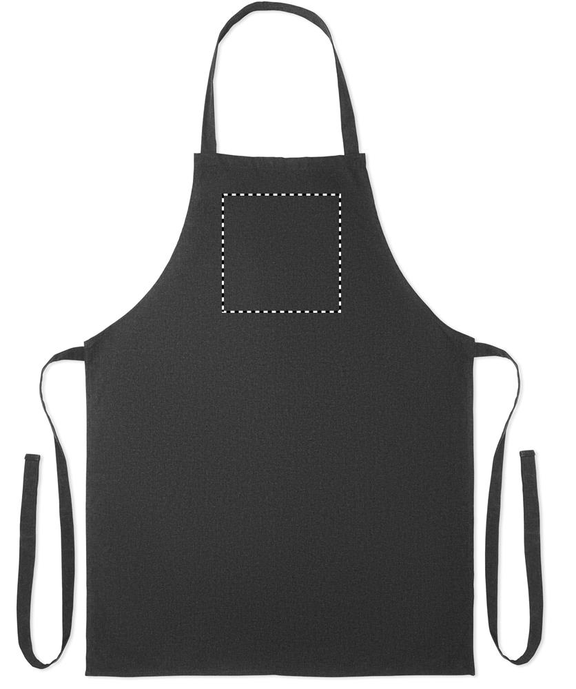
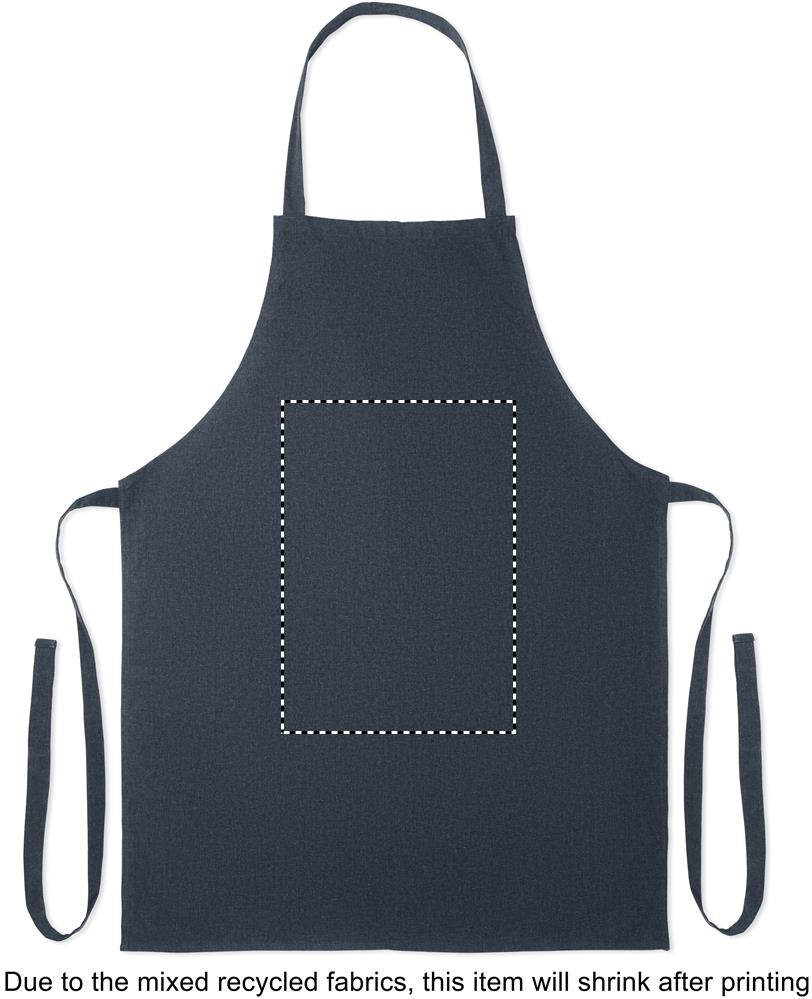
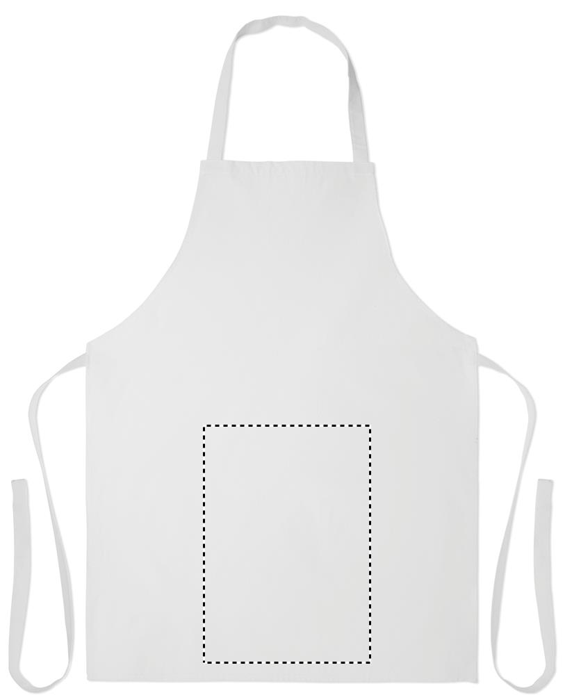
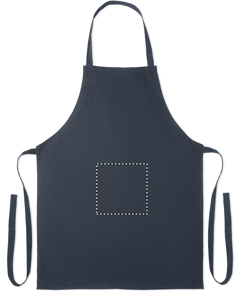
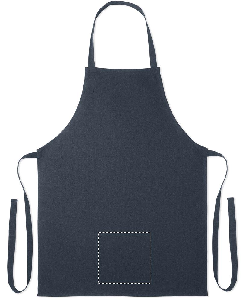
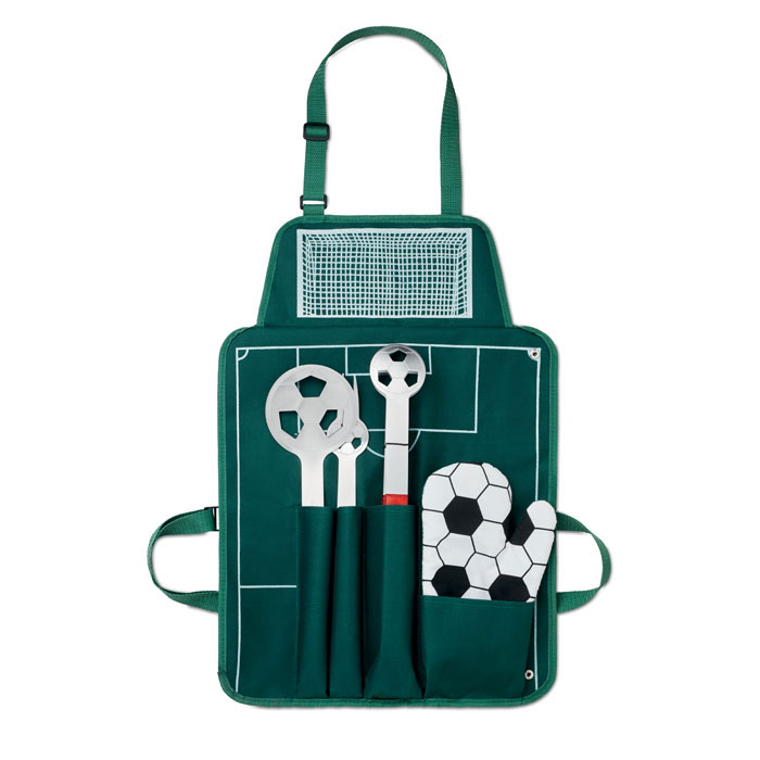
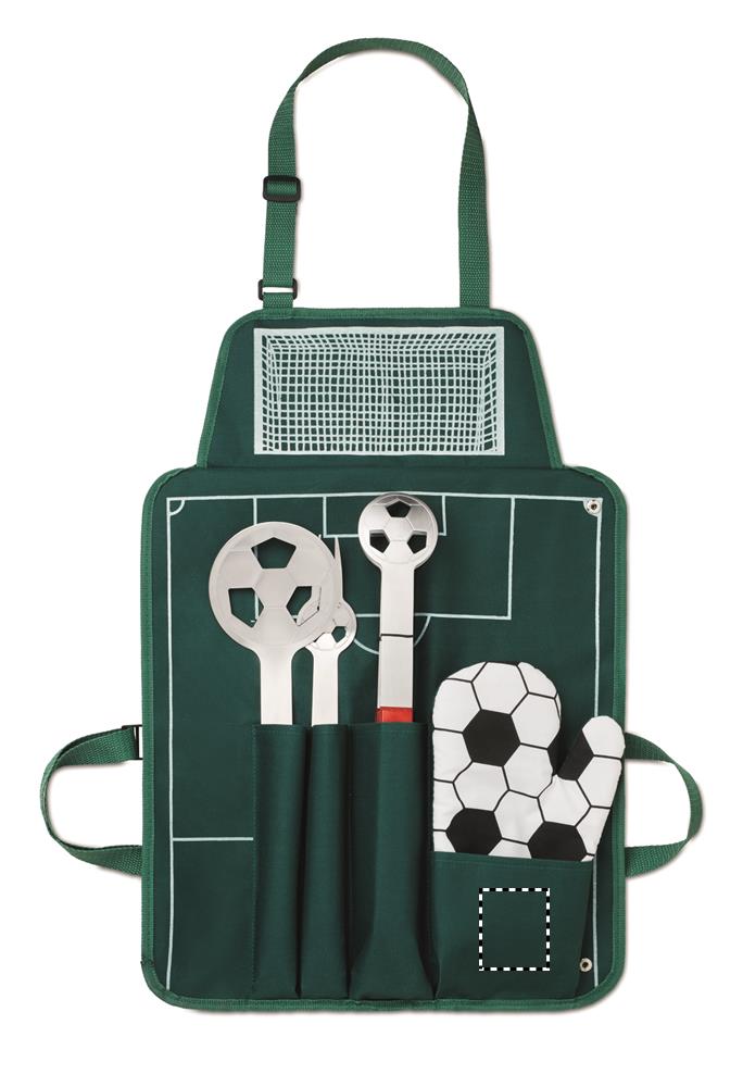
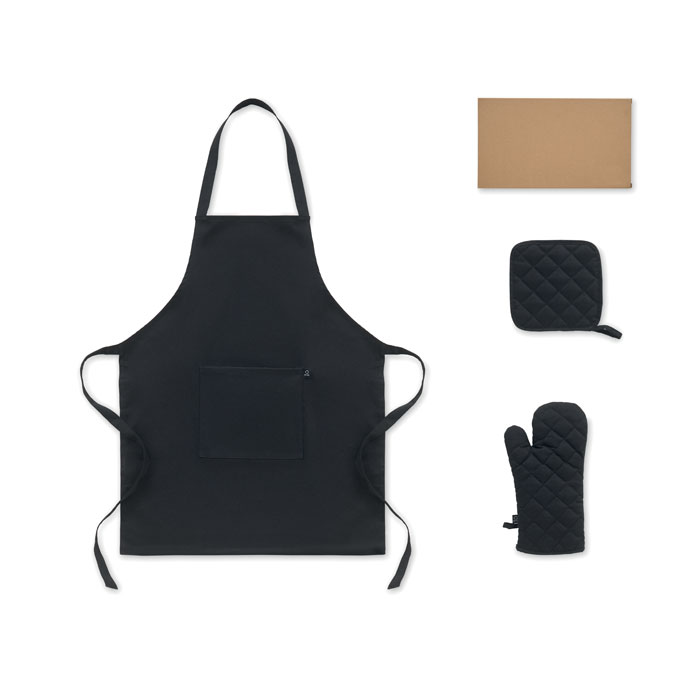
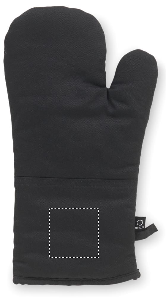
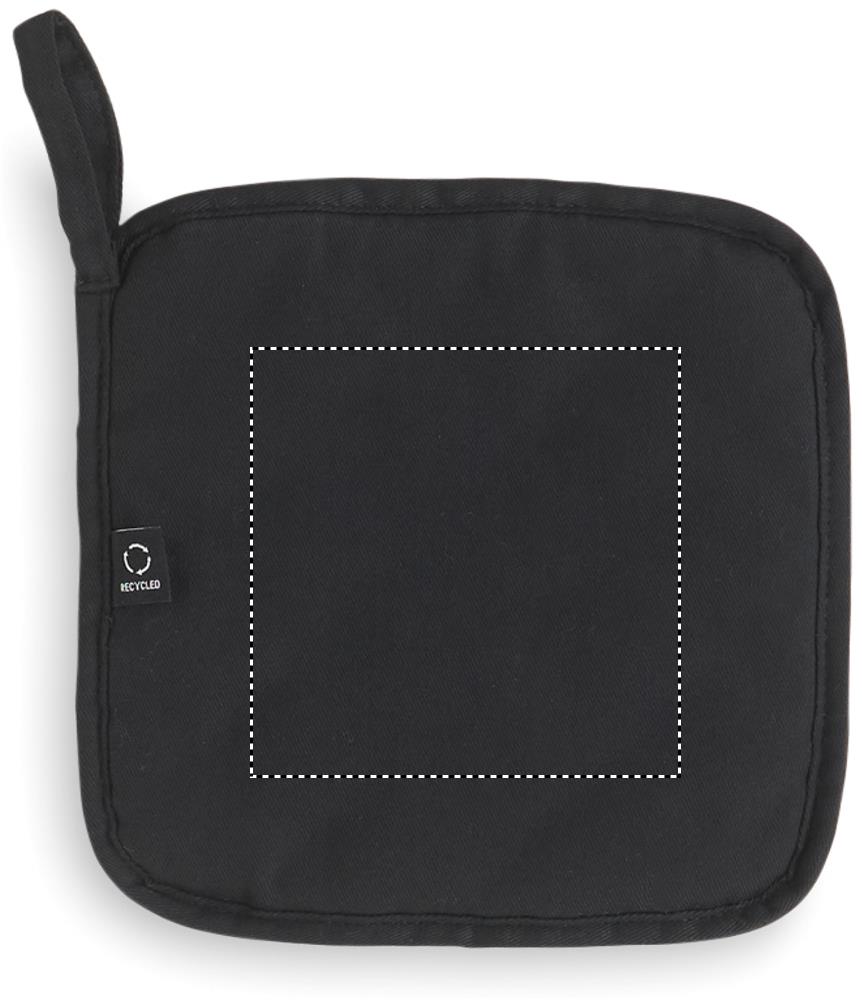
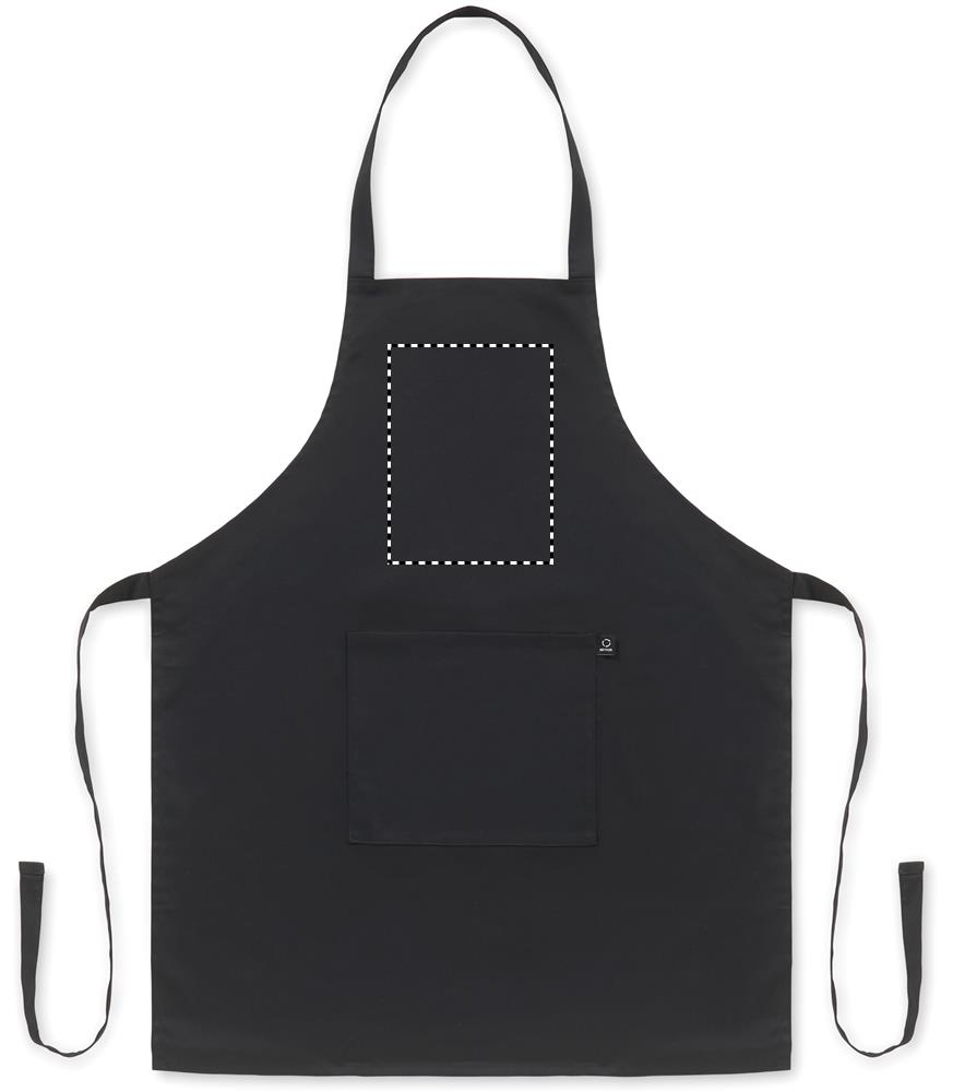
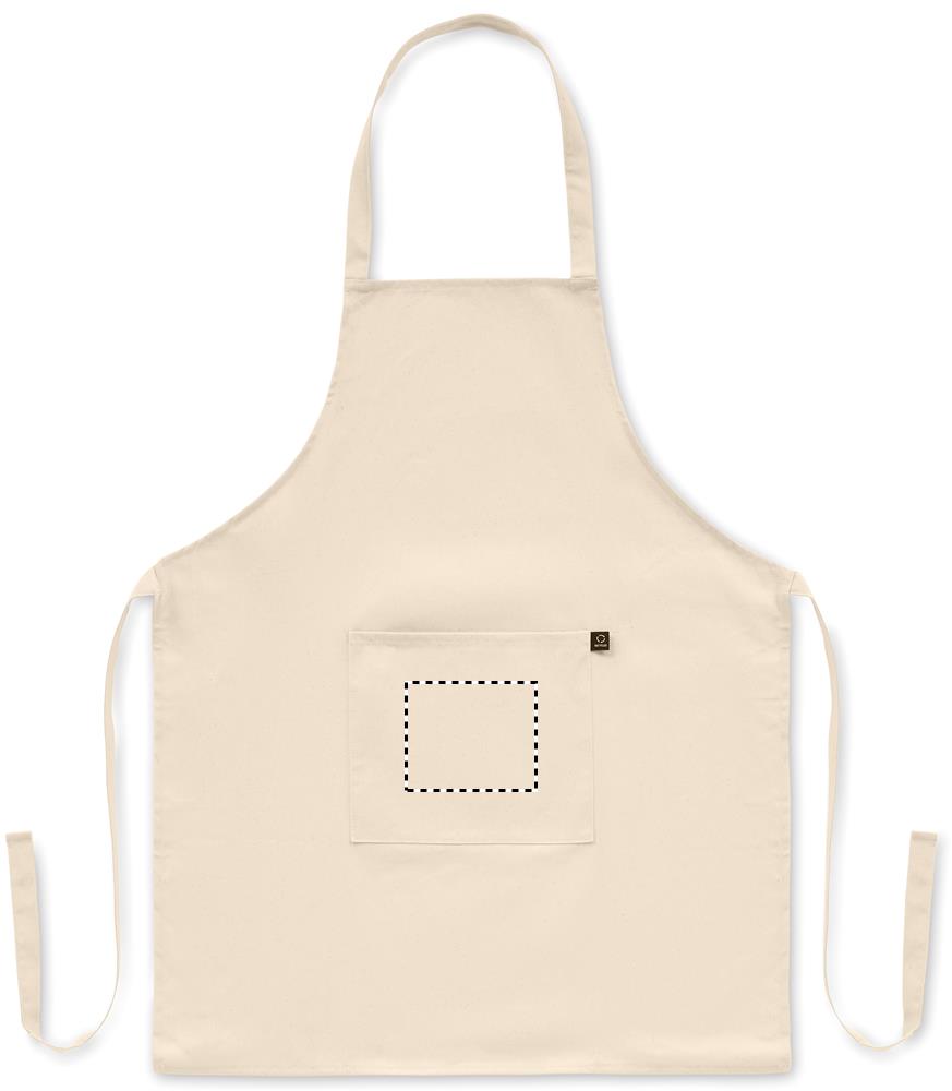
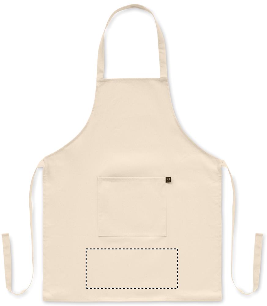
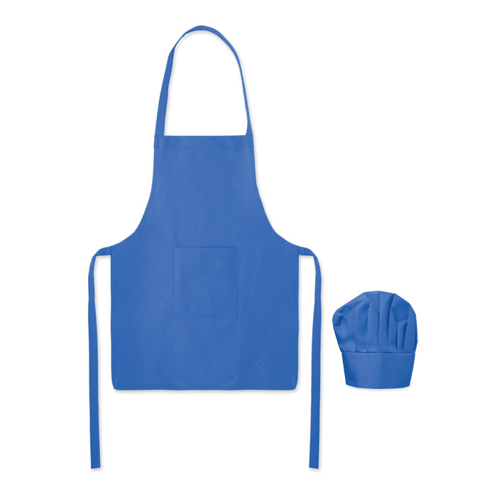
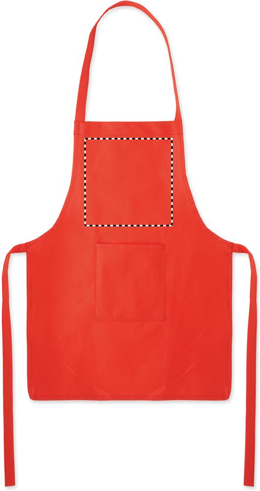
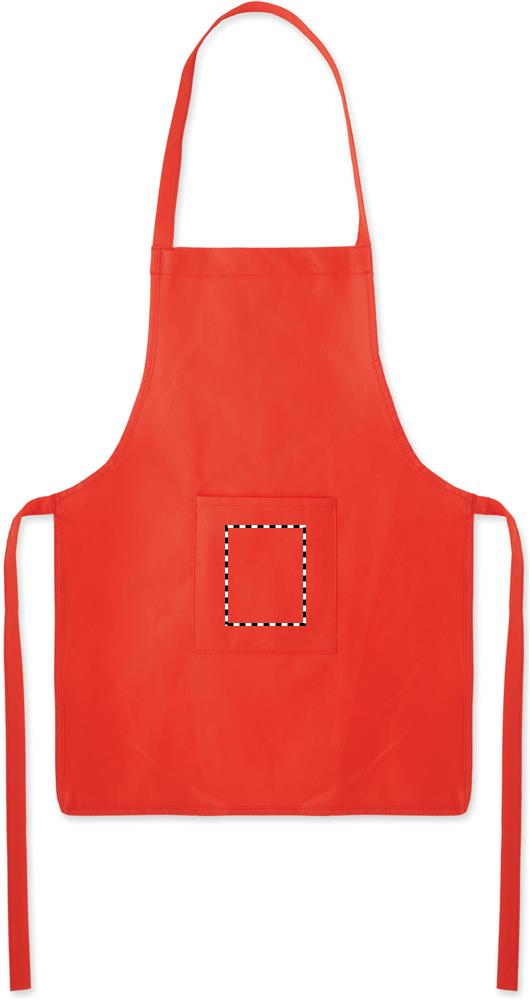
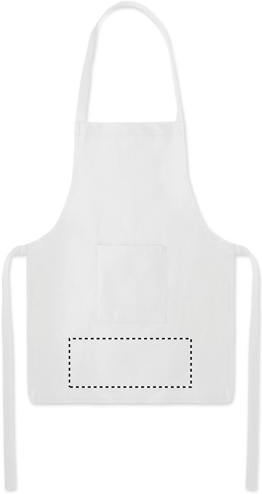
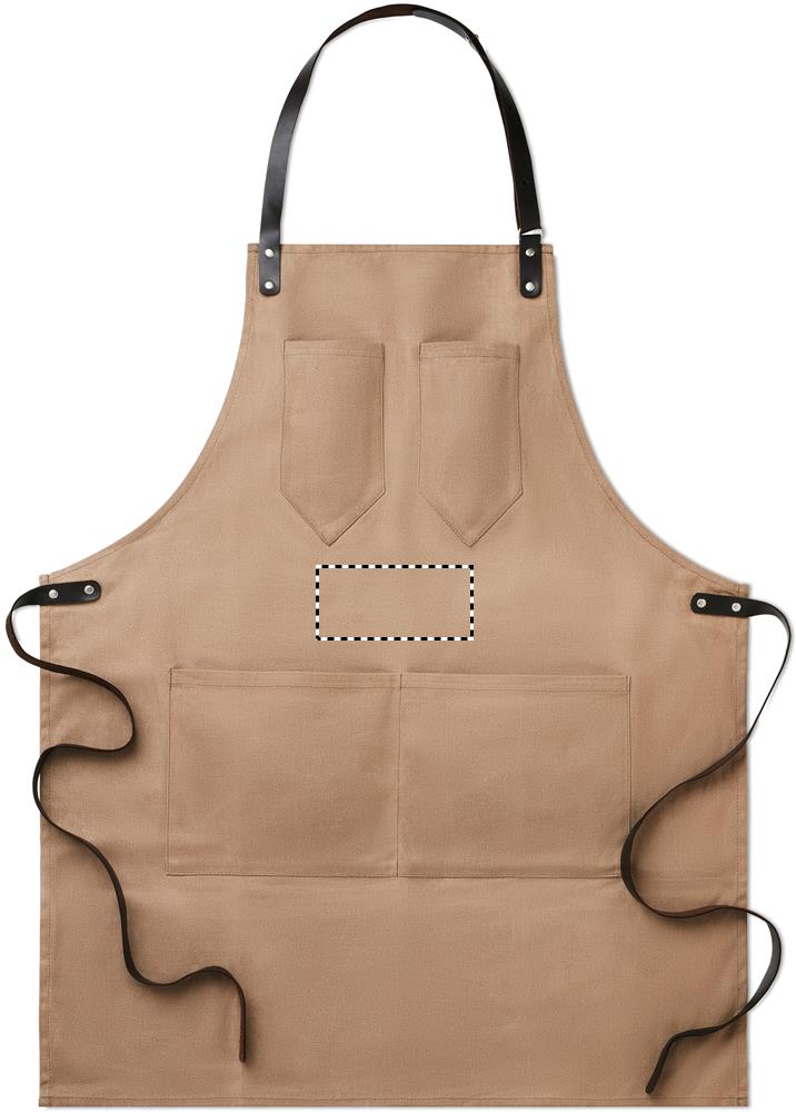
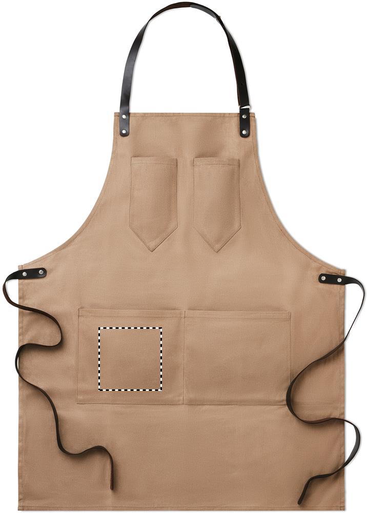
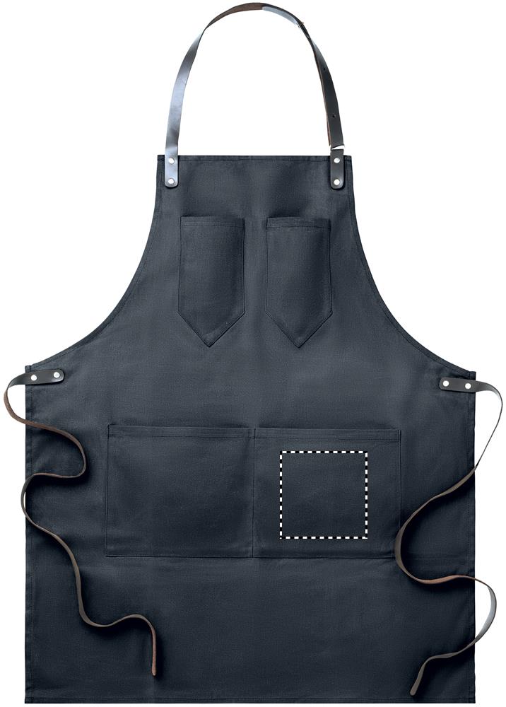
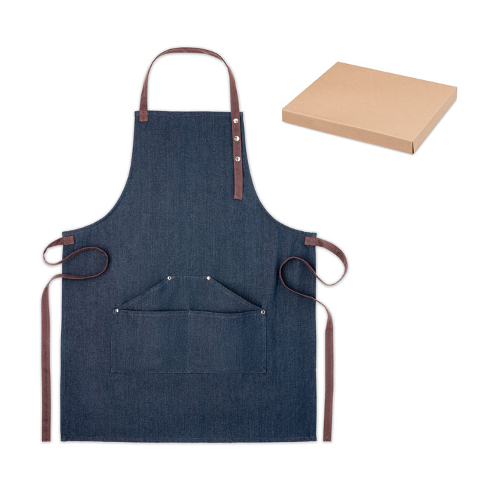
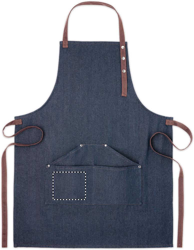
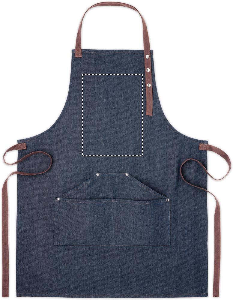
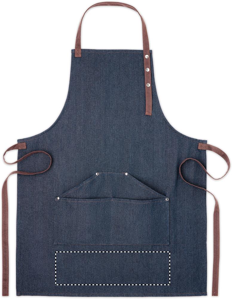
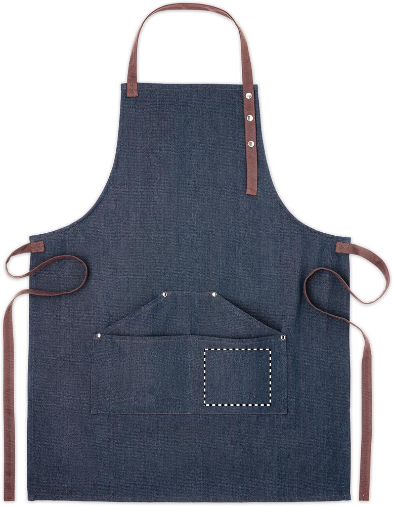
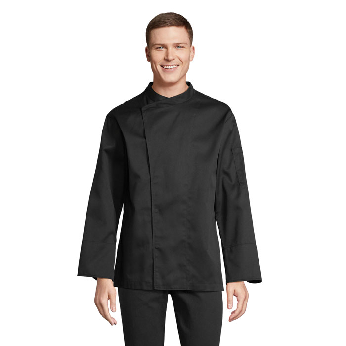
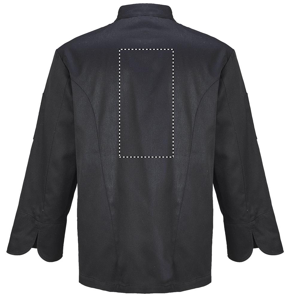
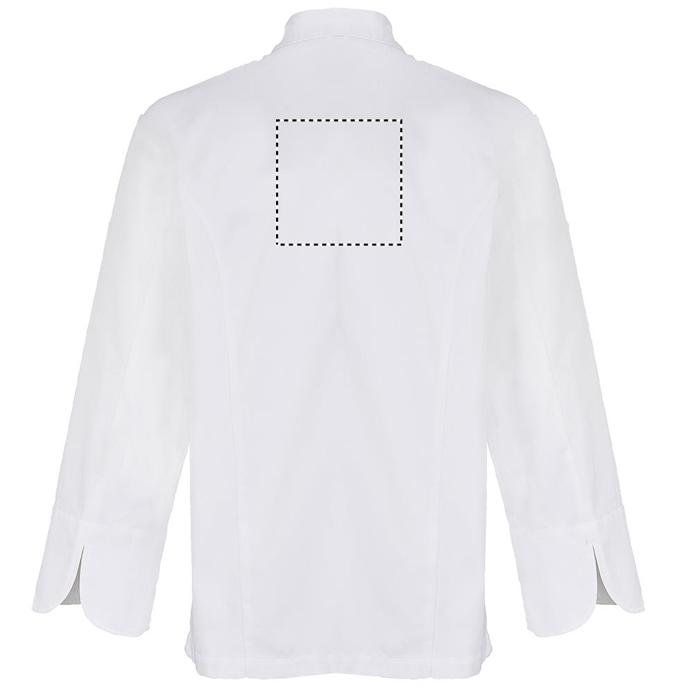
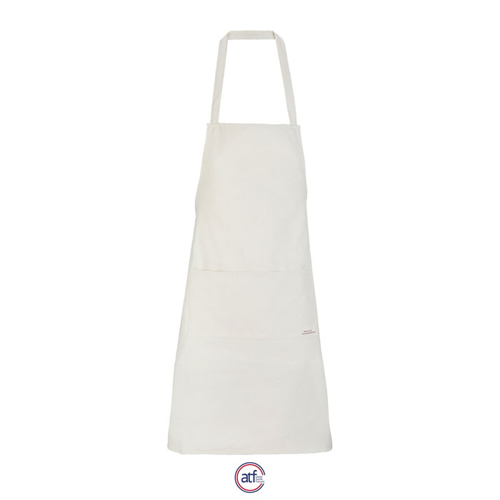
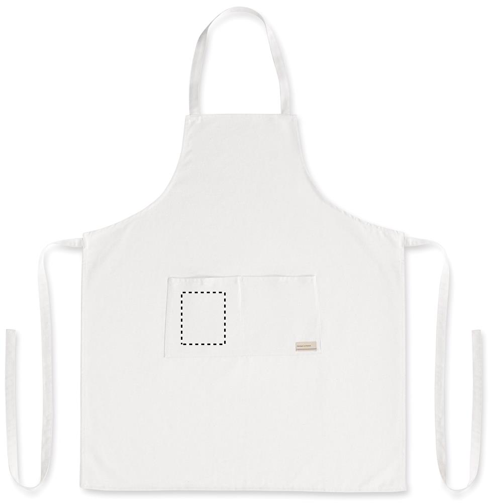
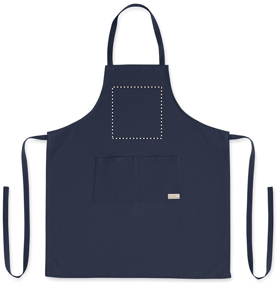
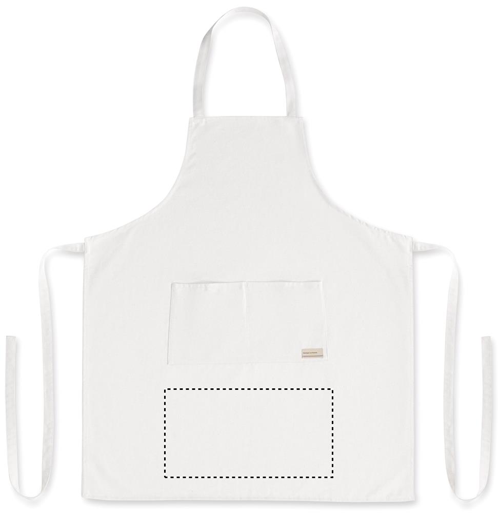
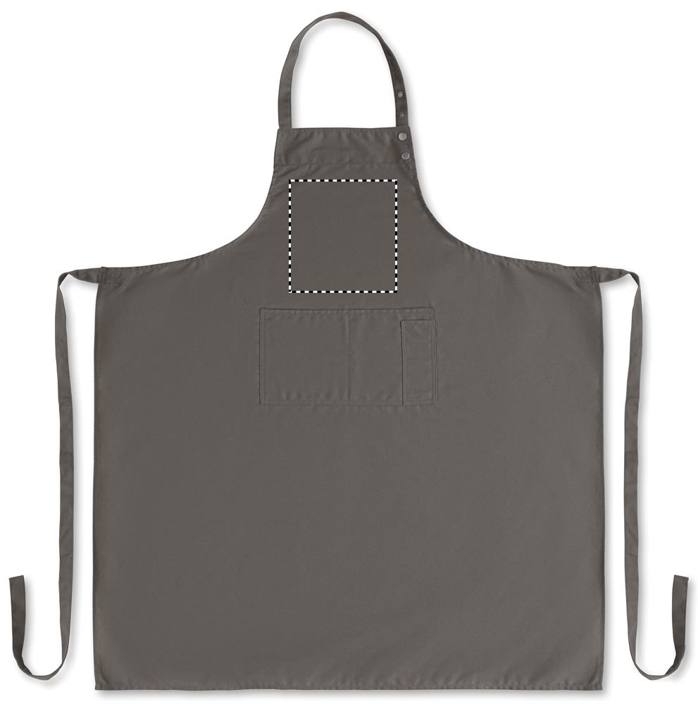
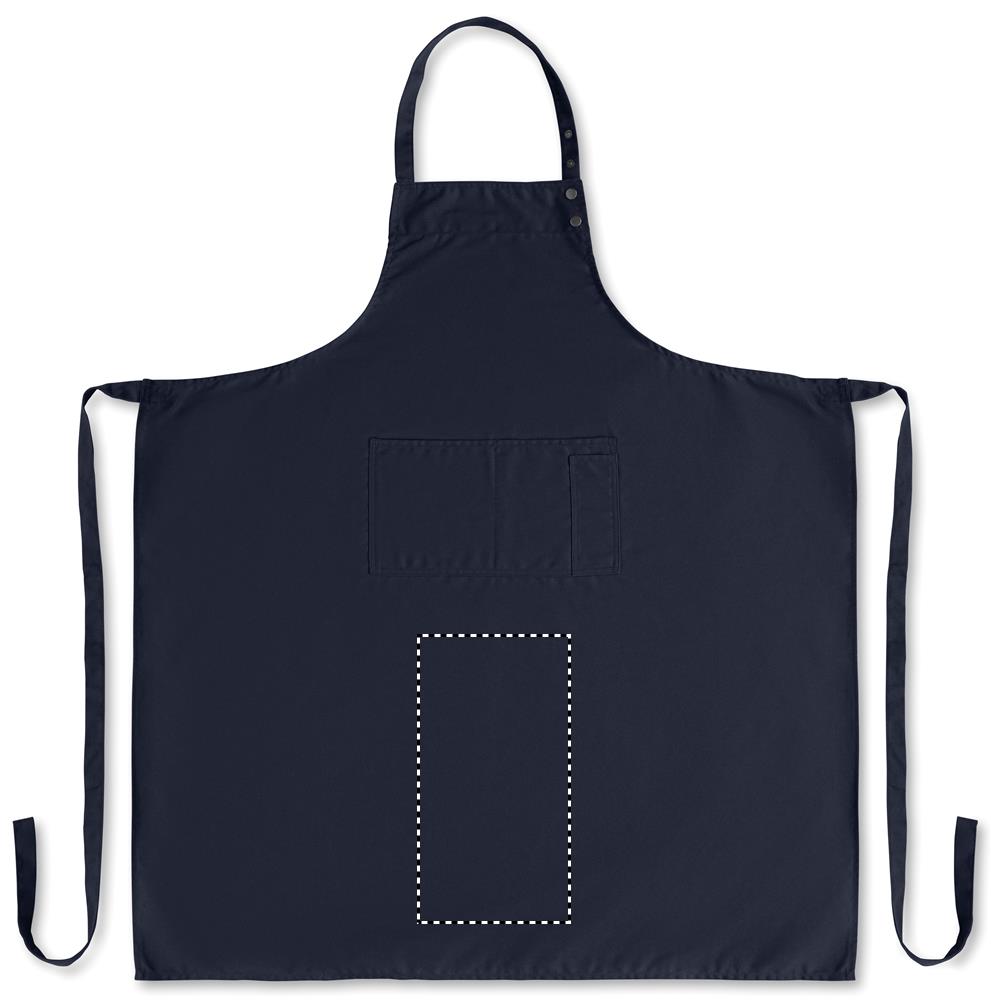
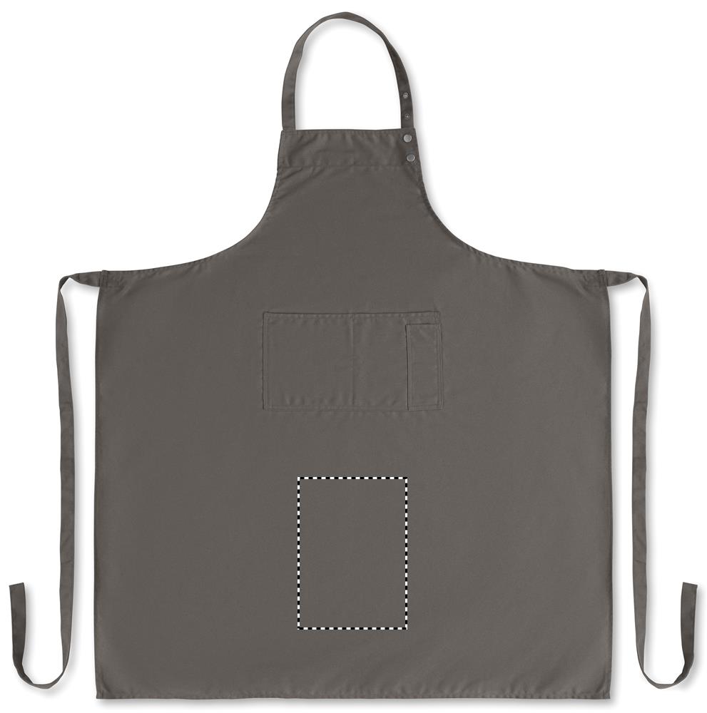
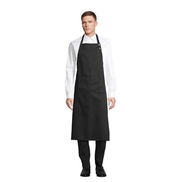
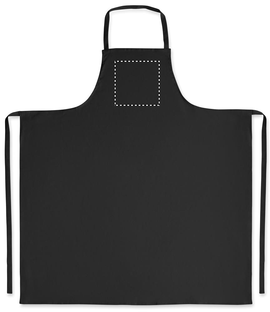
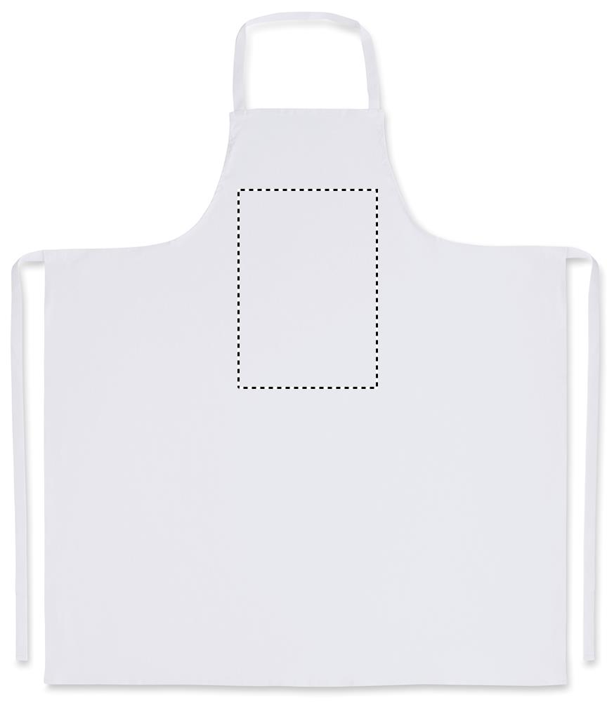
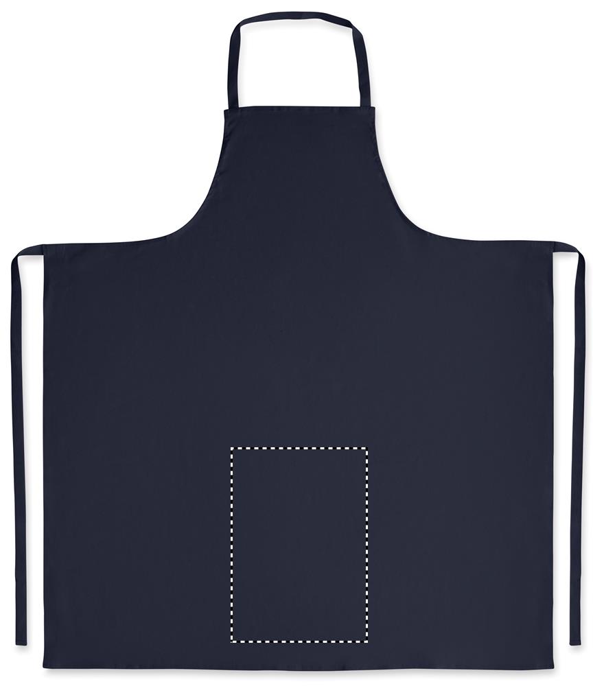
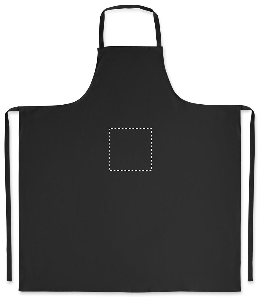
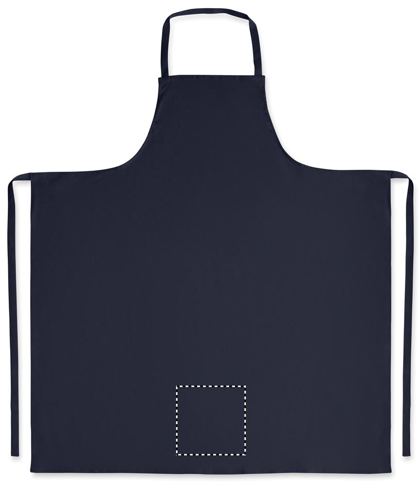
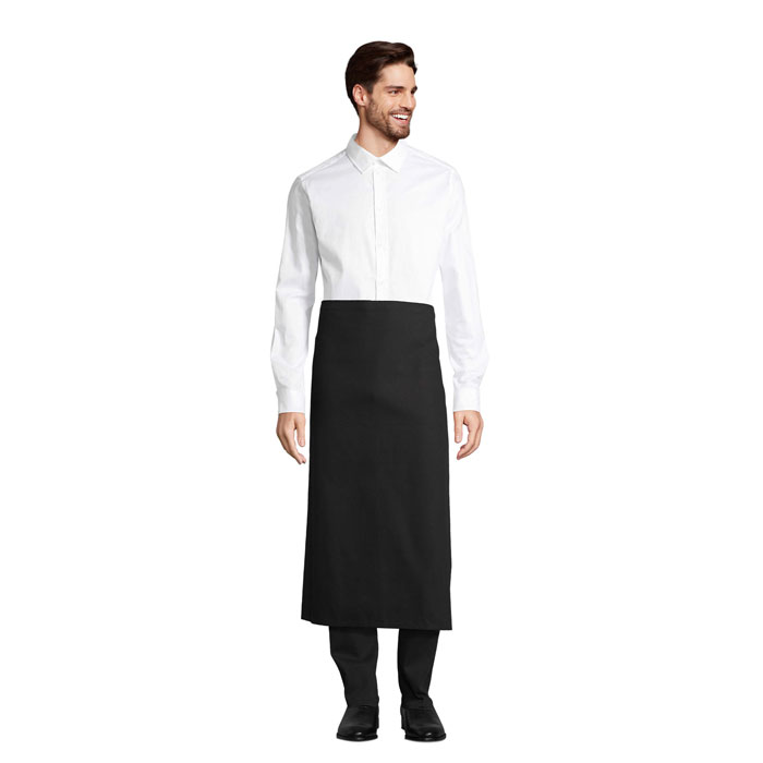
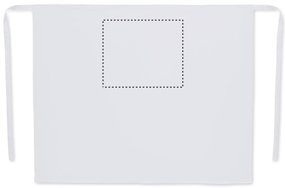
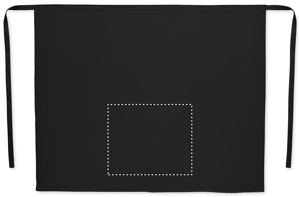
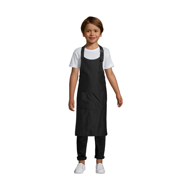
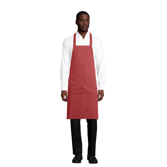
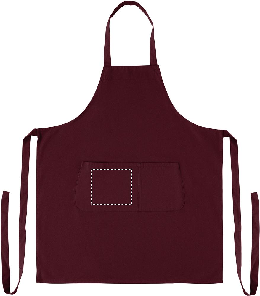
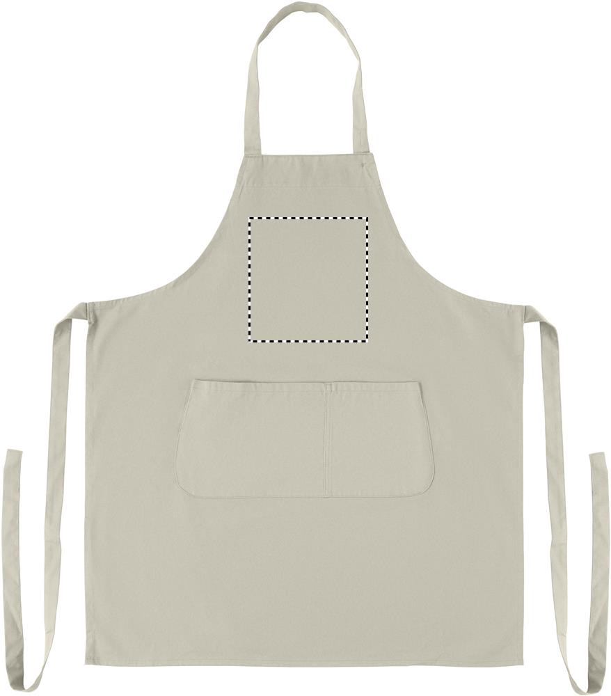
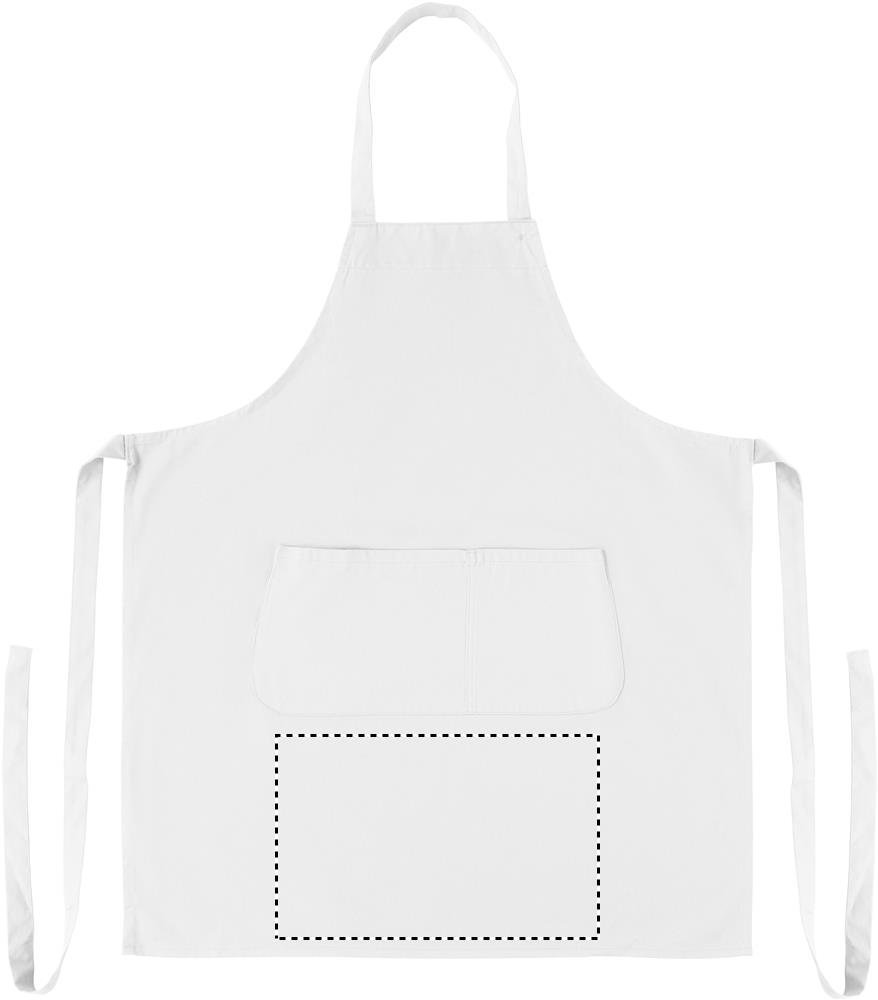
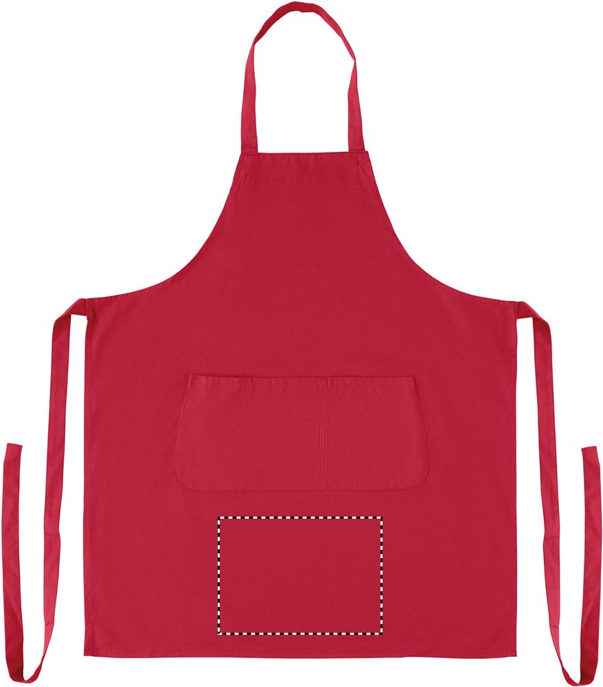
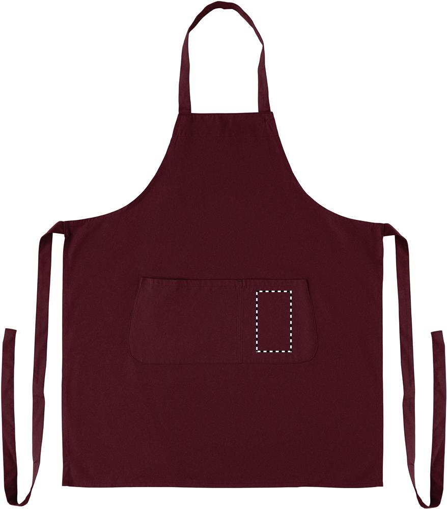
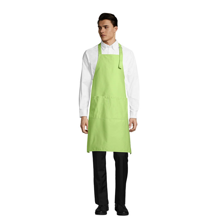
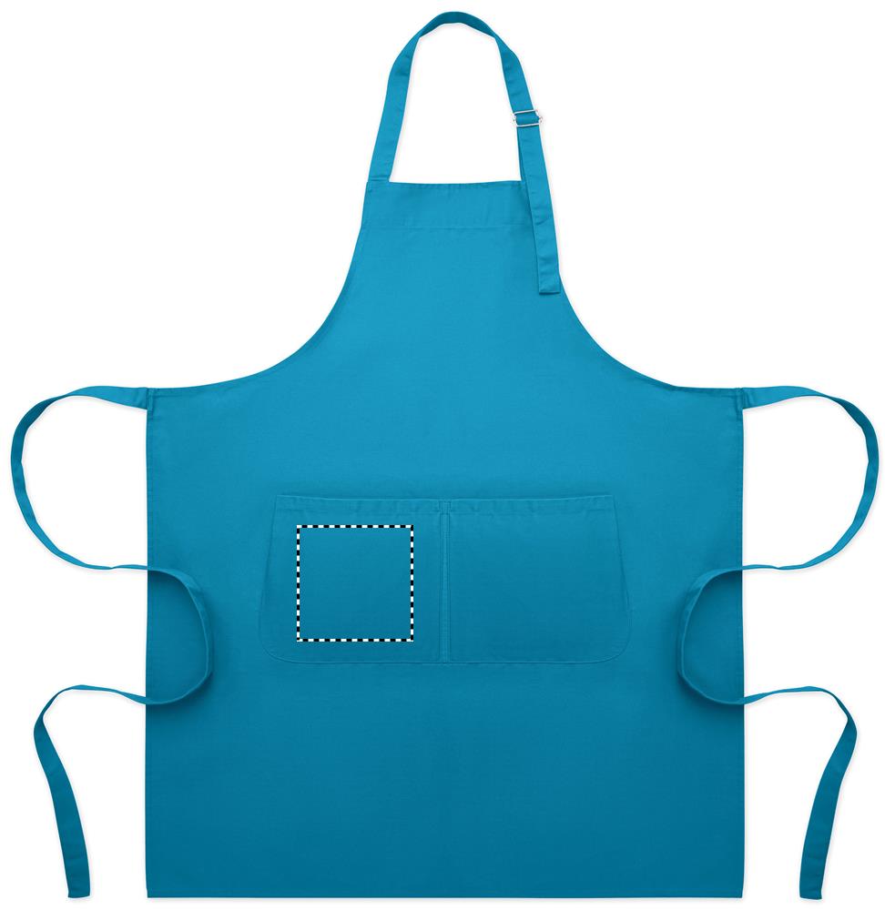
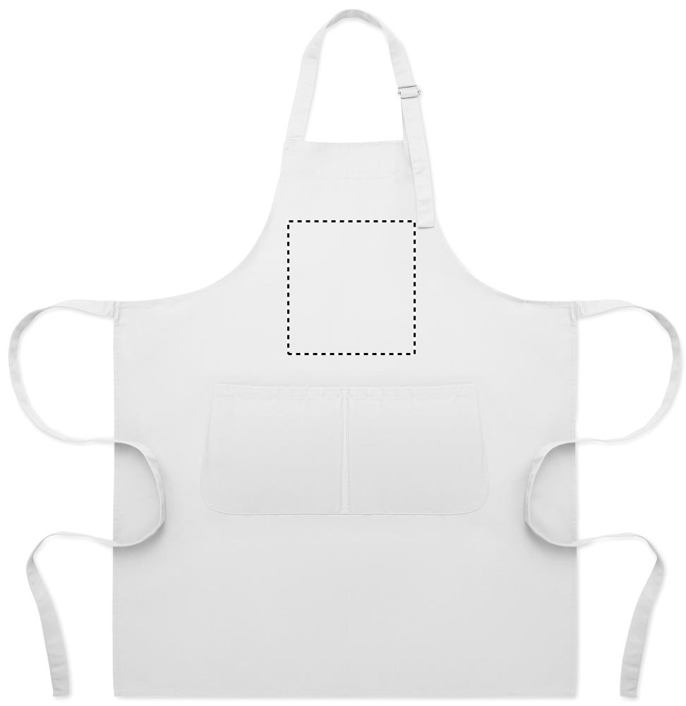
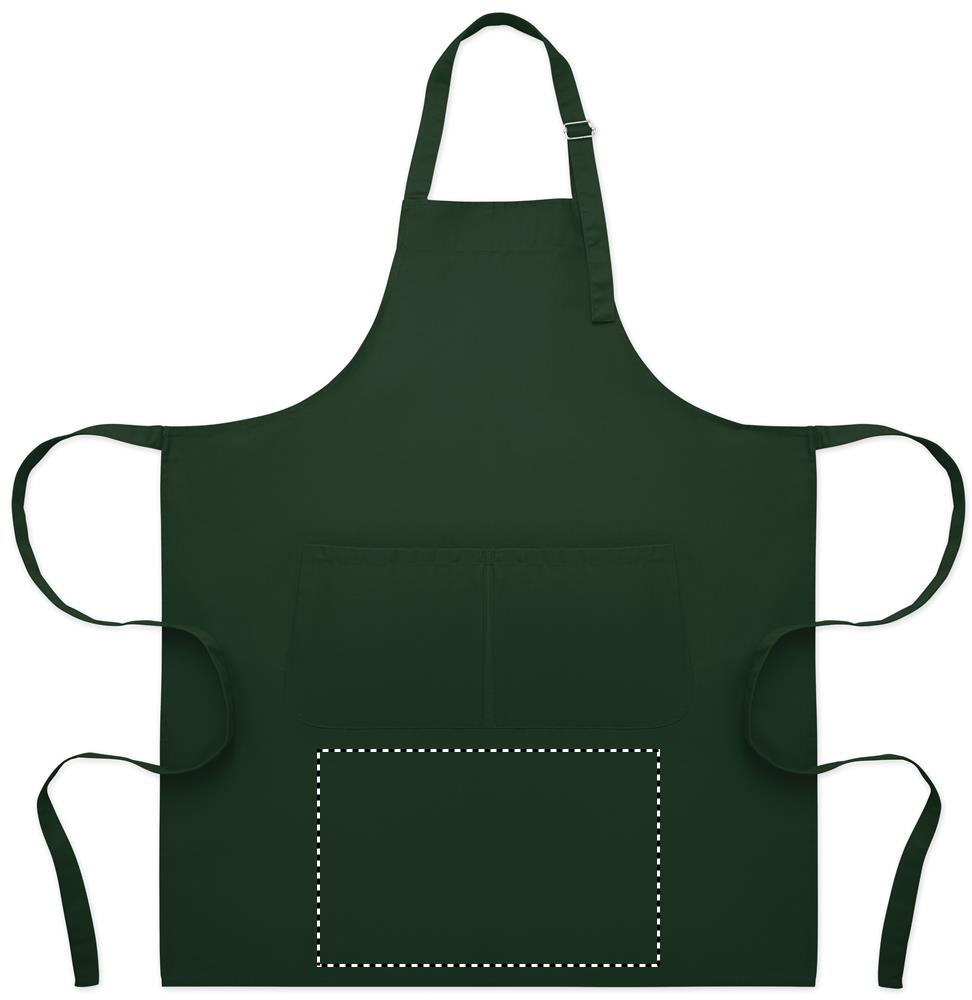
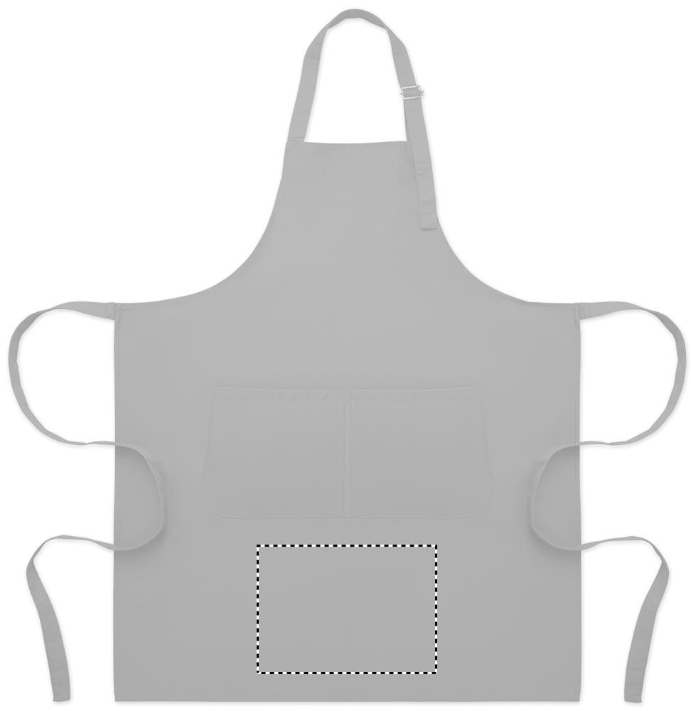
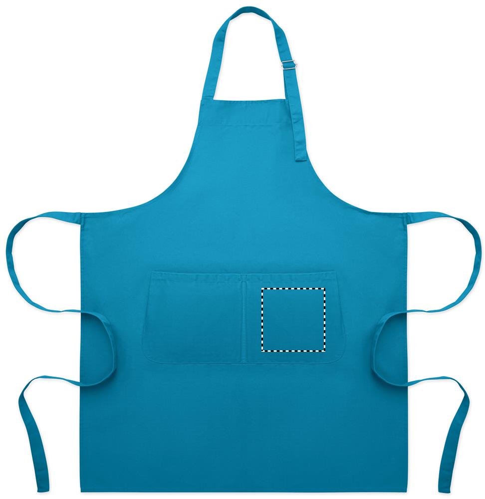
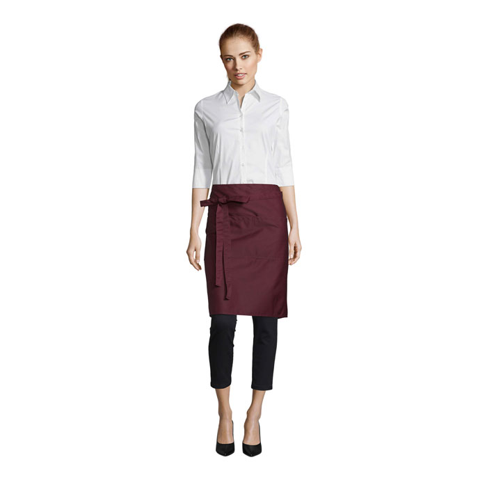
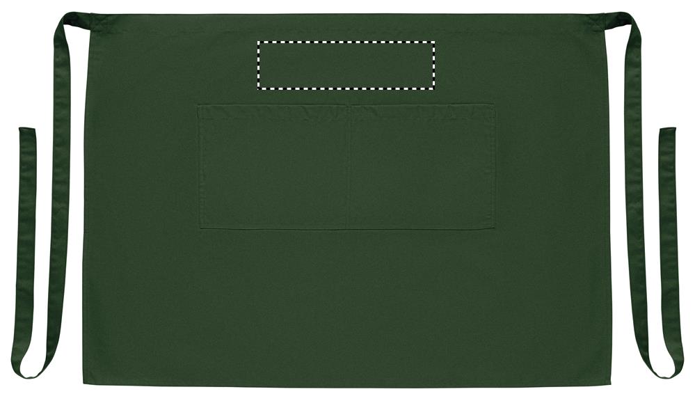
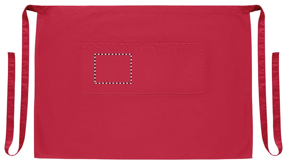
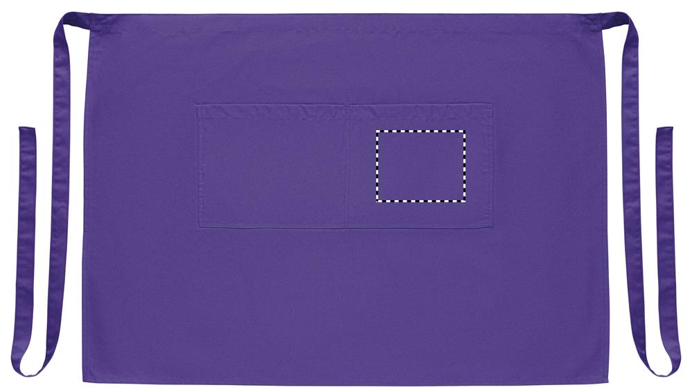
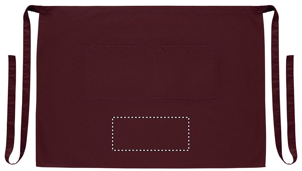
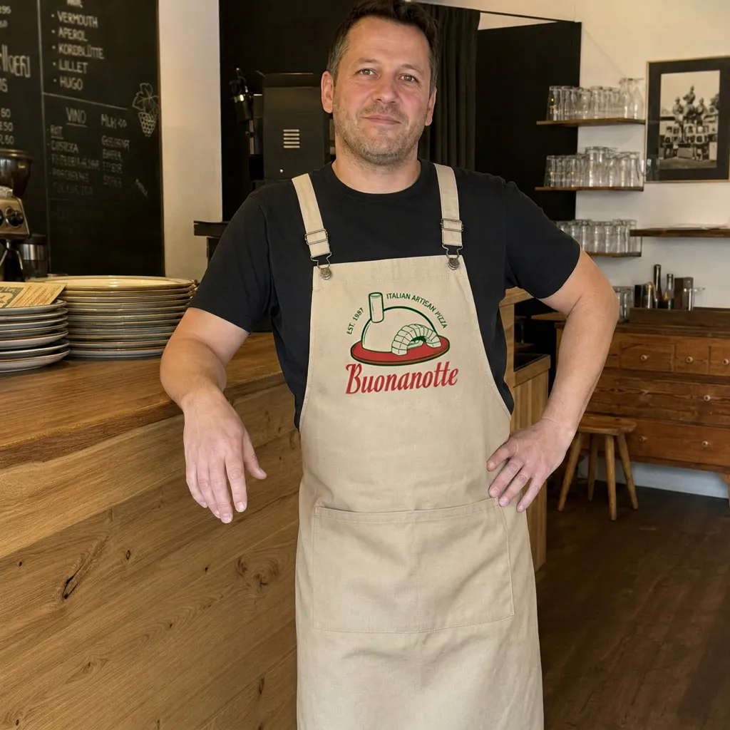
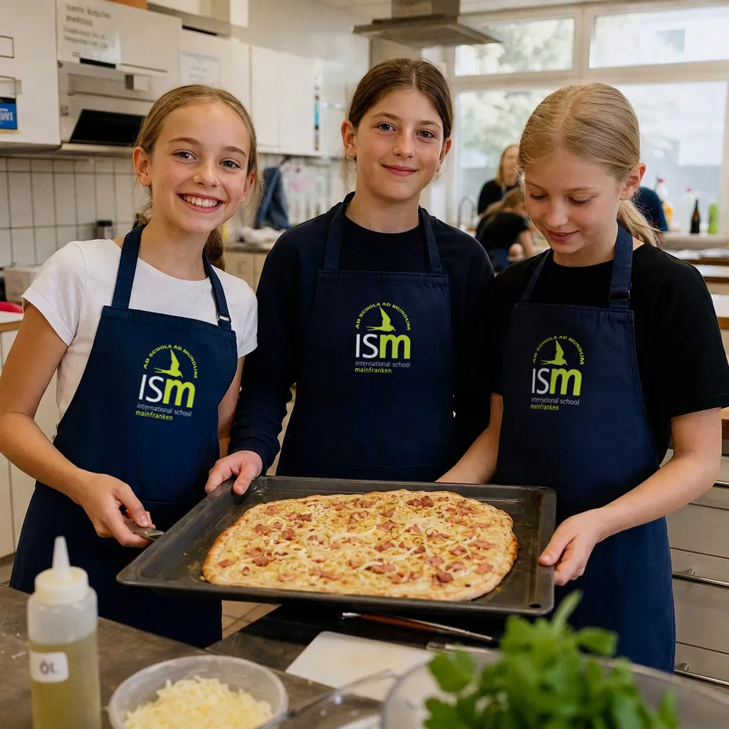
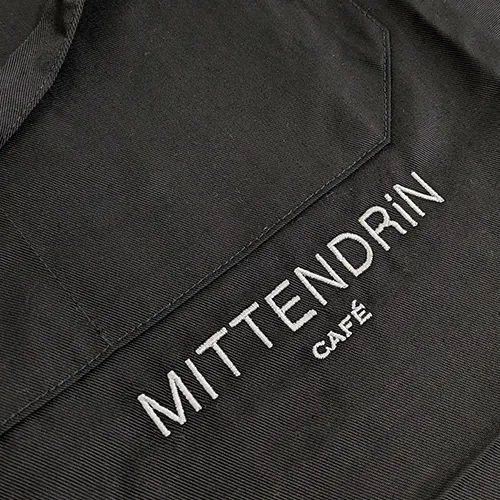
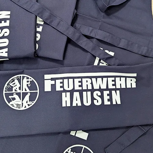
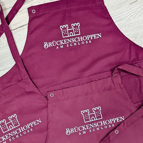
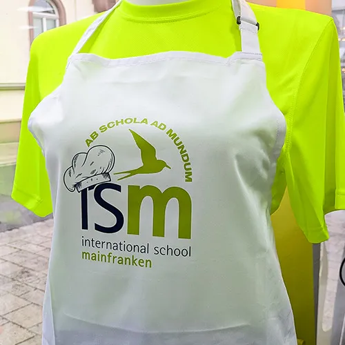
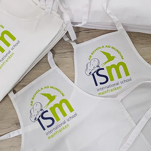
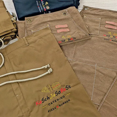
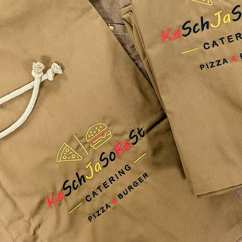
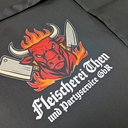
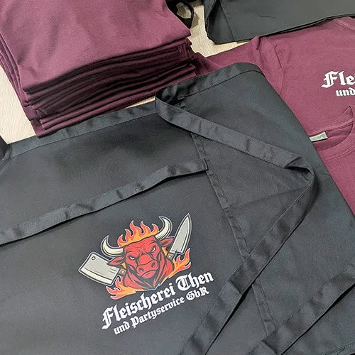
For the color of your apron, you can go by your company or club design, the occasion and the colors of your design. For logos and lettering, a clear contrast to the base color of the apron matters most.
🖤 Classic colors: black, gray and navy
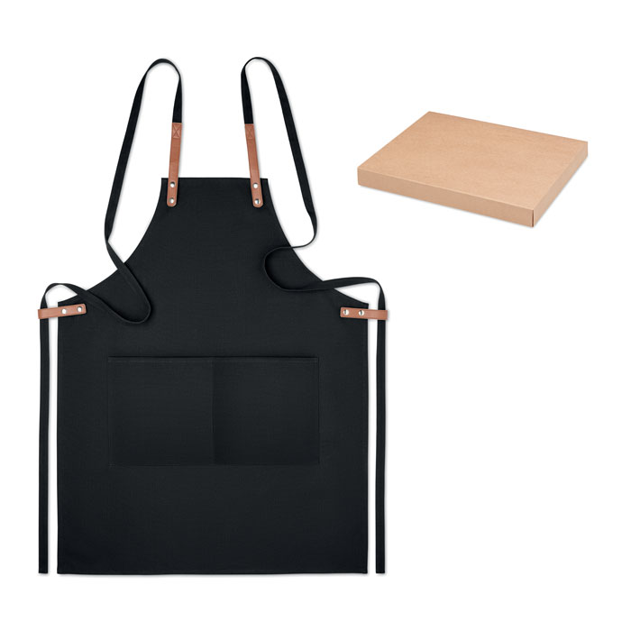
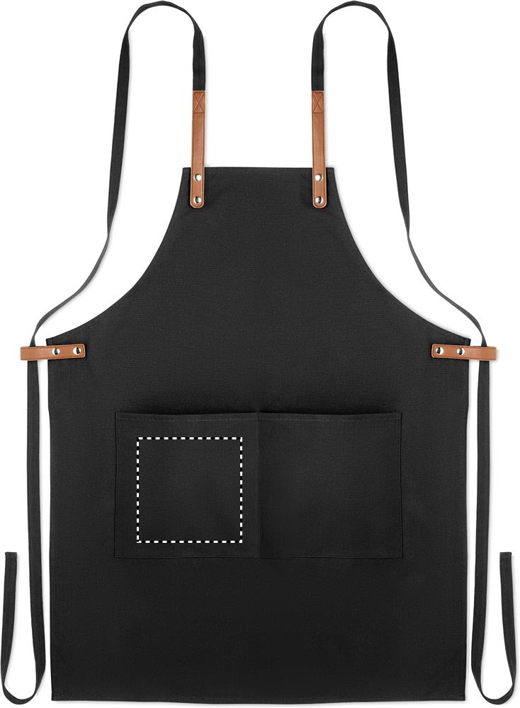
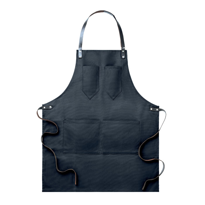
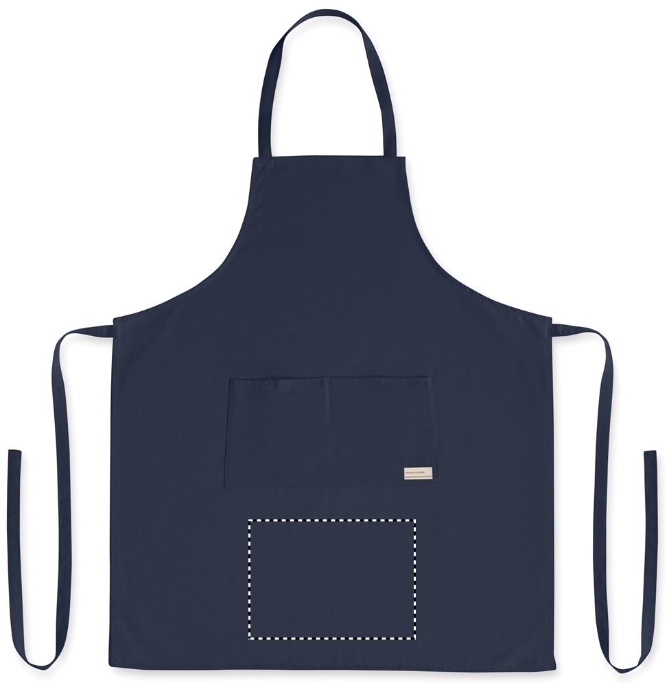
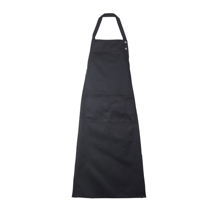
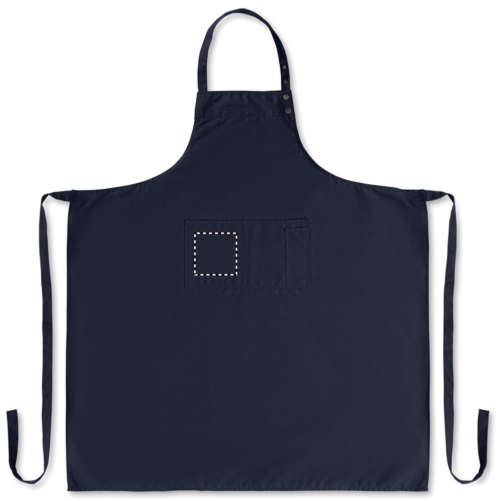
Dark aprons can be combined with light logos and lettering. Black, gray and navy suit restaurants, service and uniform company clothing, for example.
🔴 Bold colors
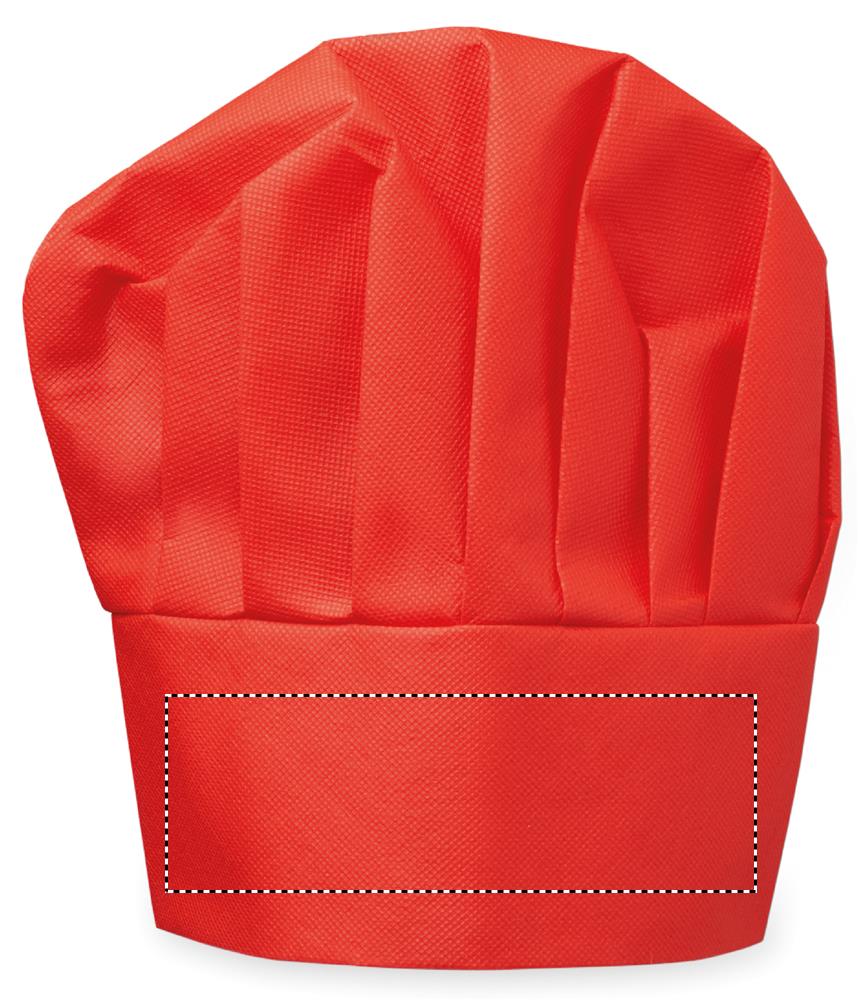
Red, blue and other intense shades can pick up existing company or club colors. When personalizing, the design should stand out clearly from the chosen base color.
🌾 Earth and natural tones
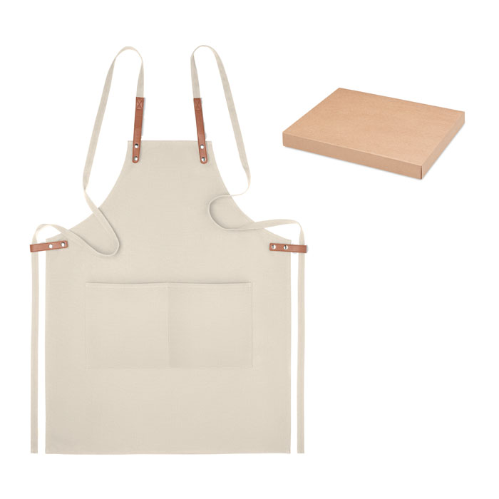
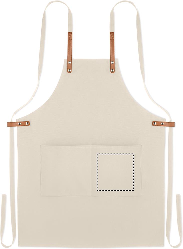
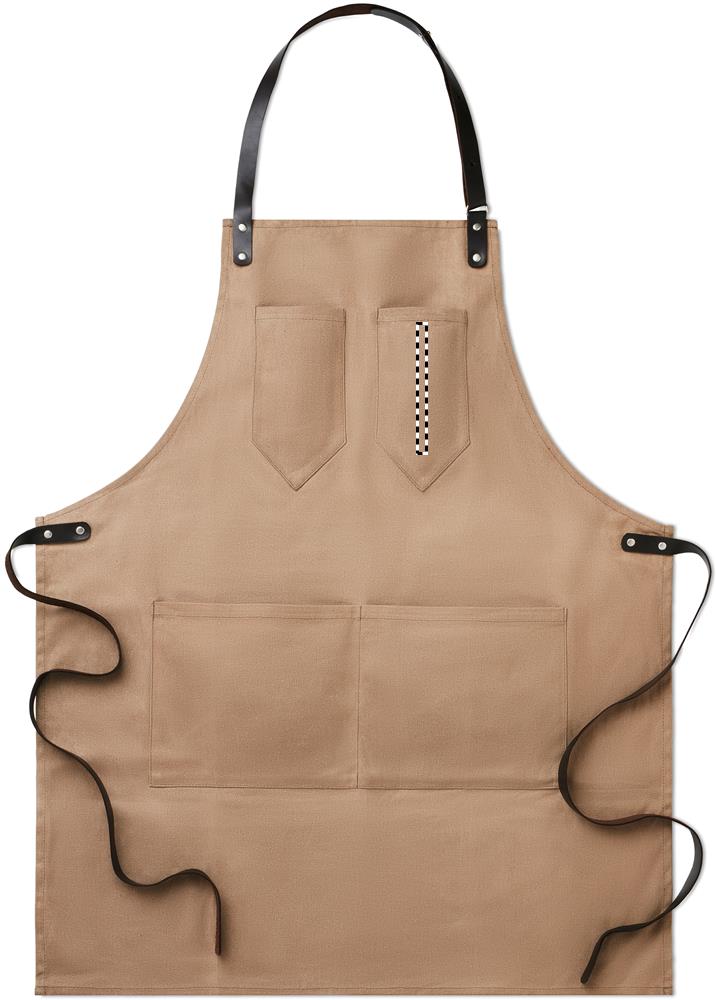
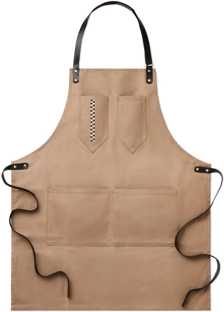
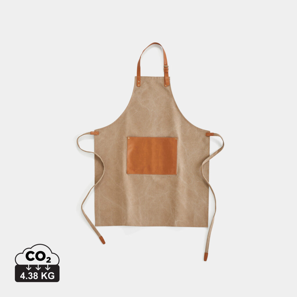
Beige, brown and other natural colors suit companies or projects whose existing design also works with muted and natural shades.
🌸 Pastel colors
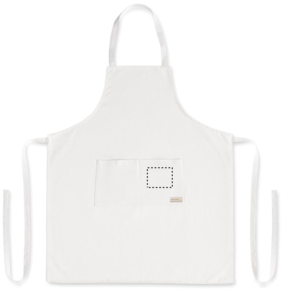
Light pastel tones can be chosen, for example, for cafés, bakeries, cooking classes or events. Darker logos and lettering form a clearly recognizable contrast on light aprons.
🌟 More colors
Depending on the chosen apron model, different colors are available. If you need a specific company, club or design color, we check the available options for you.
Our tip: On dark aprons, light designs are usually easier to see; on light fabrics, darker ones accordingly. If you want to personalize your apron, we match the base color and decoration to your logo or design.
👉 Send us your logo or your preferred colors and we will advise you on the right combination.