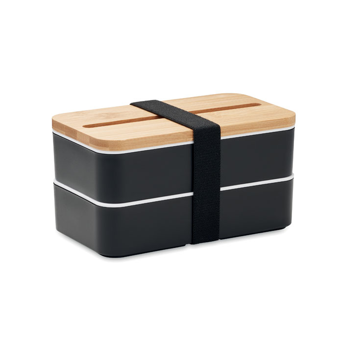
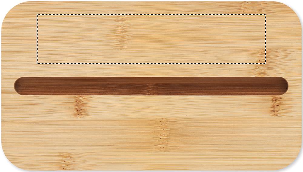
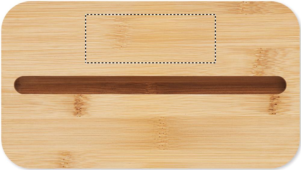
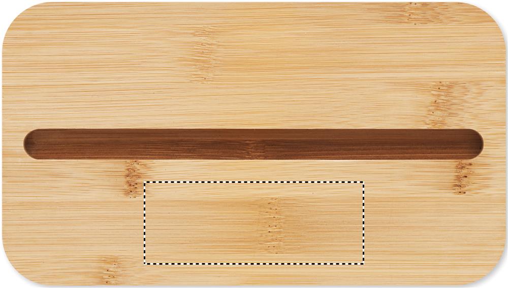
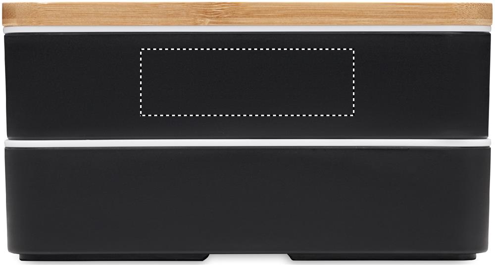
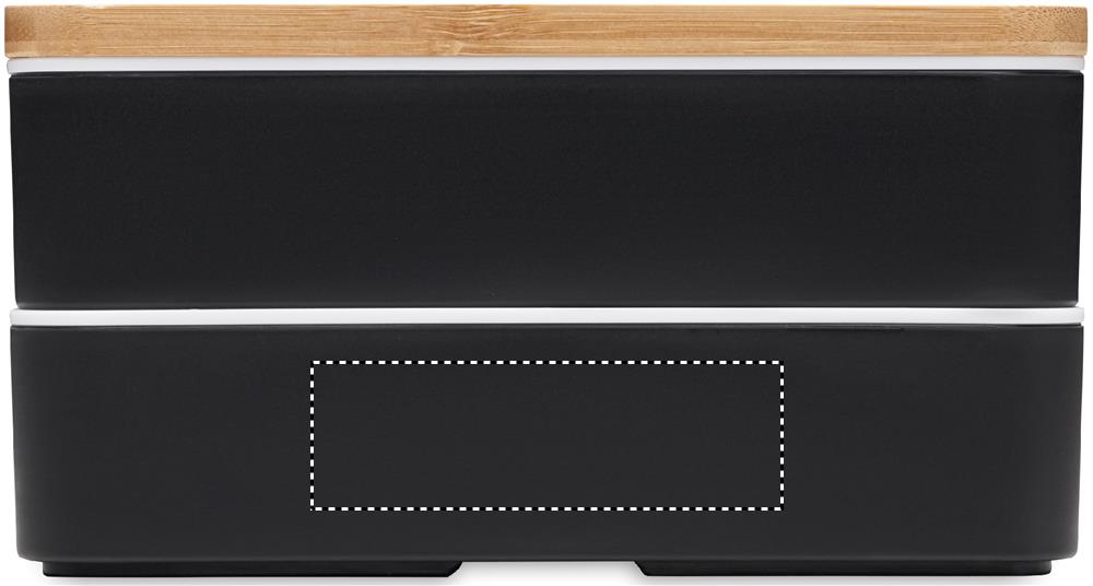
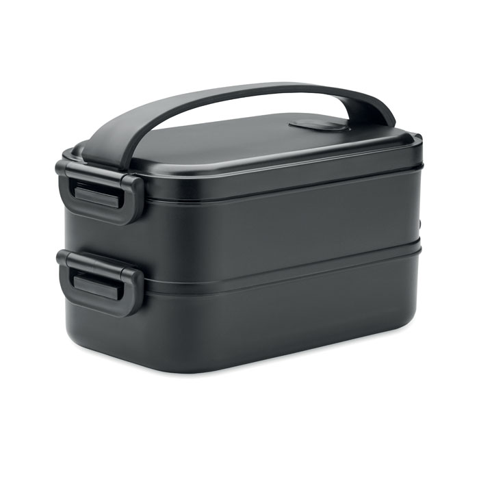
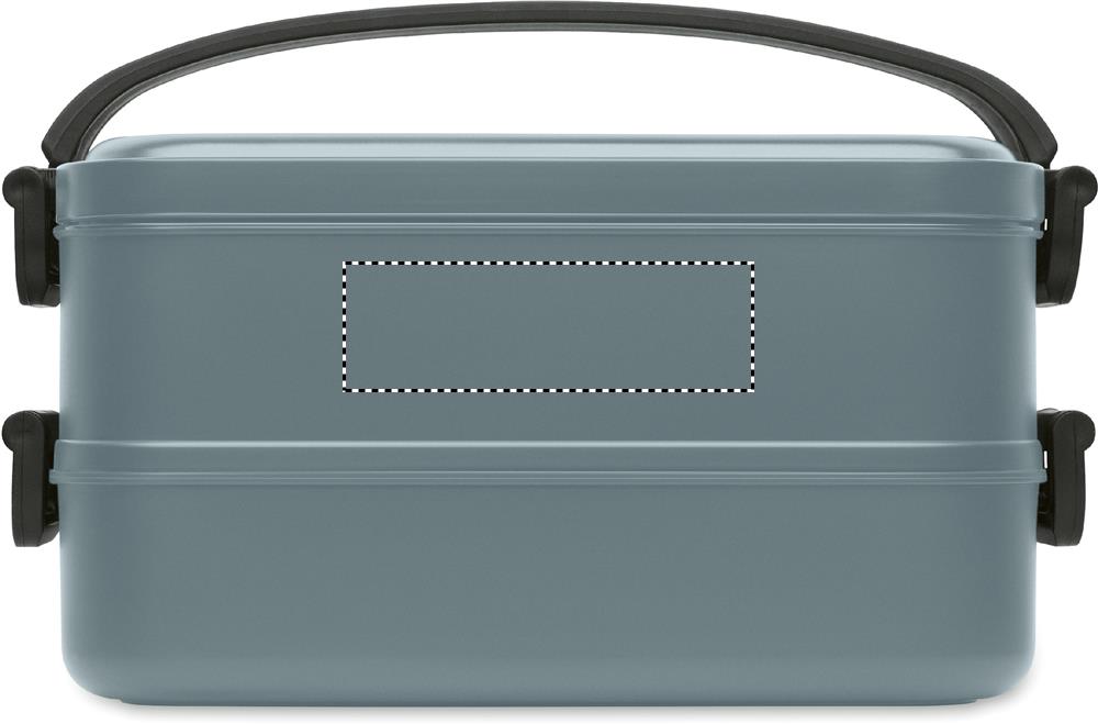
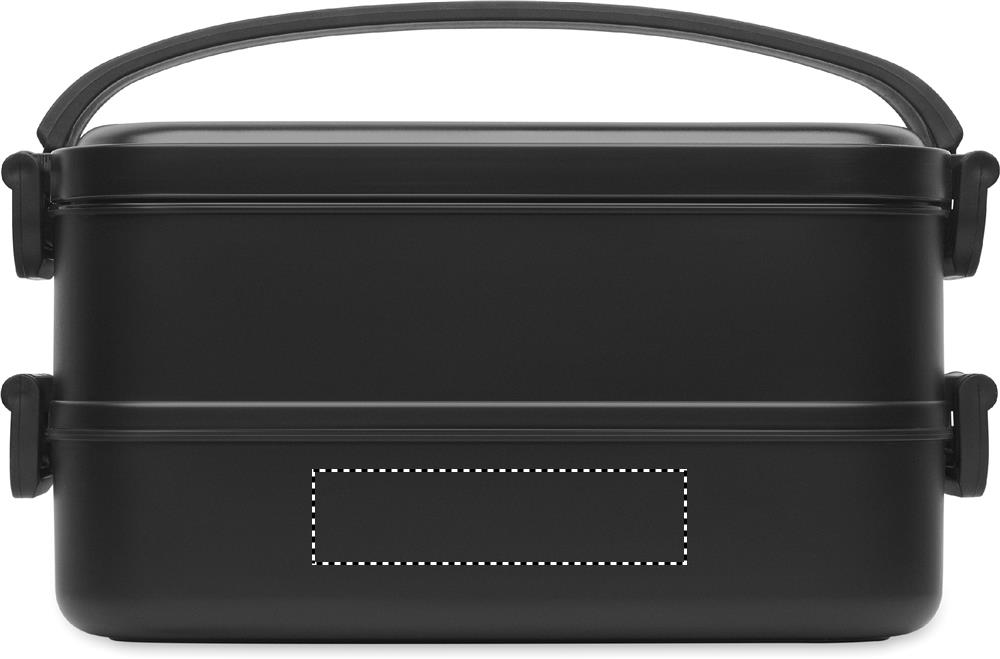
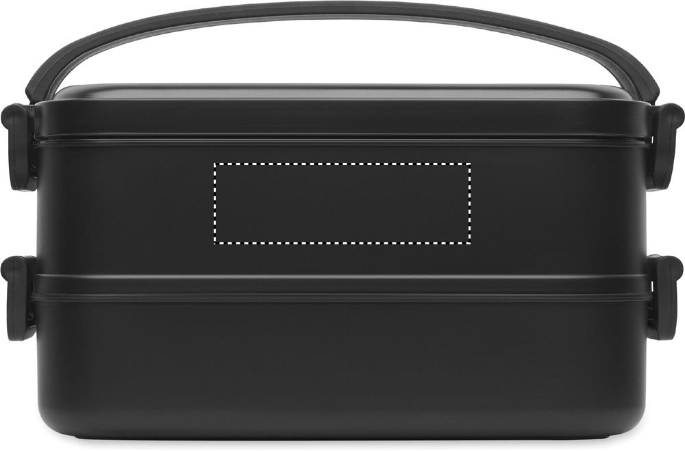
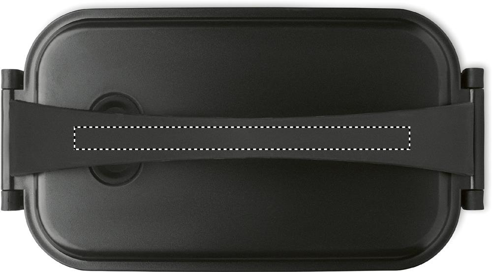
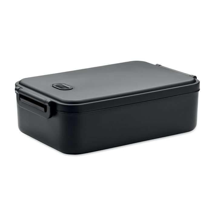
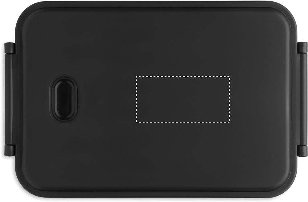
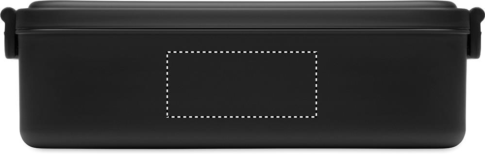
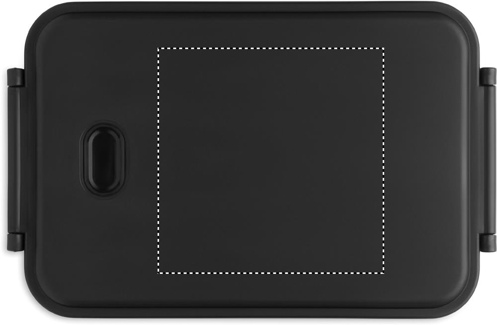
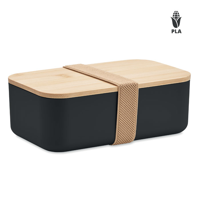
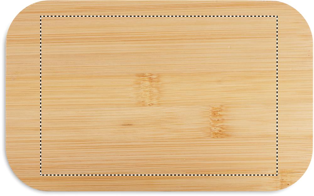
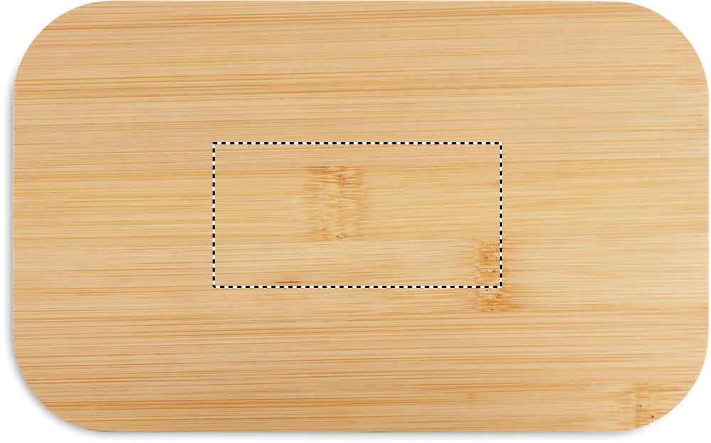
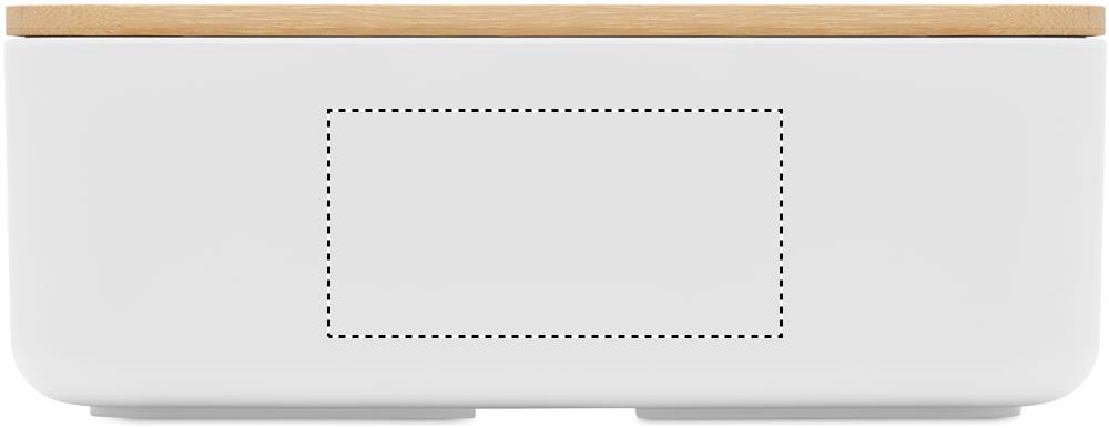
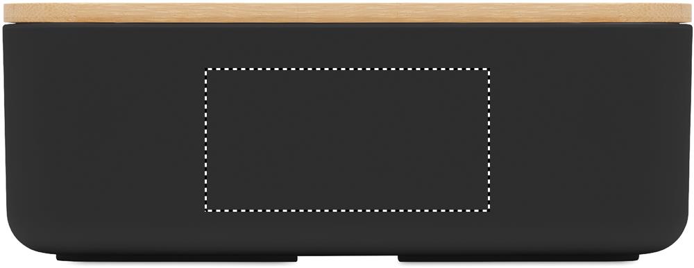
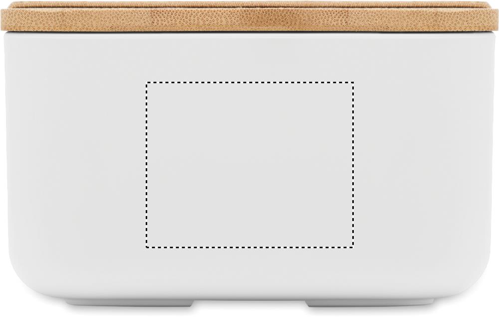
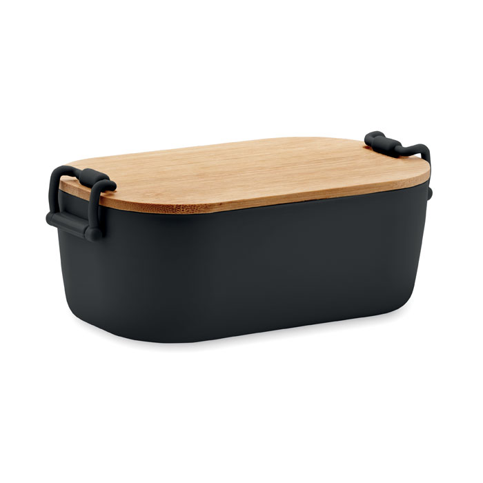
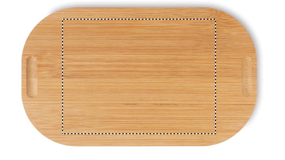
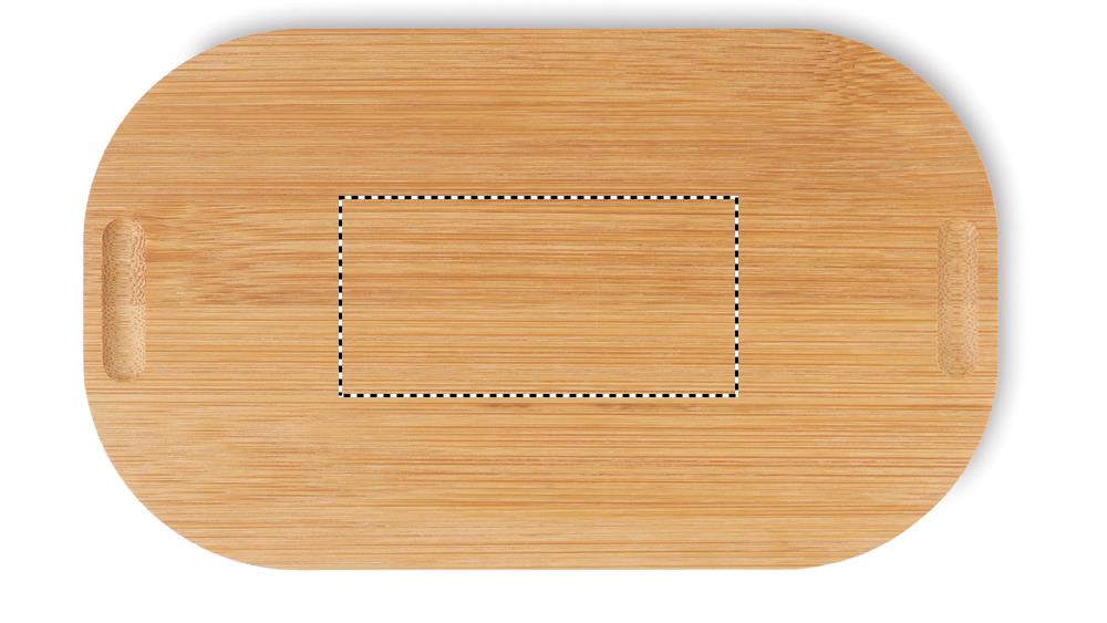
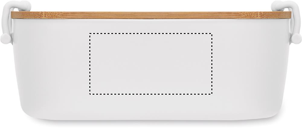
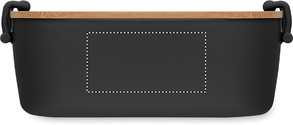
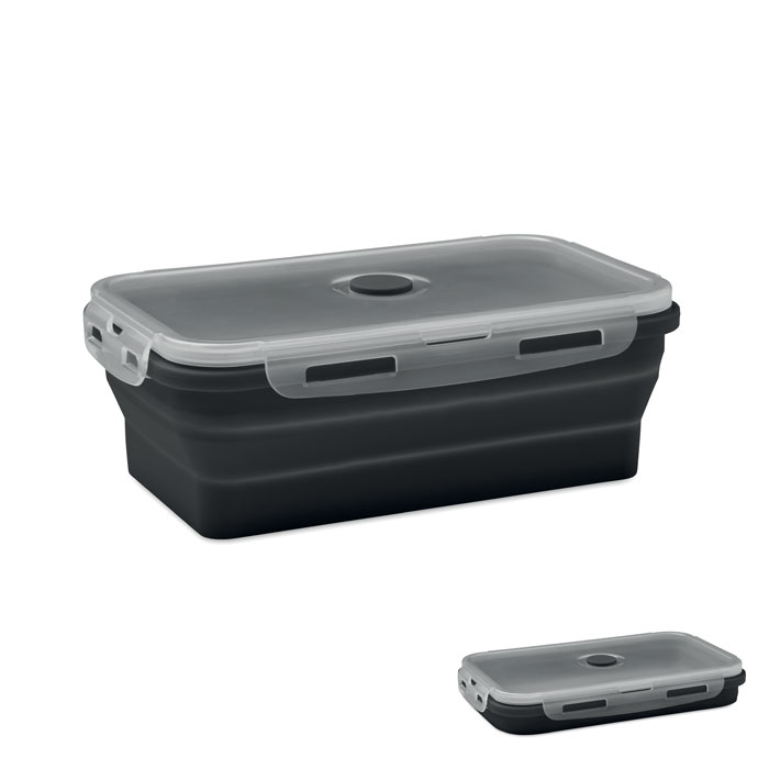
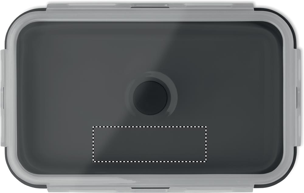
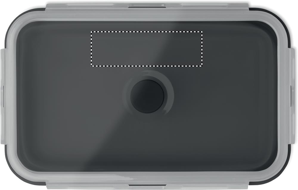
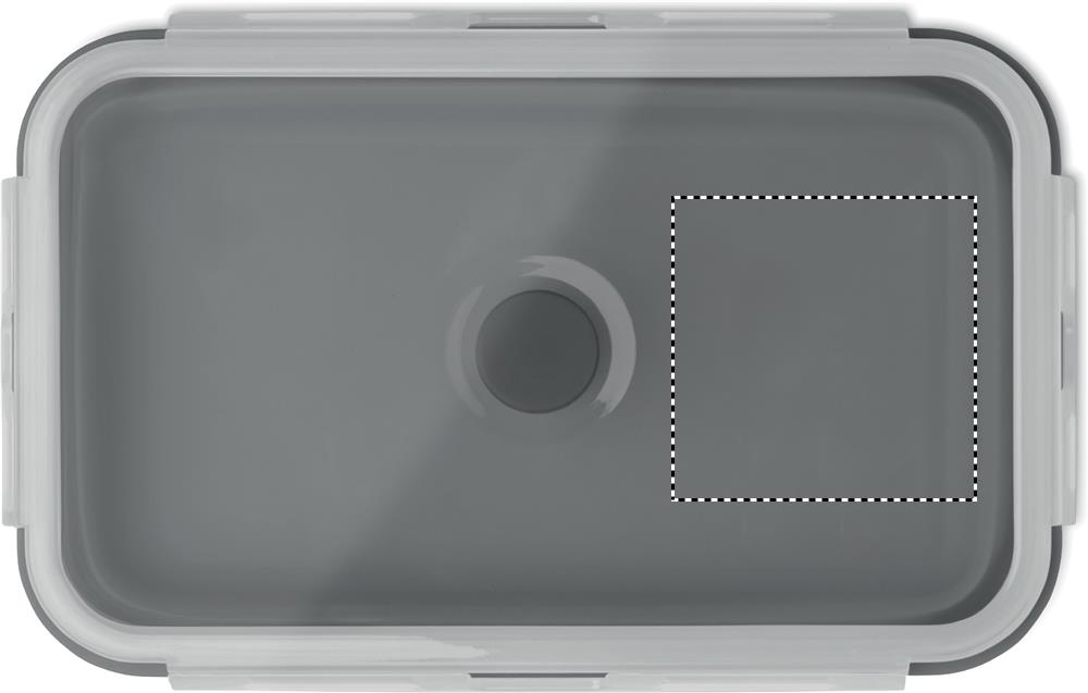
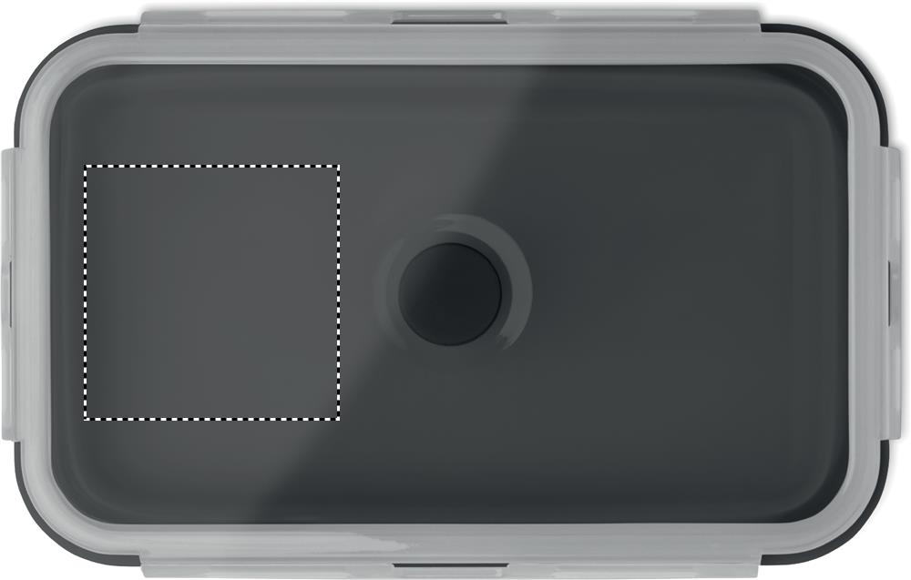
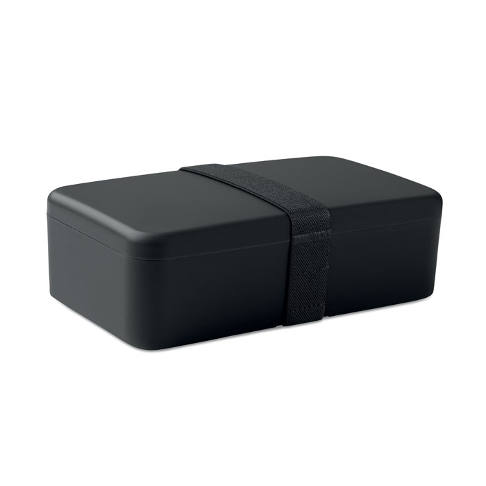
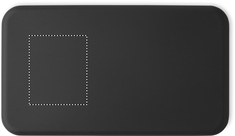
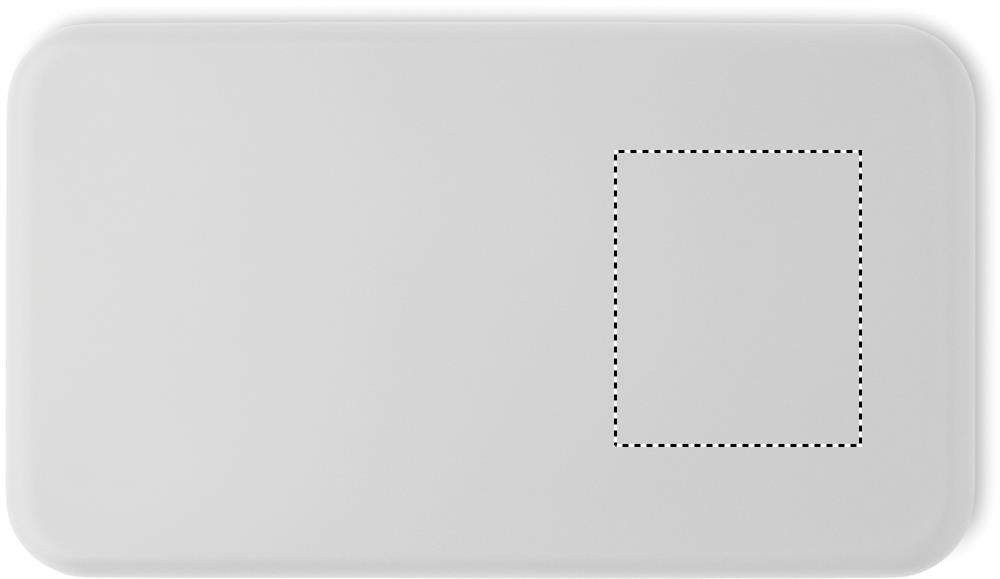
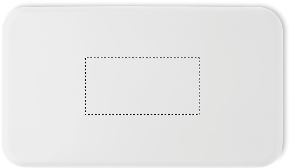
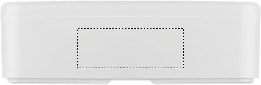
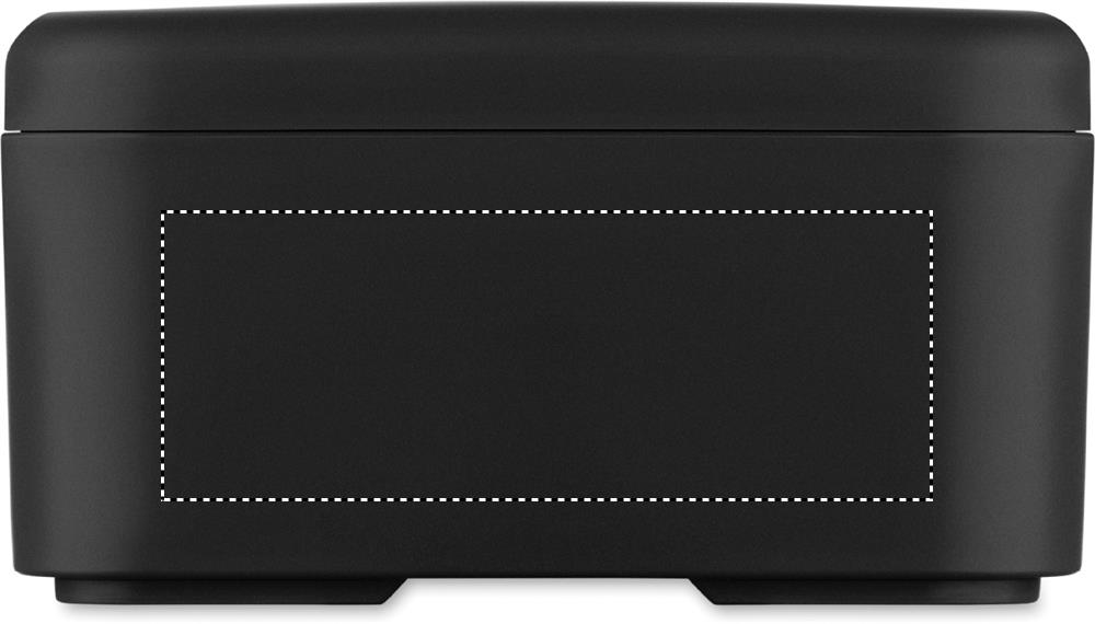
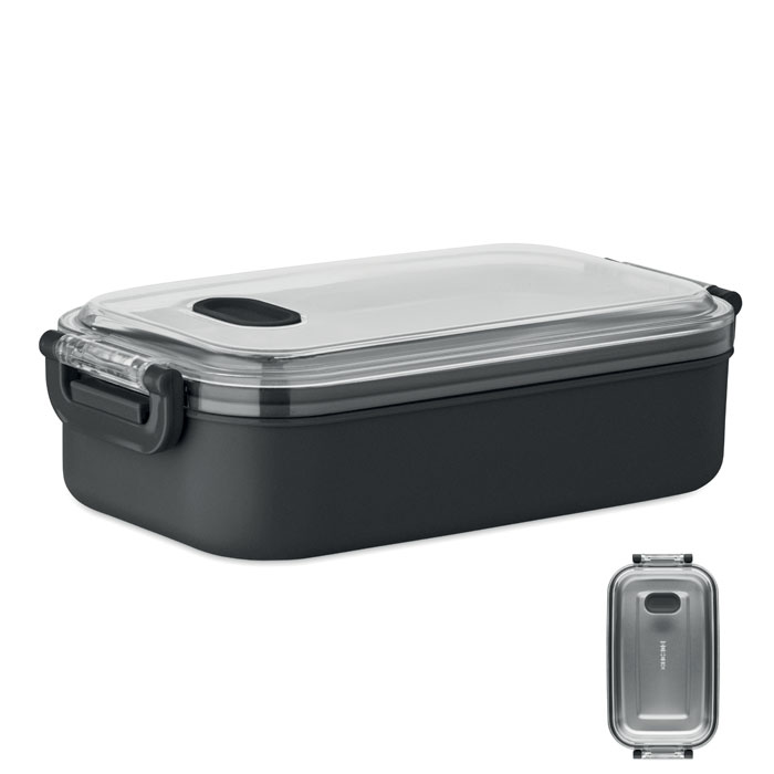
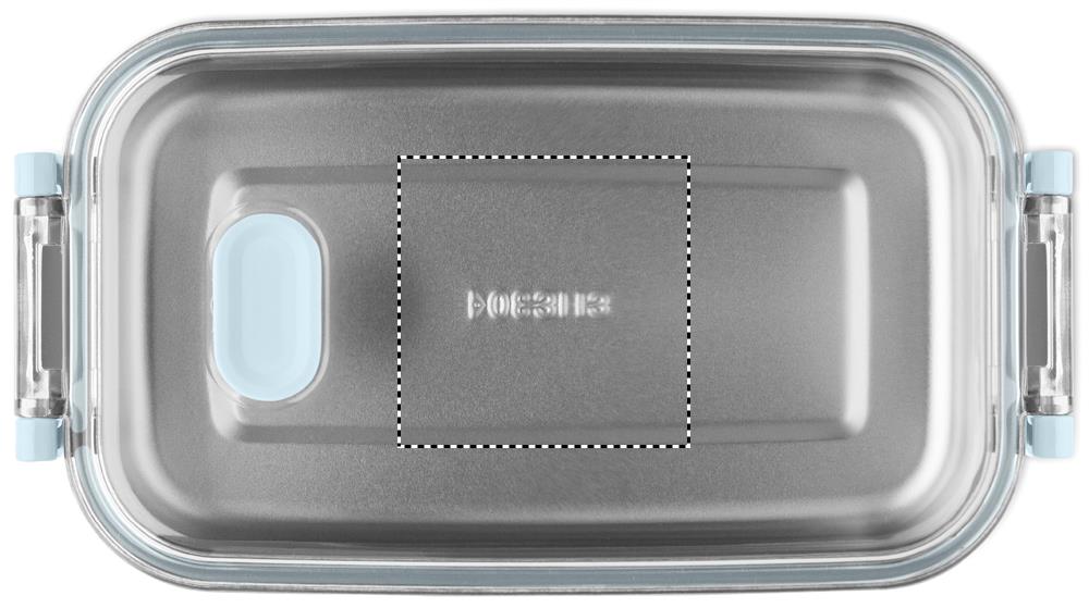
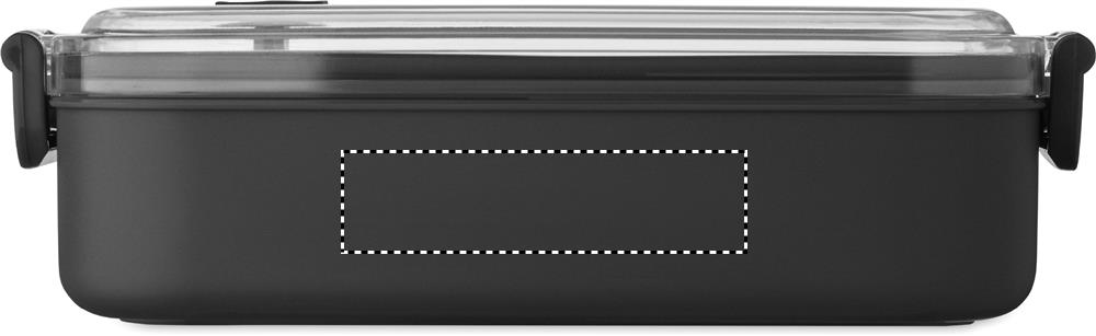
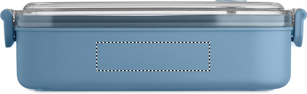
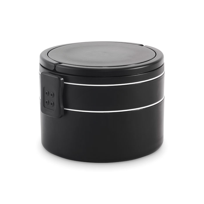
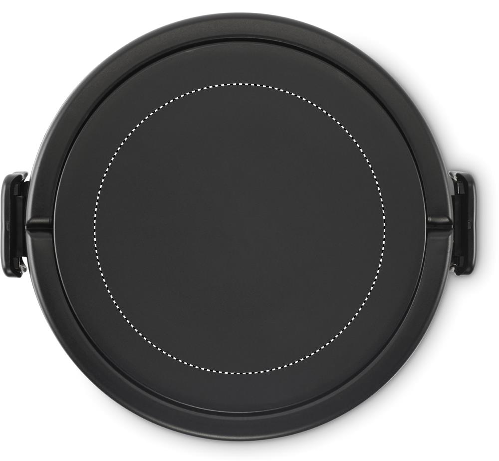
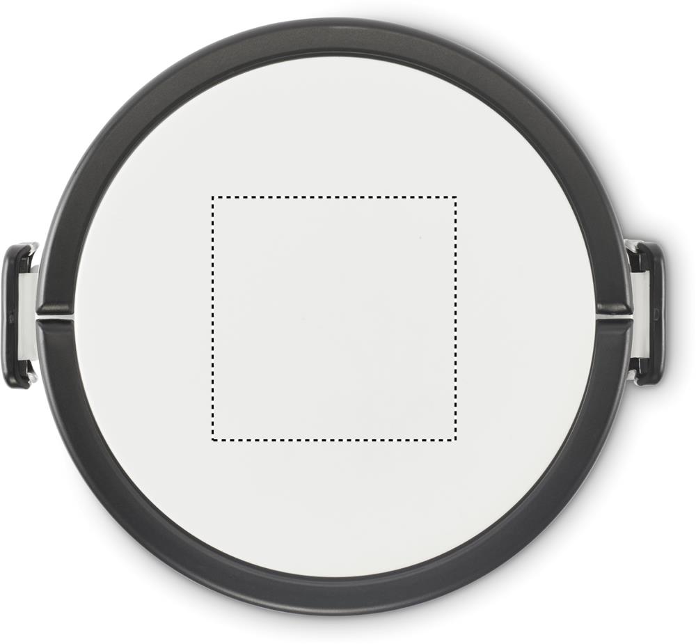
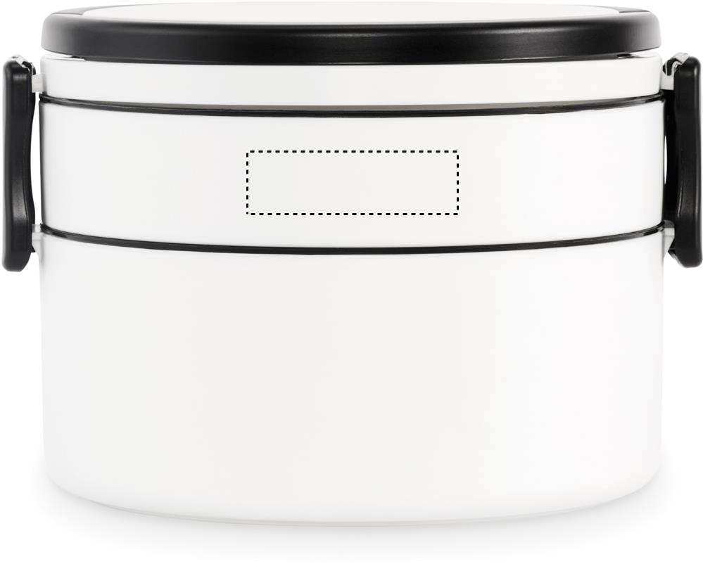
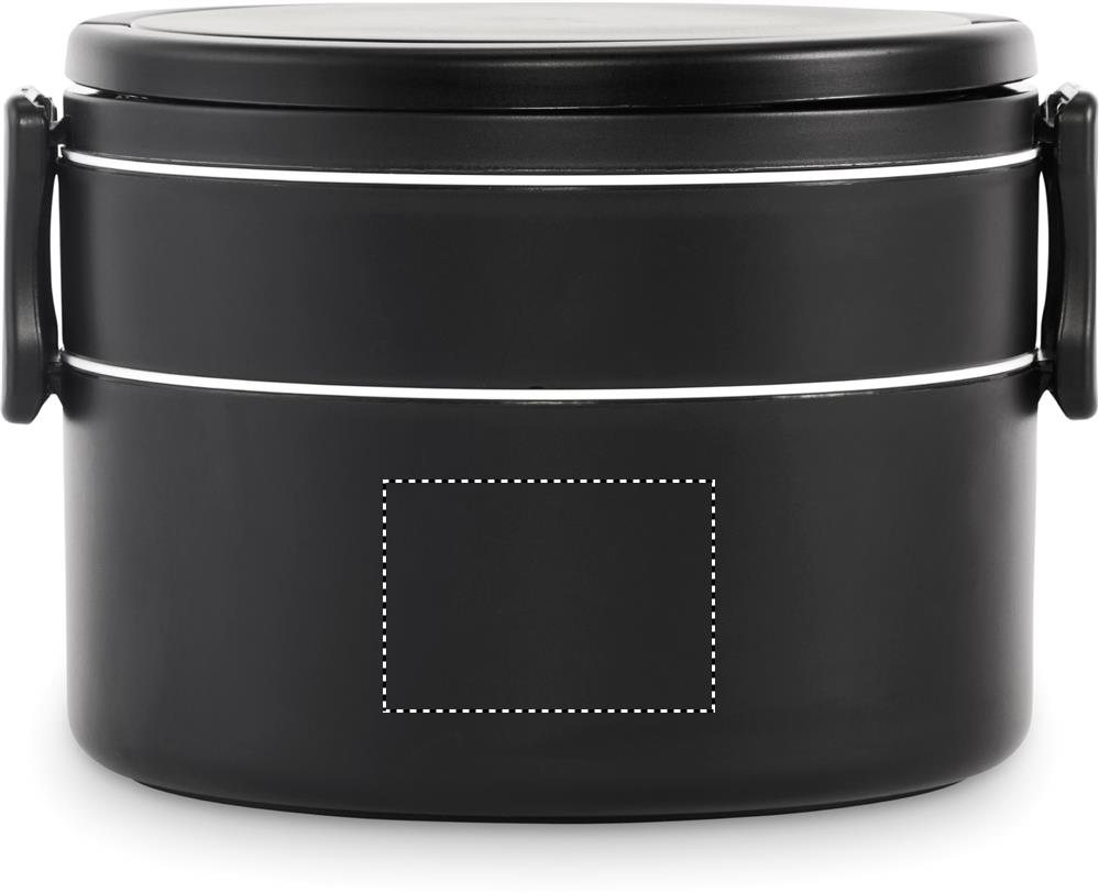
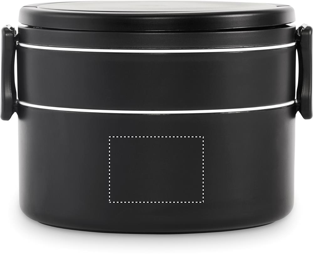
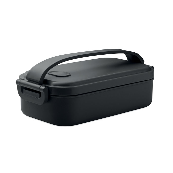
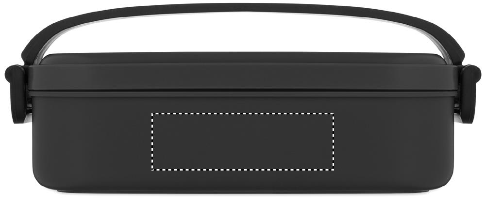
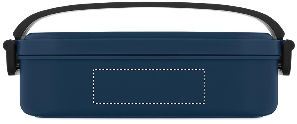
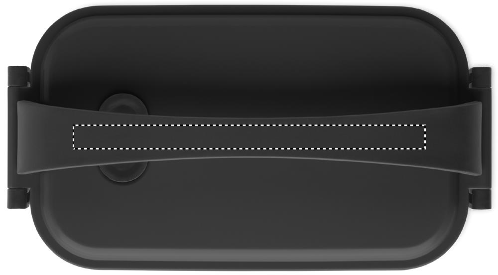
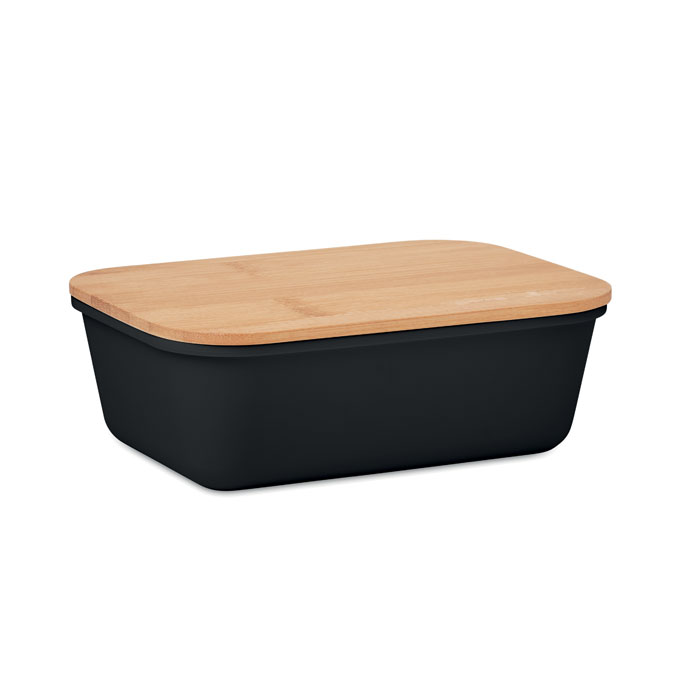
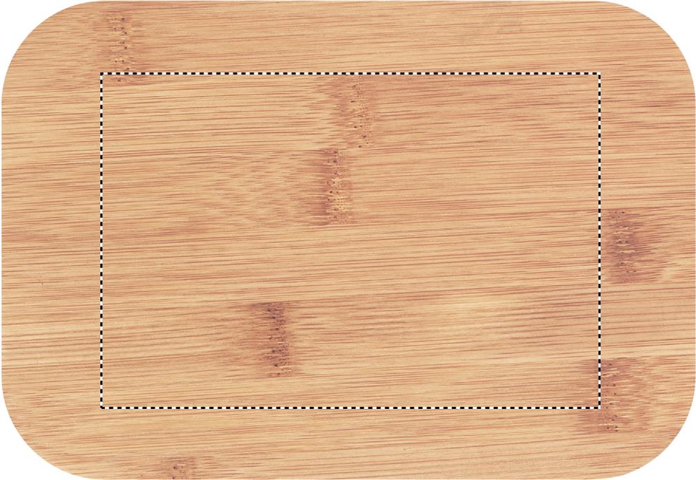
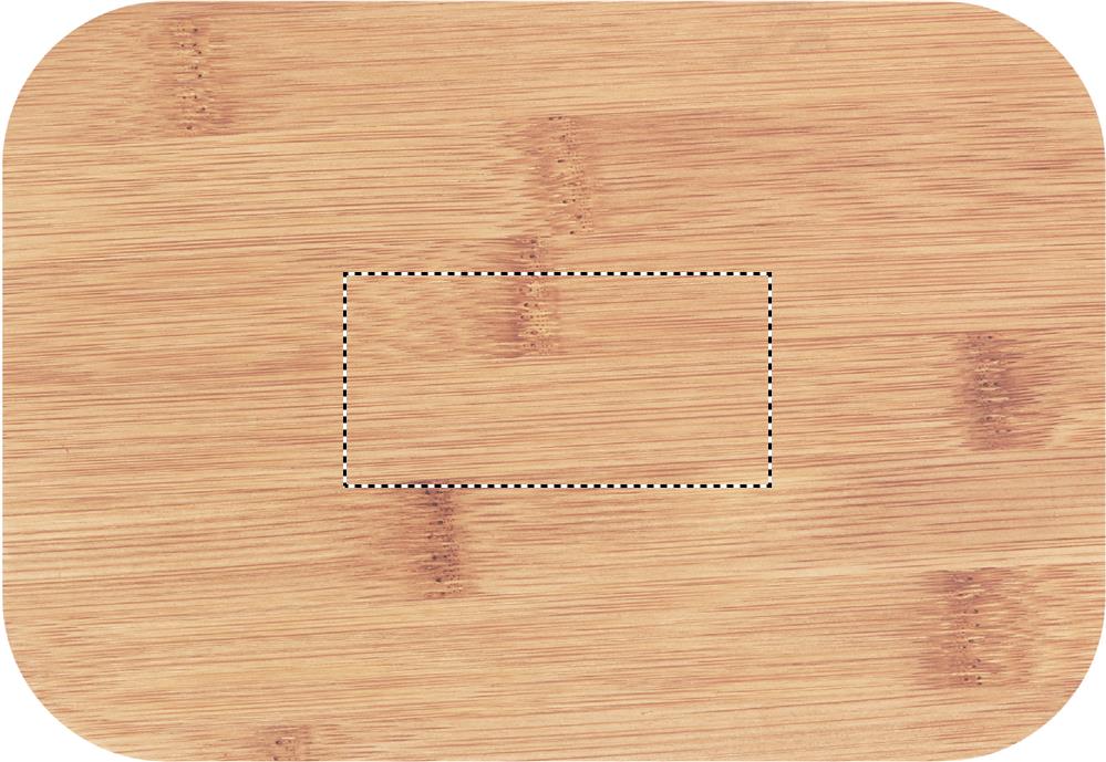
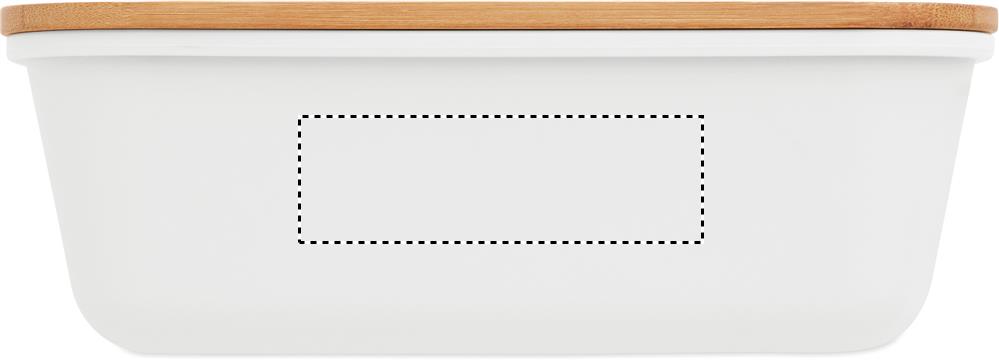
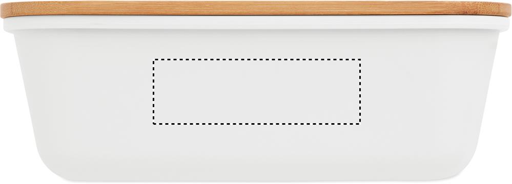
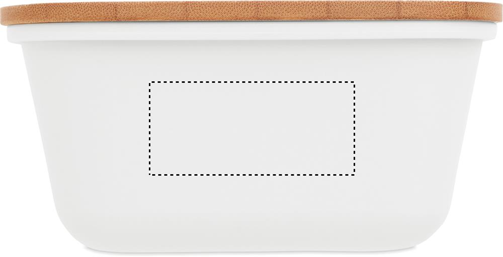
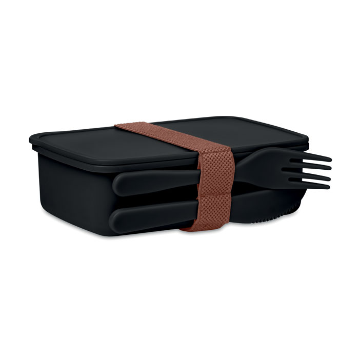
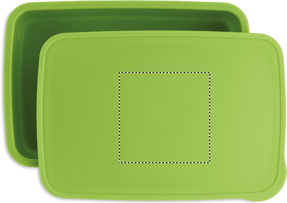
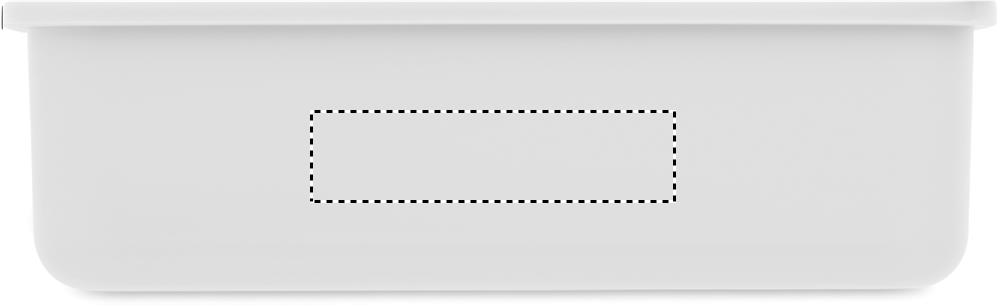
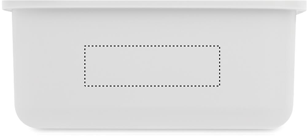
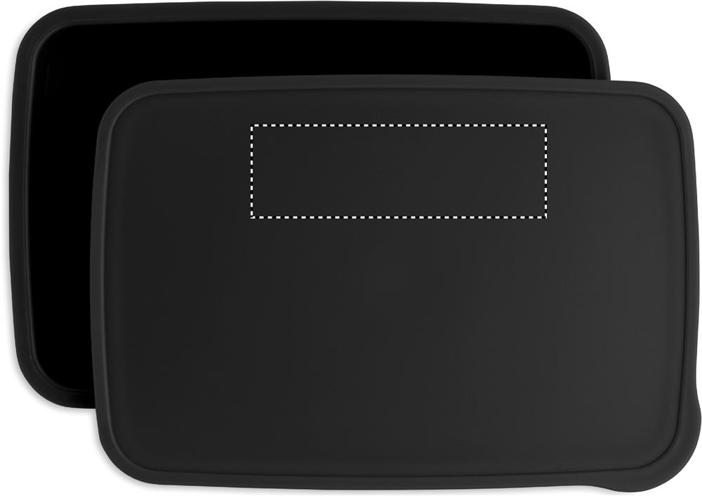
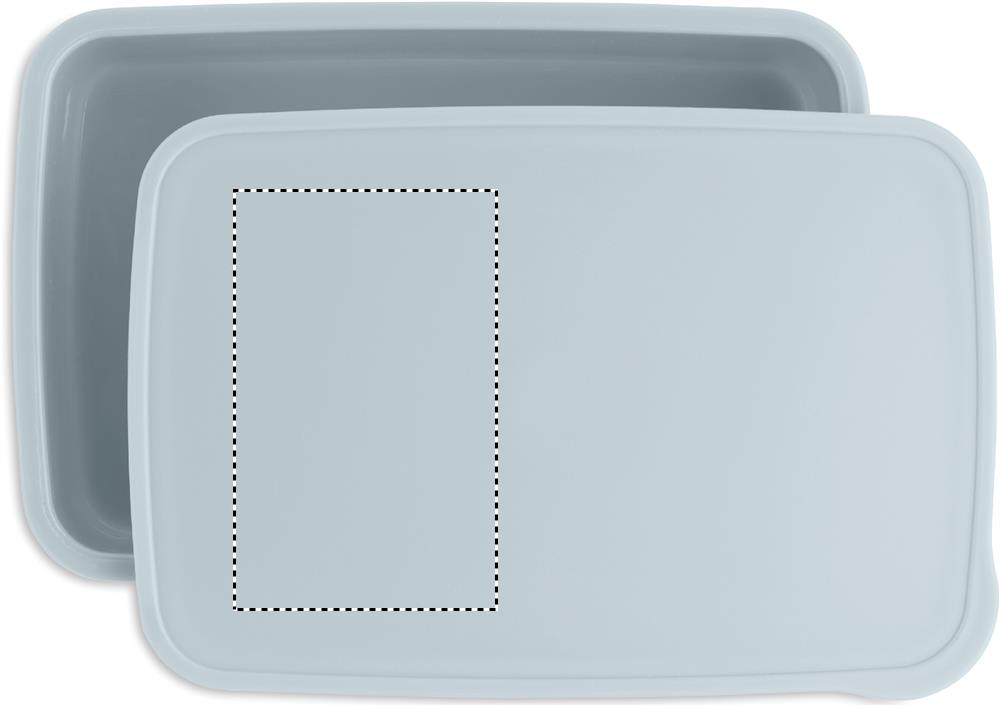
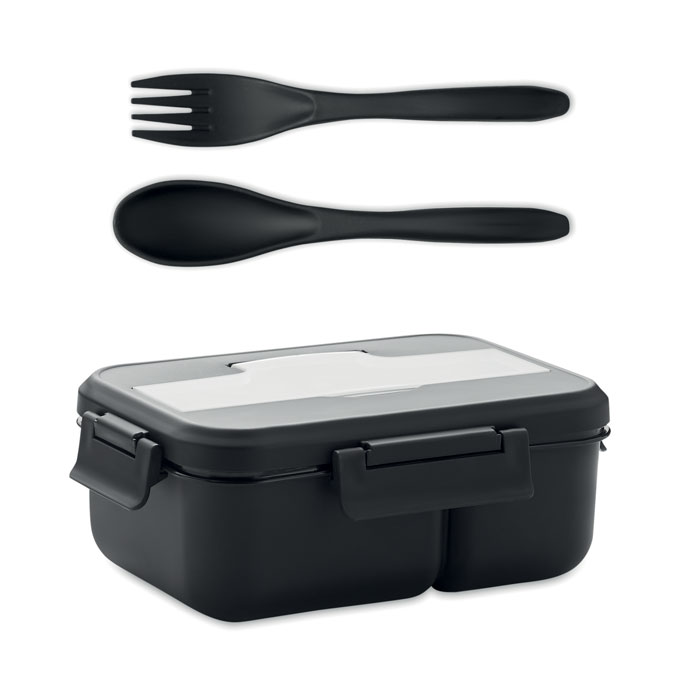
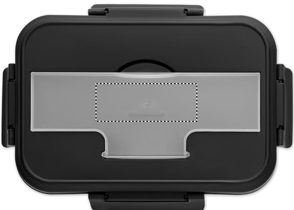
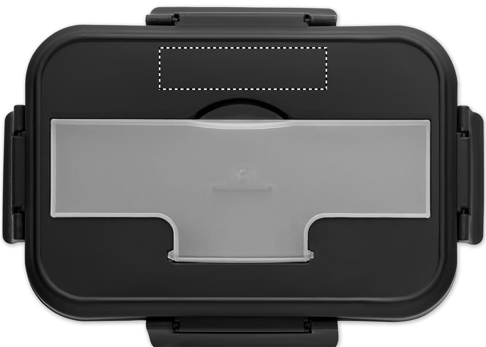
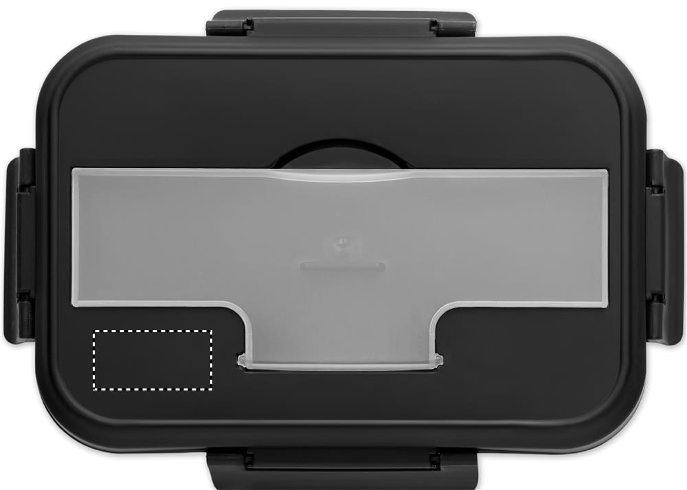
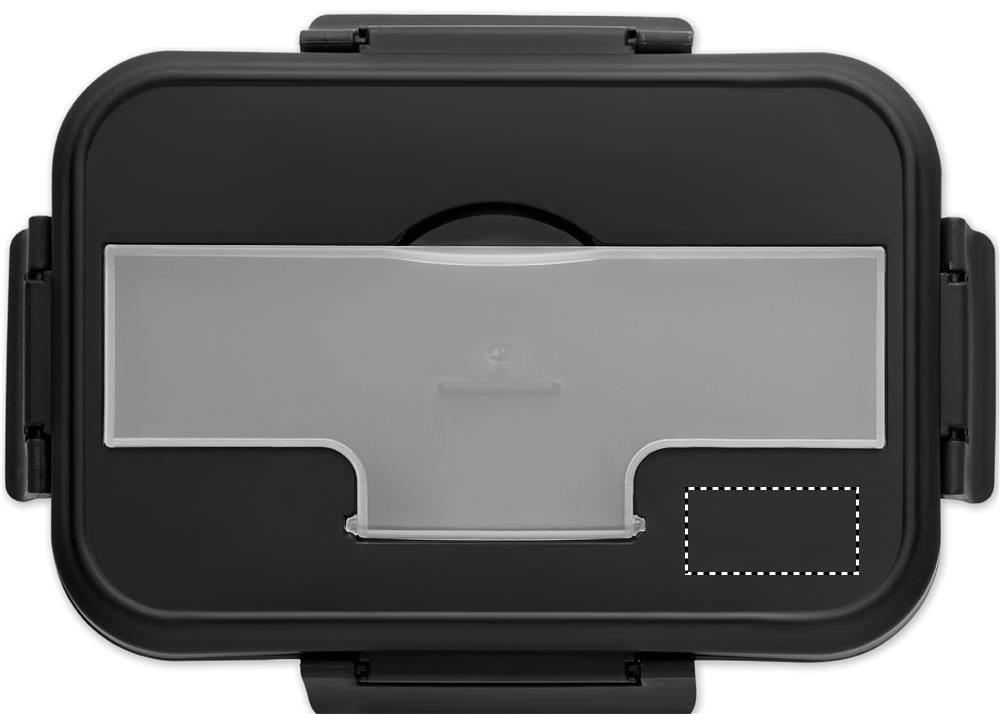
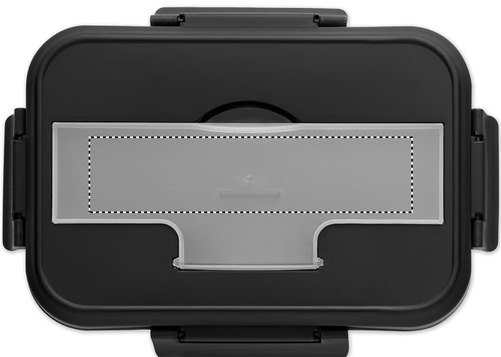
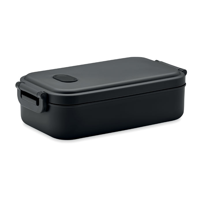
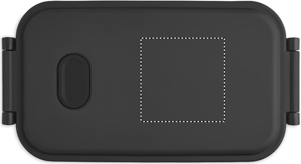
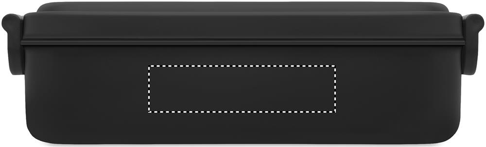
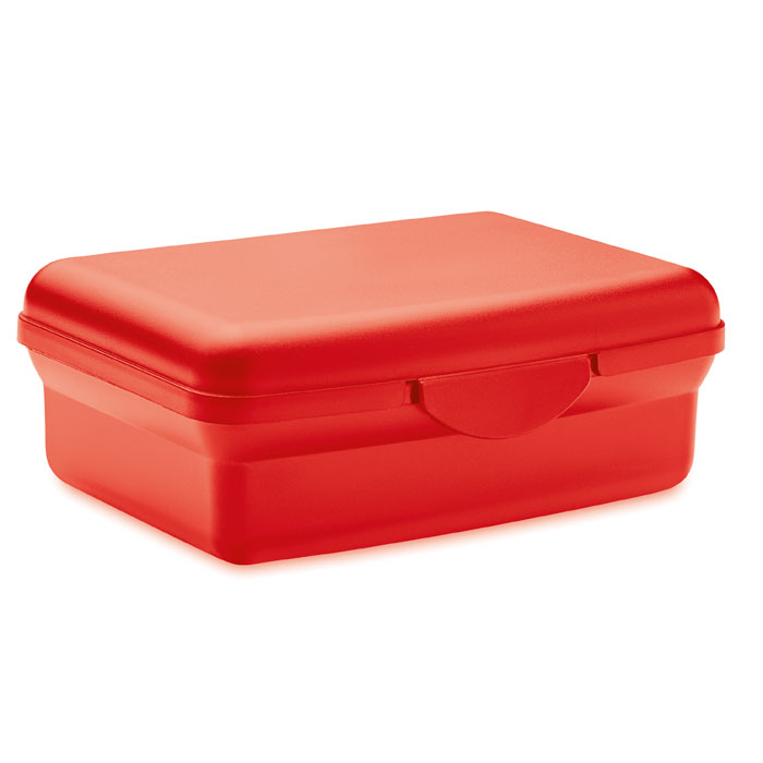
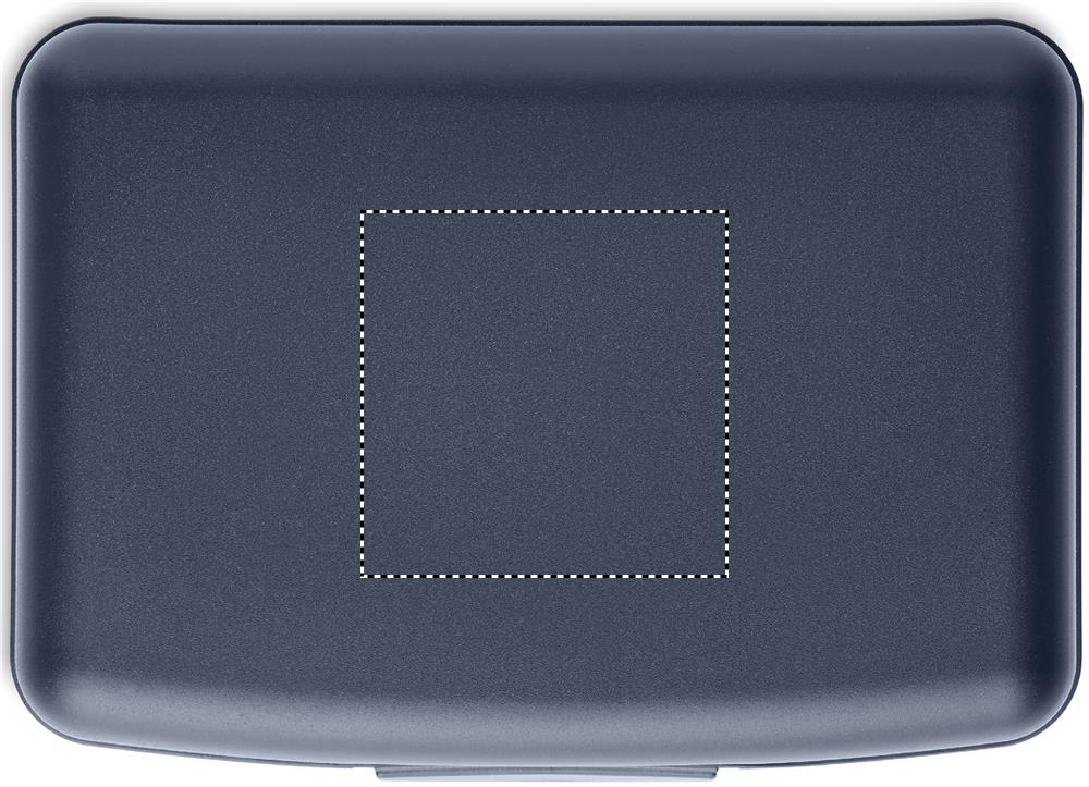
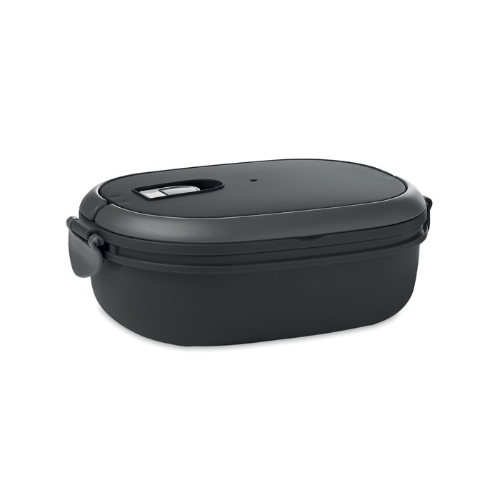
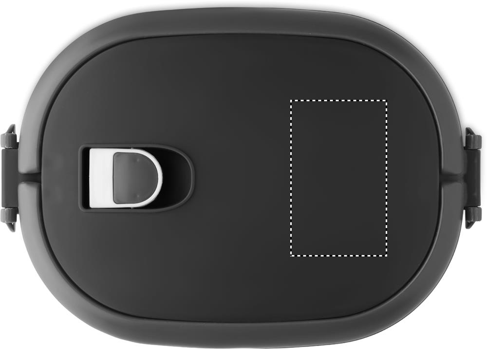
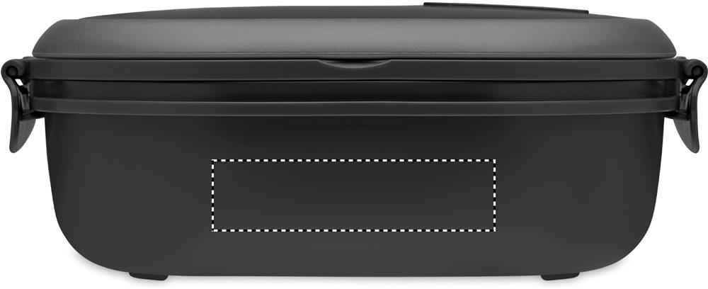
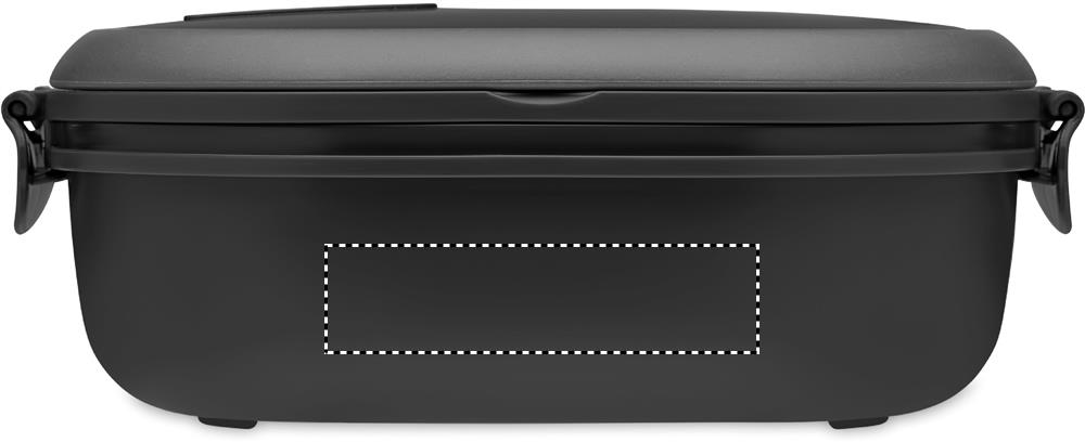
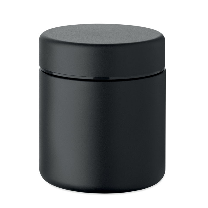
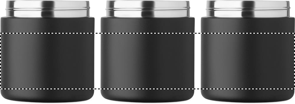
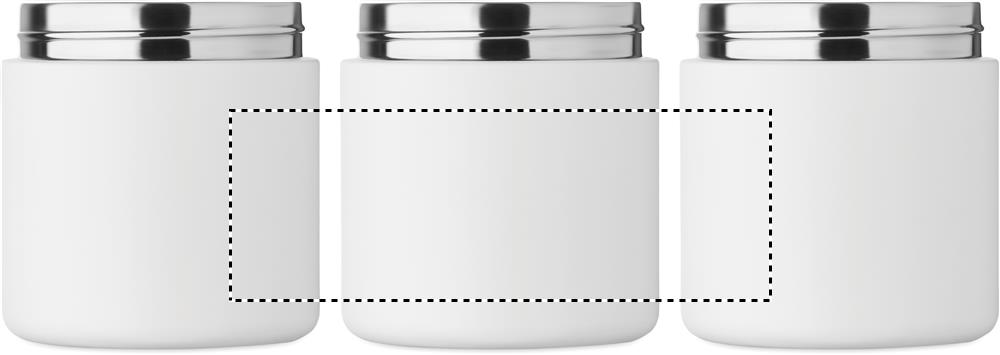
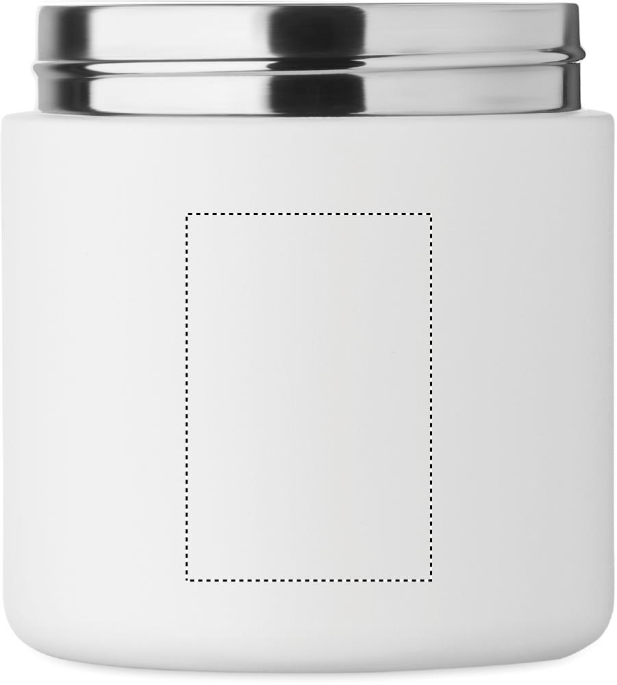
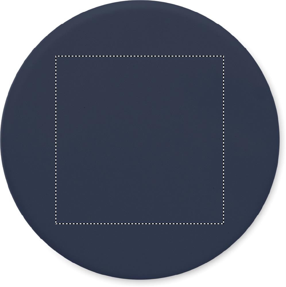
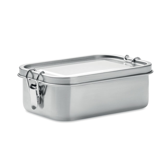
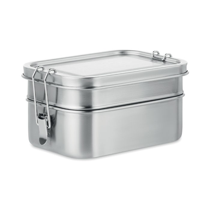
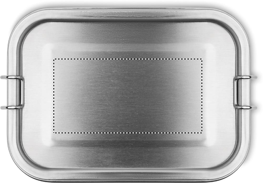
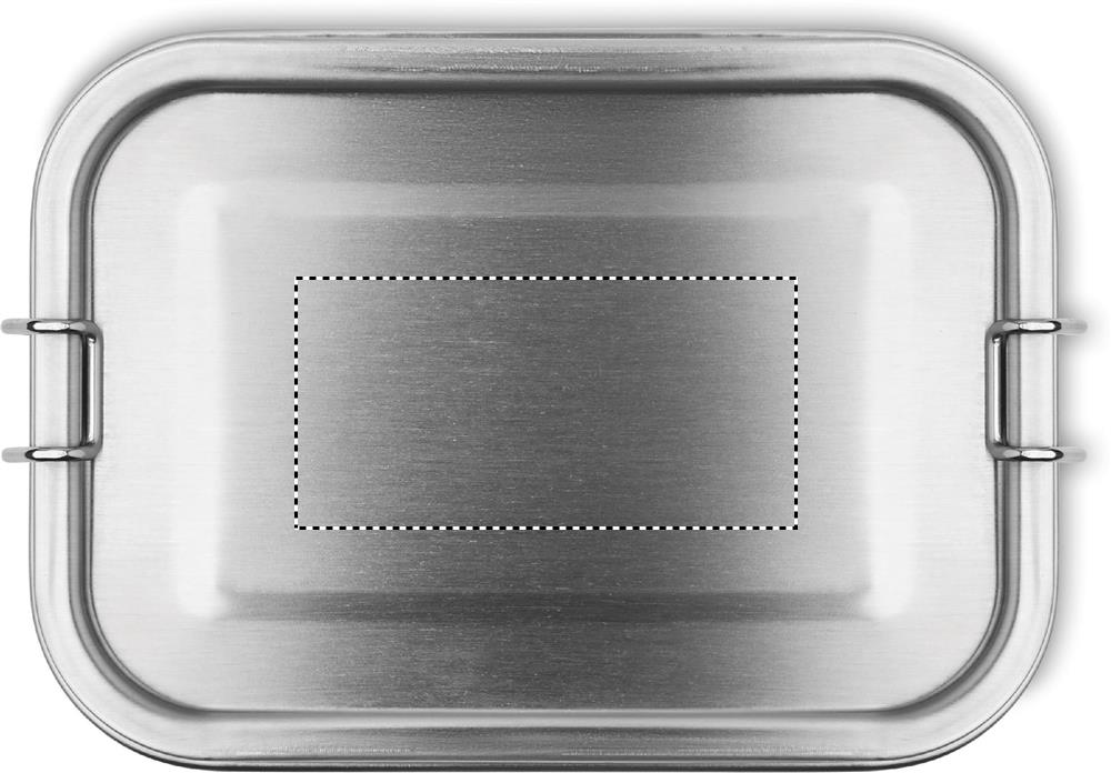
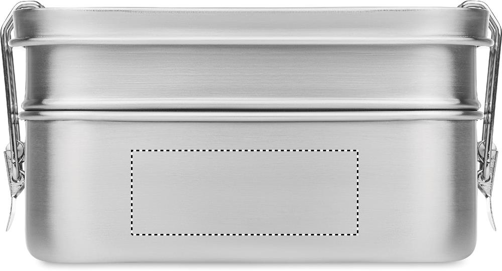
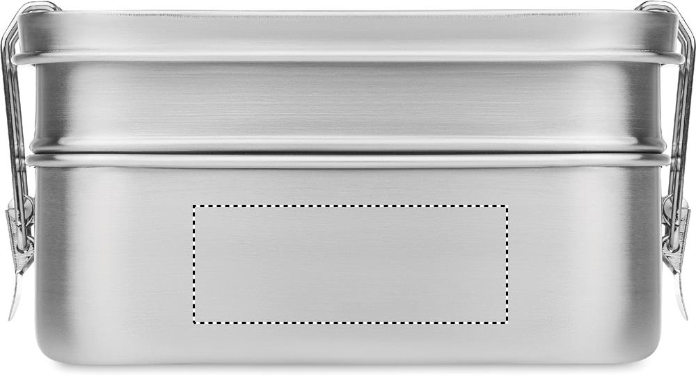
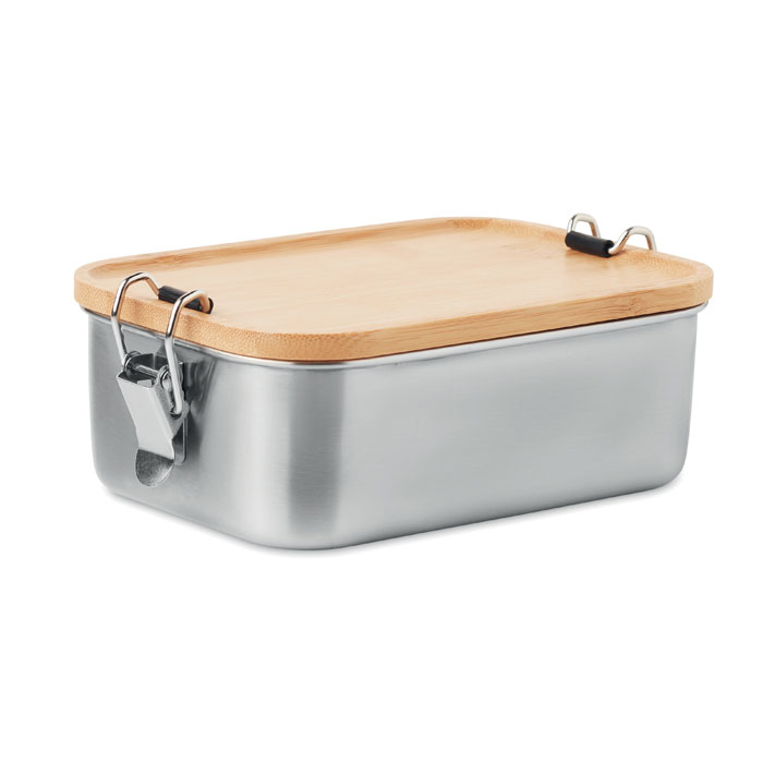
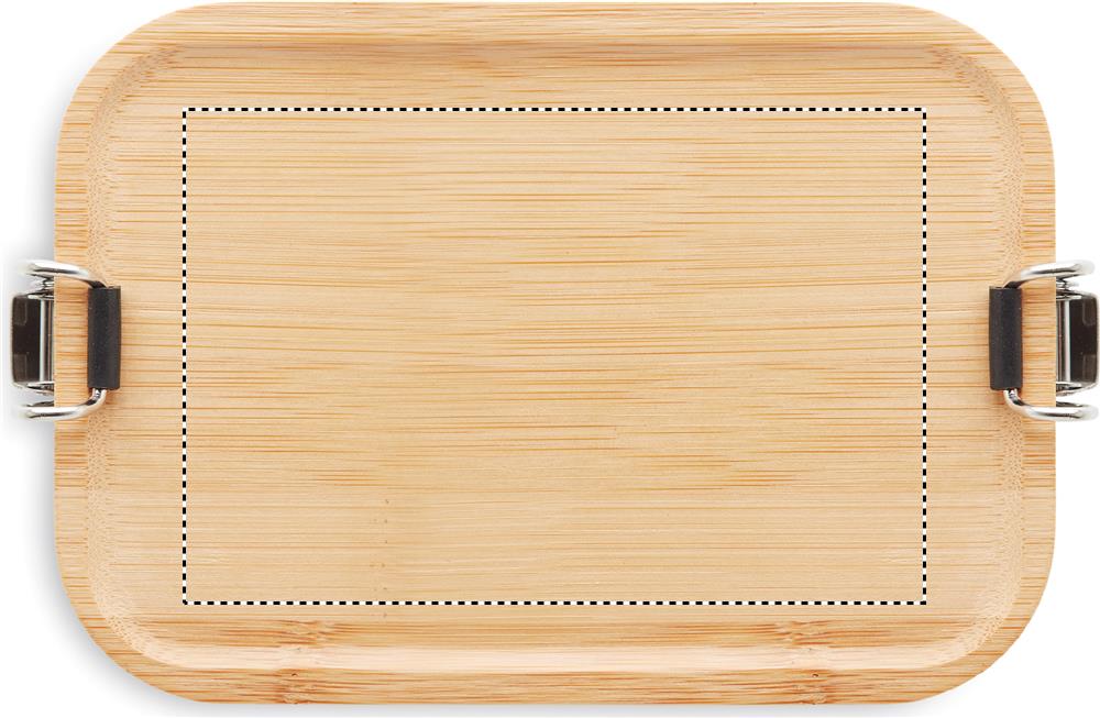
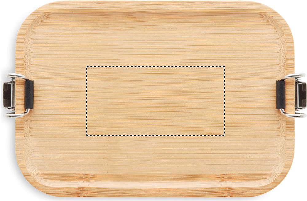
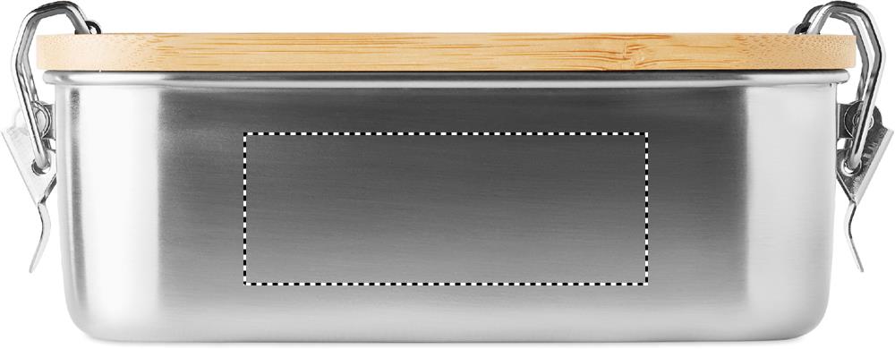
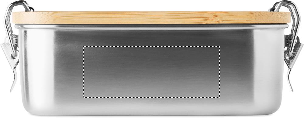
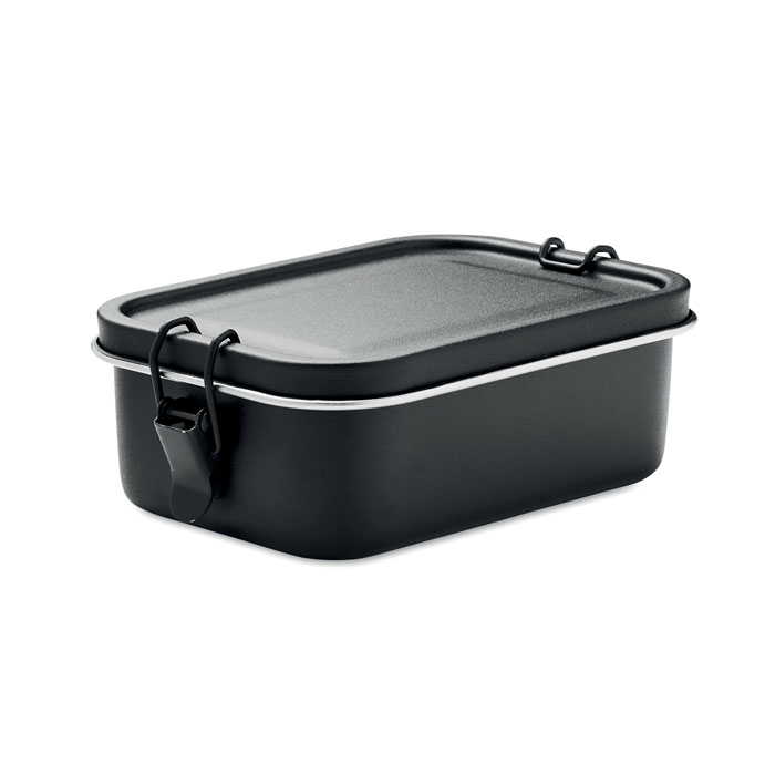
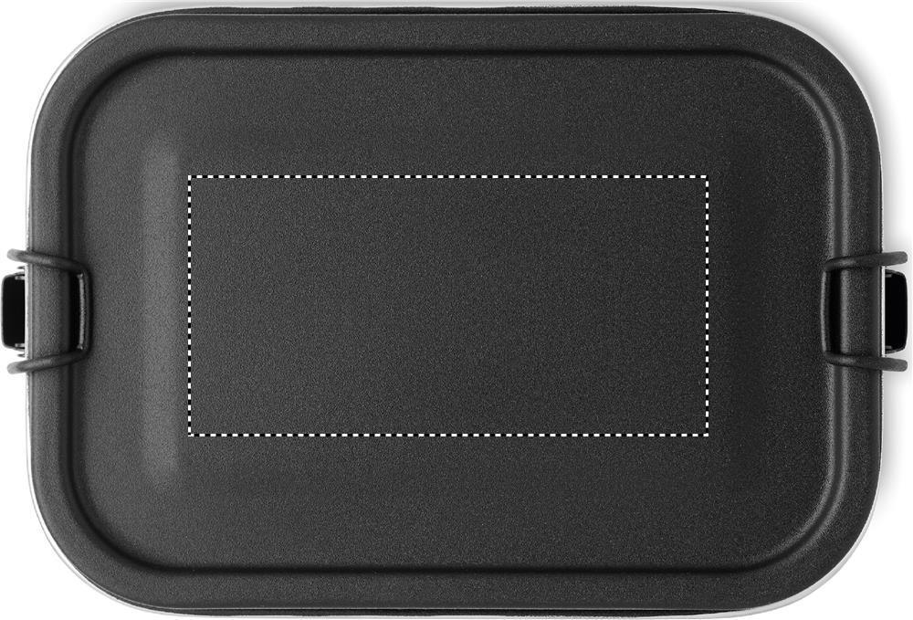
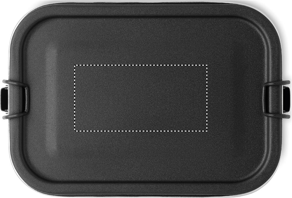
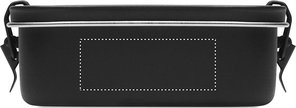
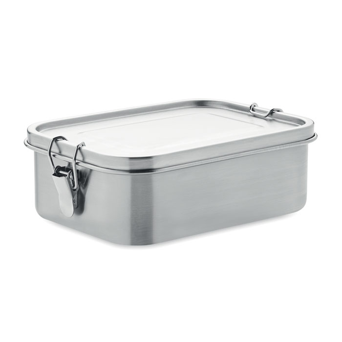
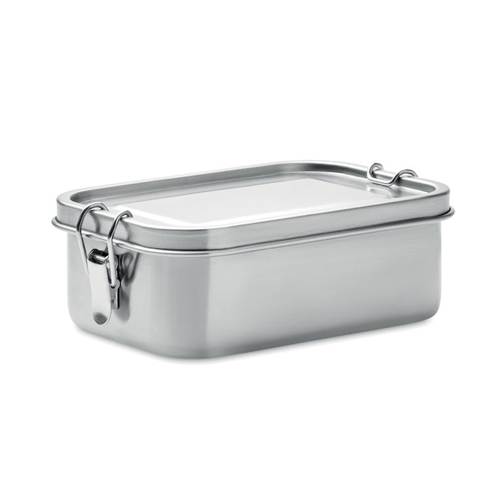
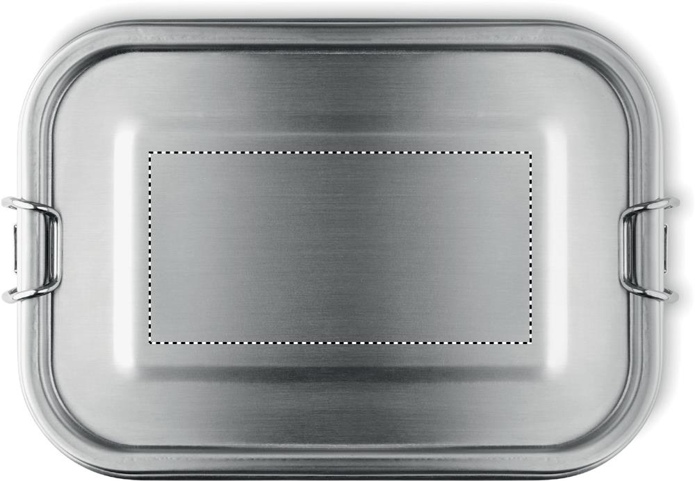
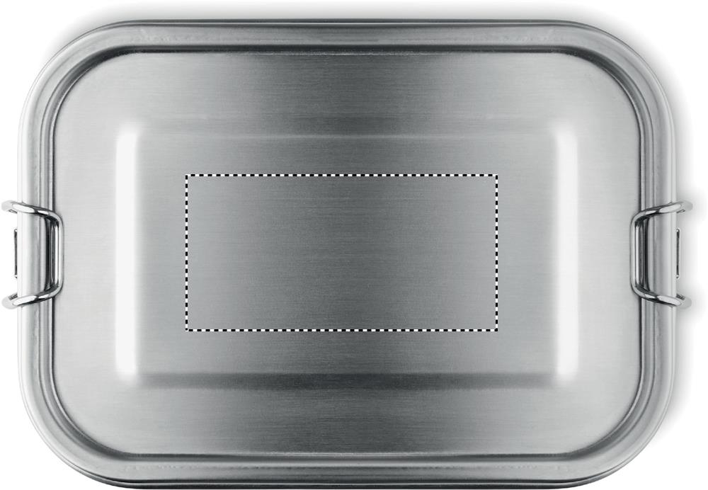
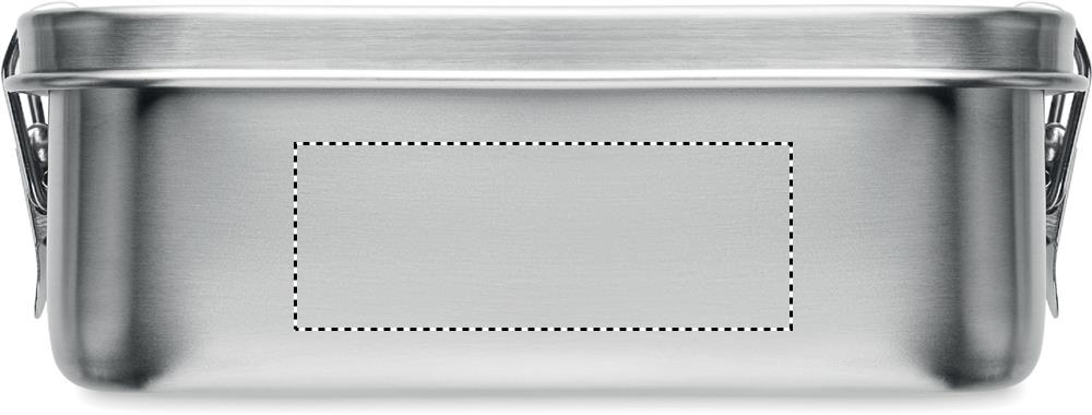
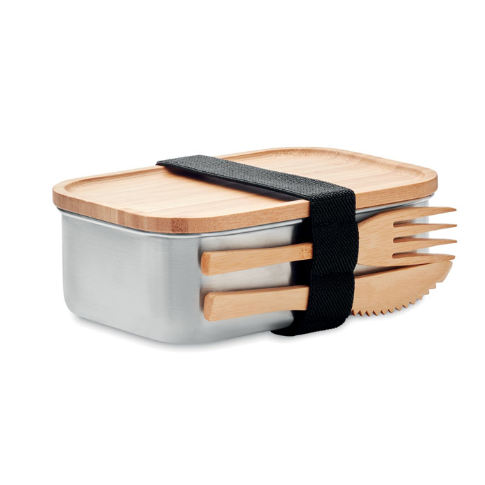
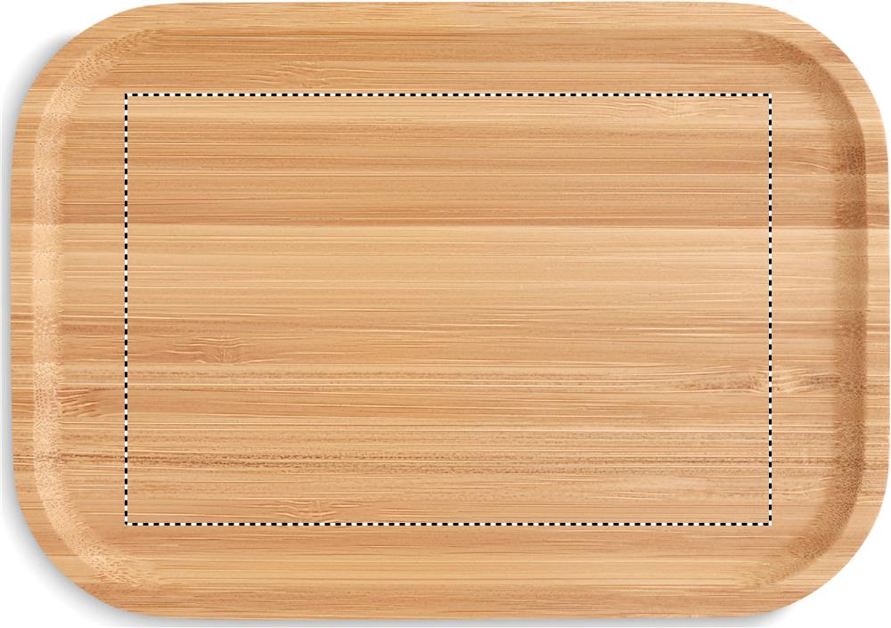
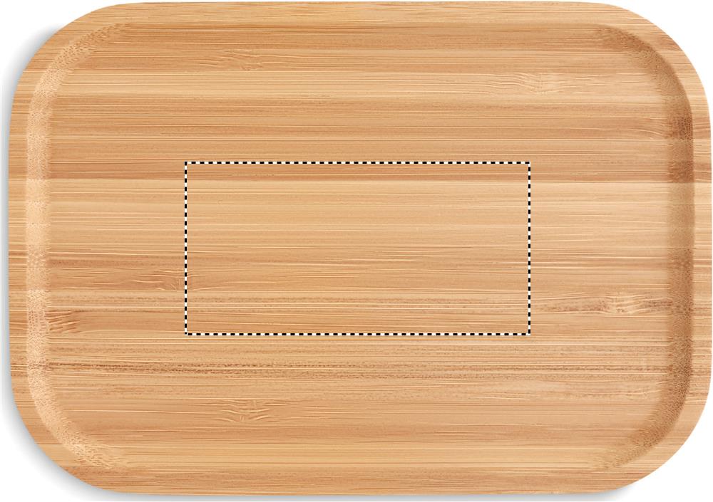
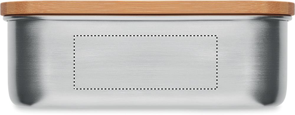
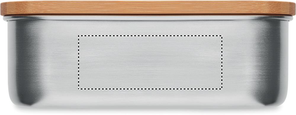
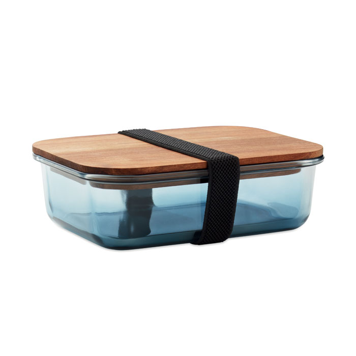
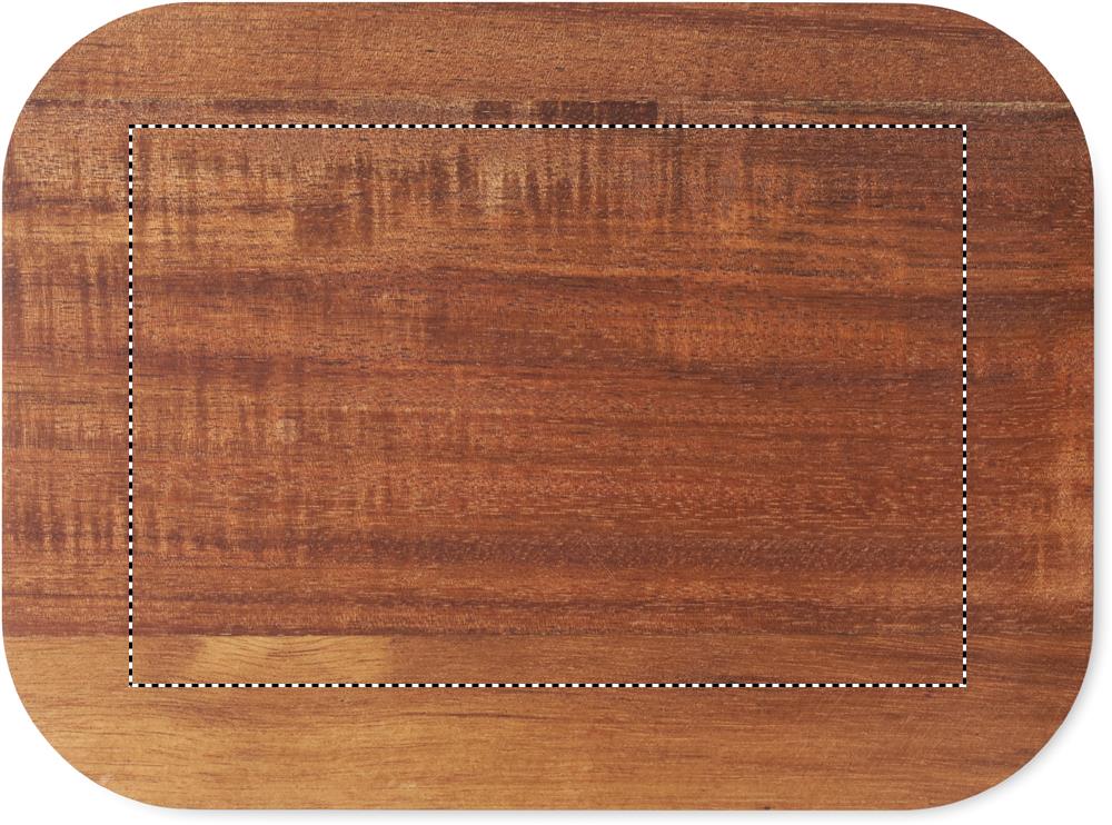
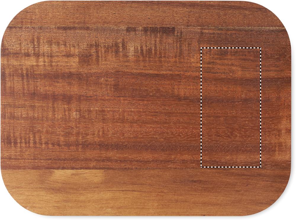
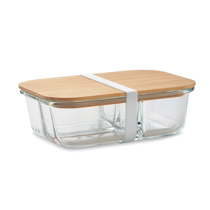
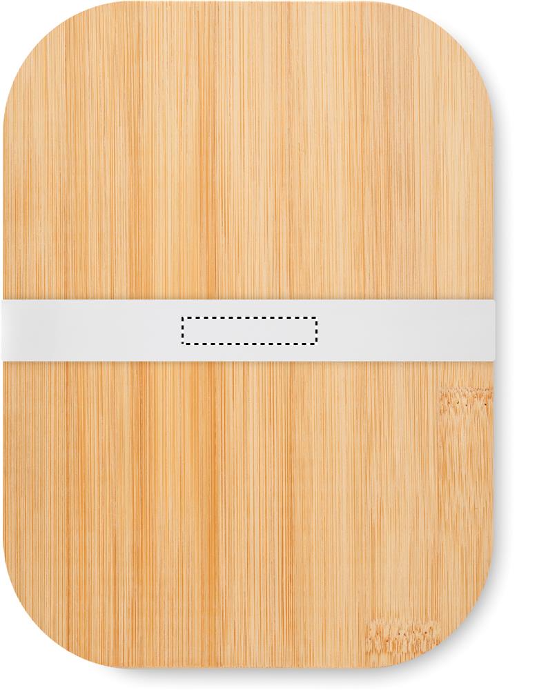
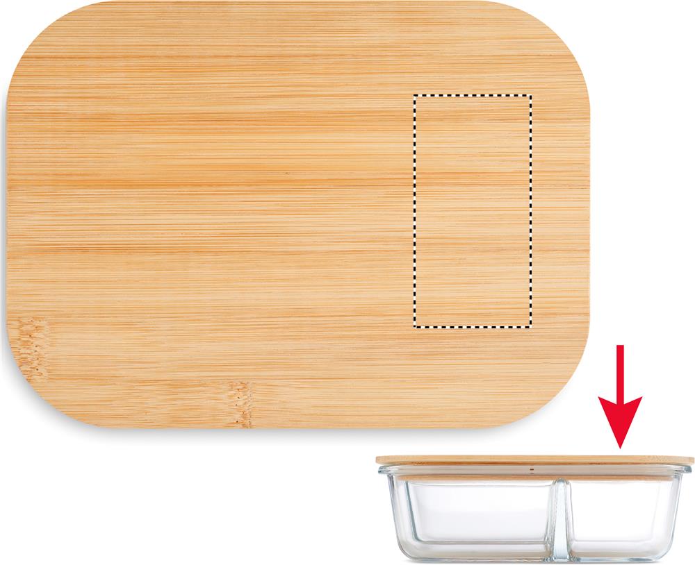
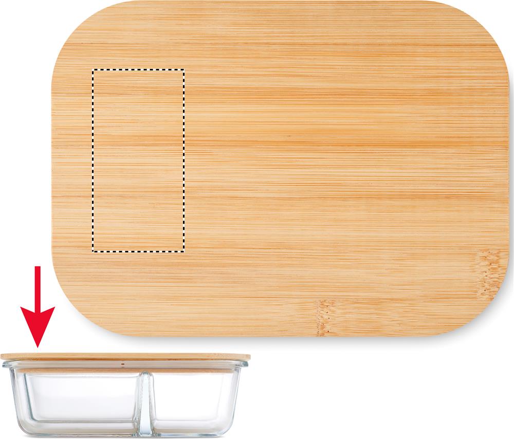
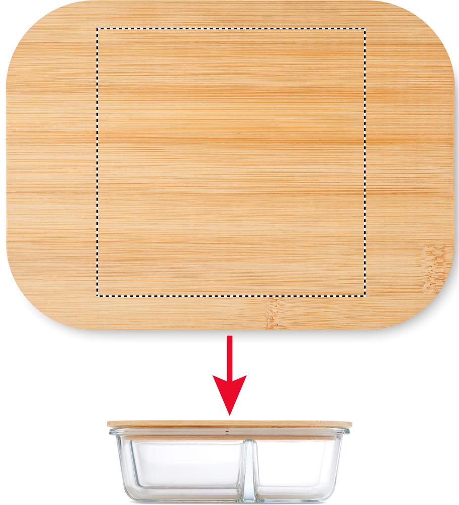
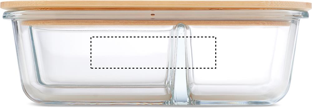
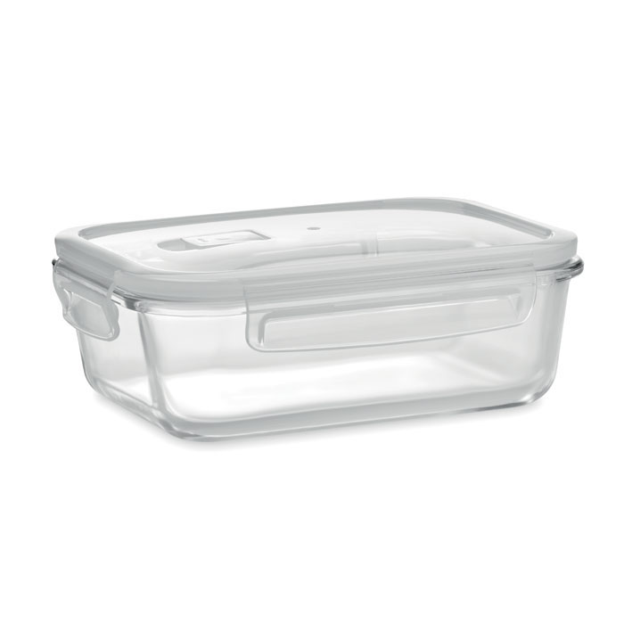
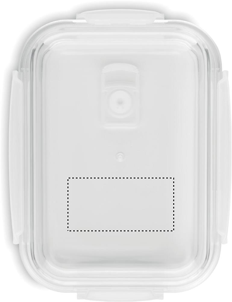
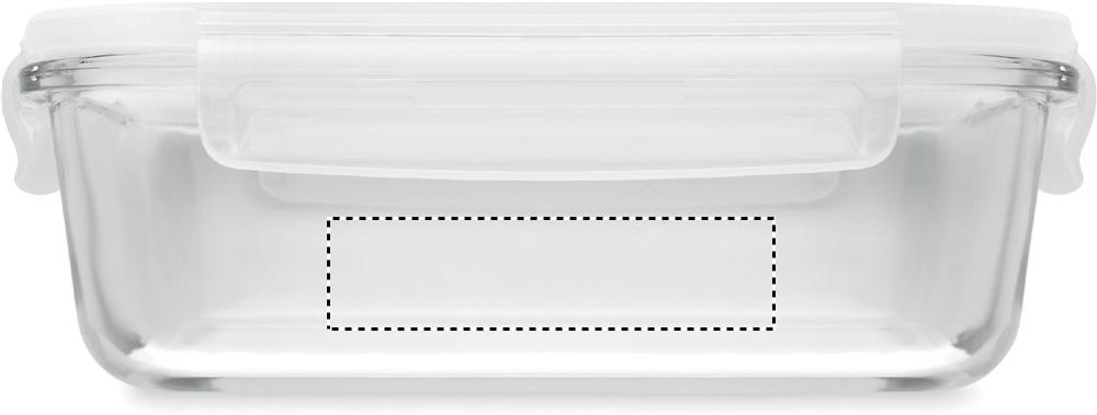
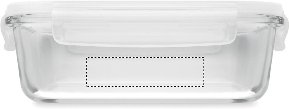
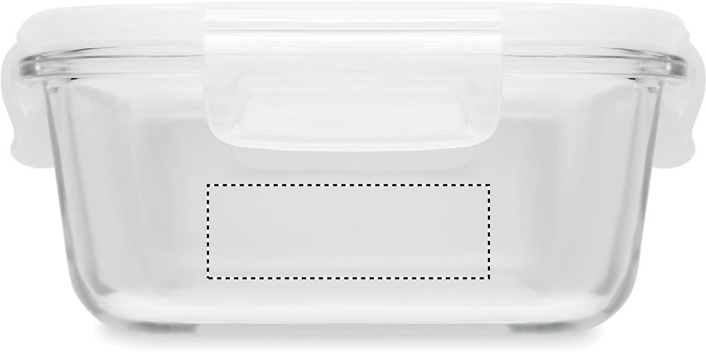
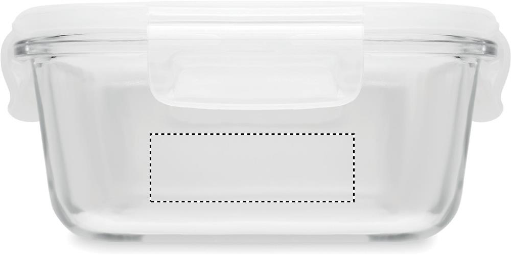
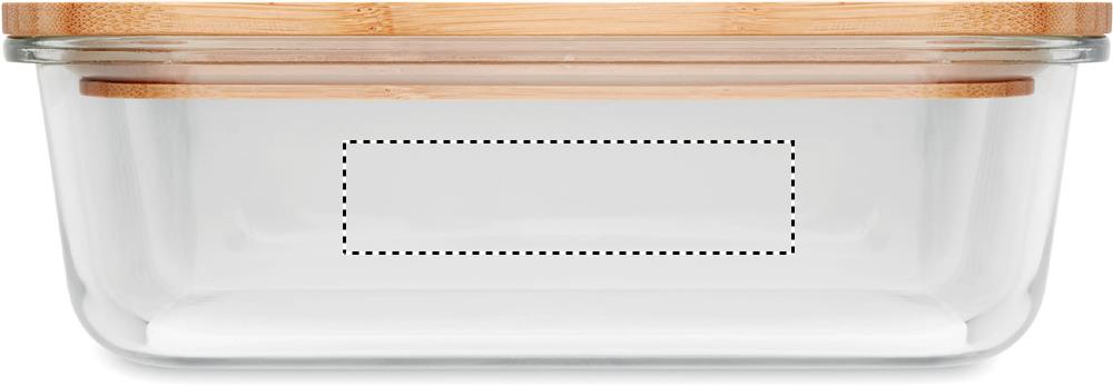
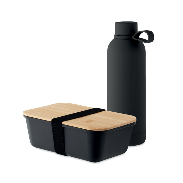
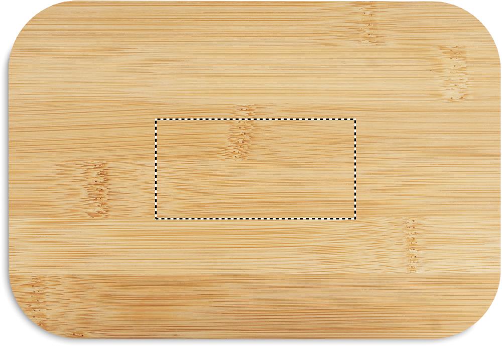
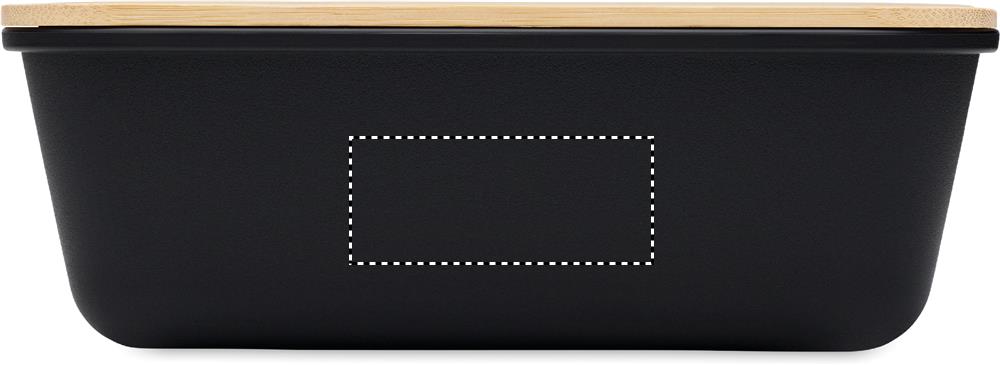
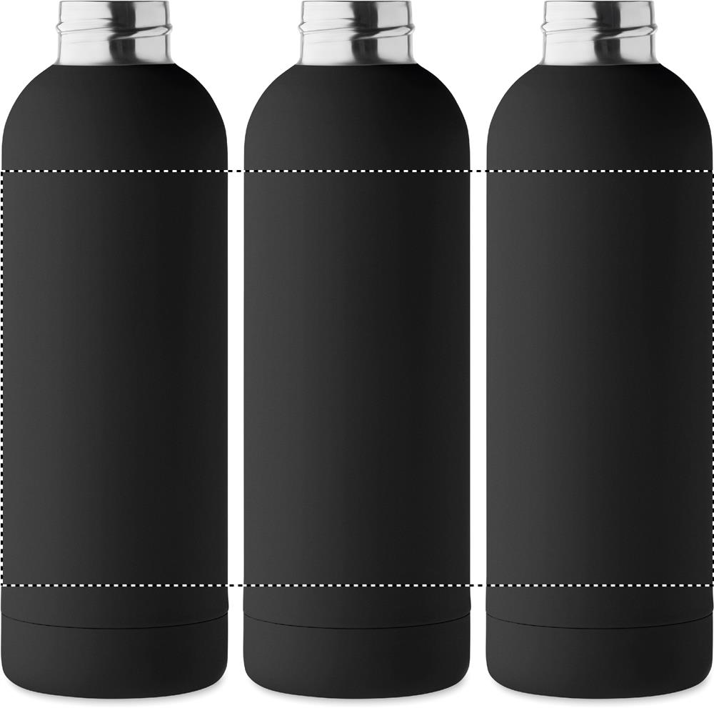
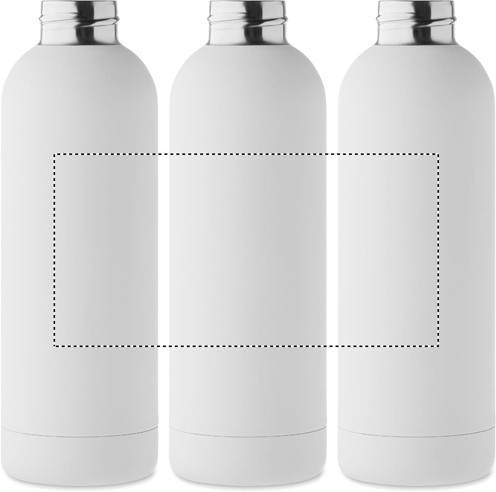
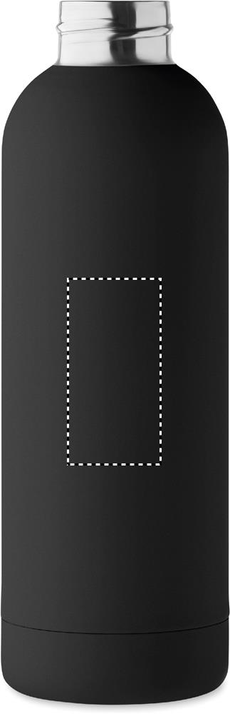
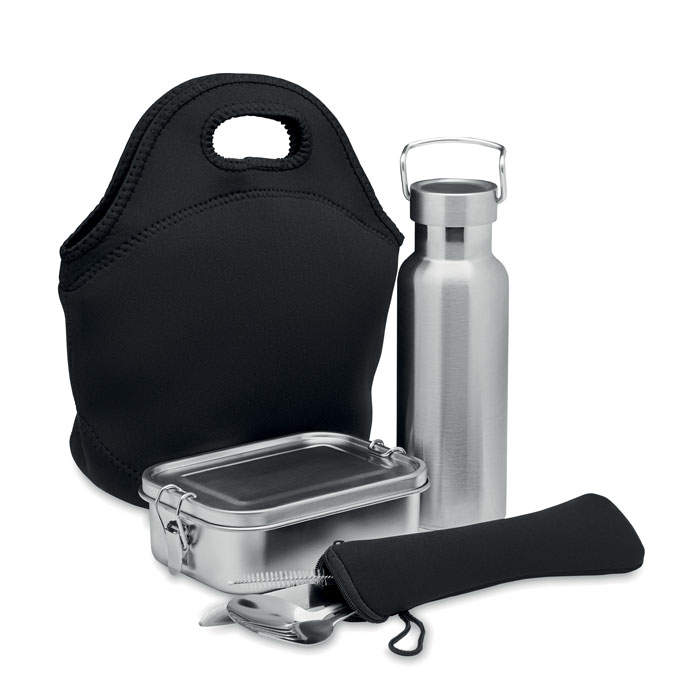
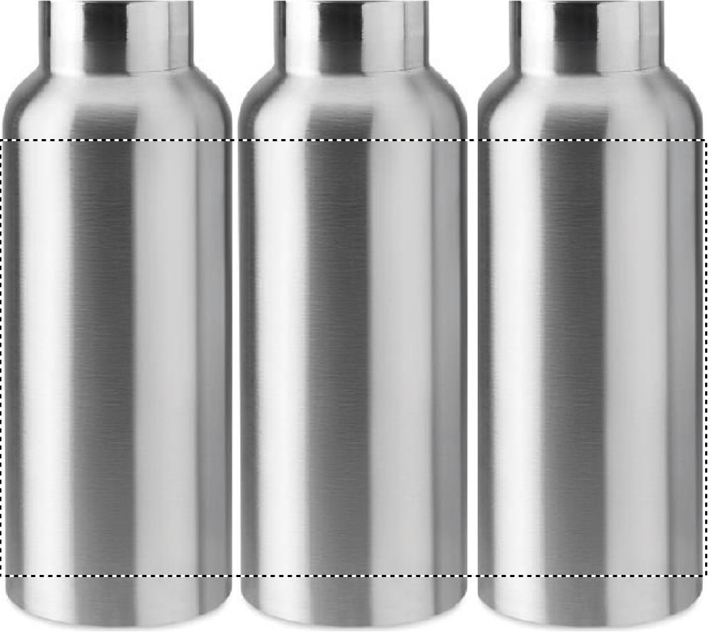
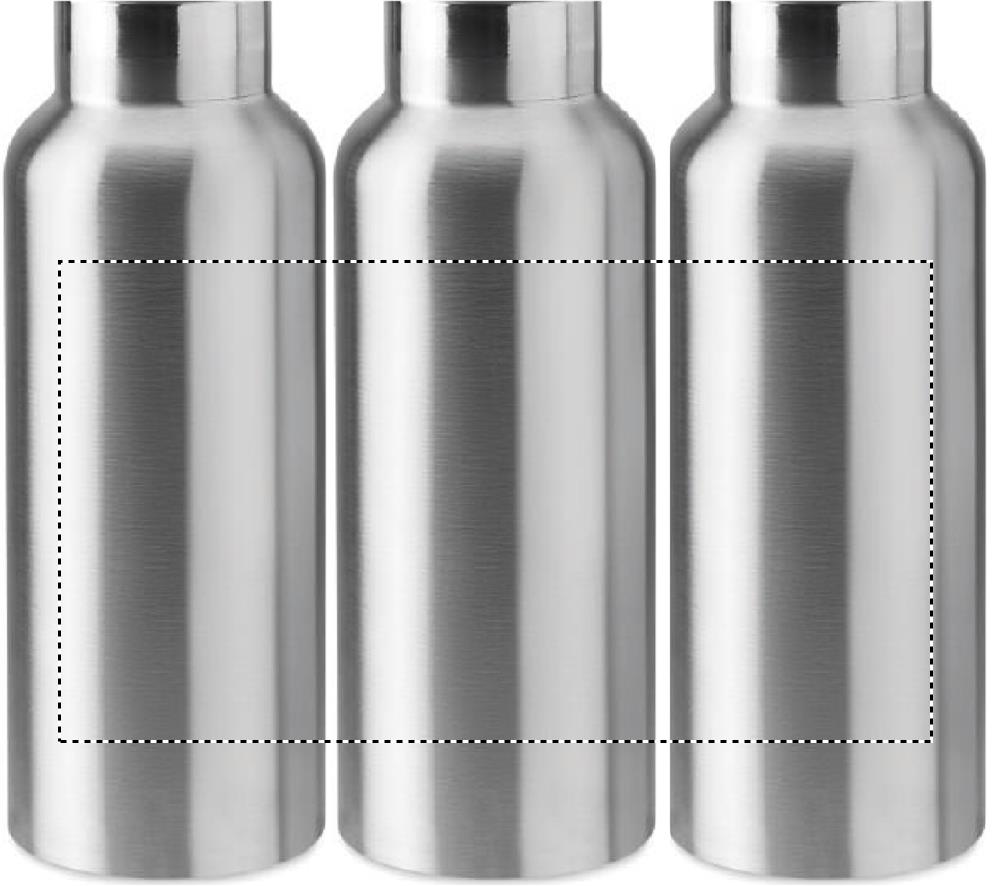
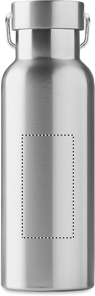
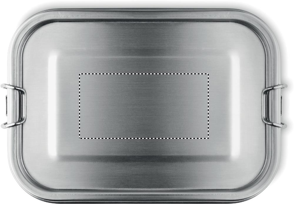
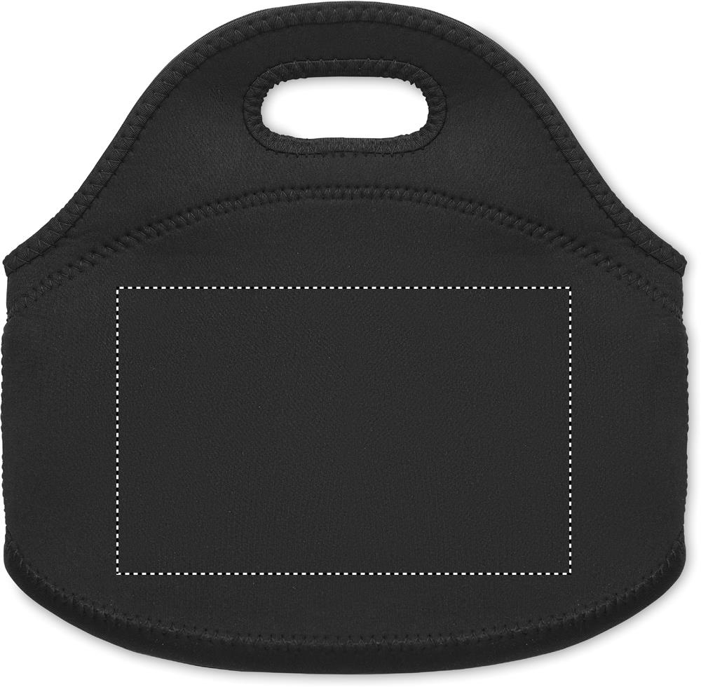
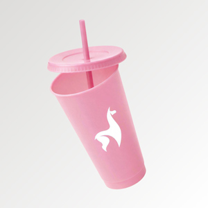
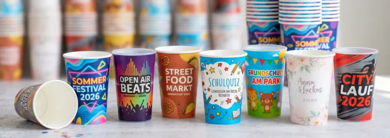
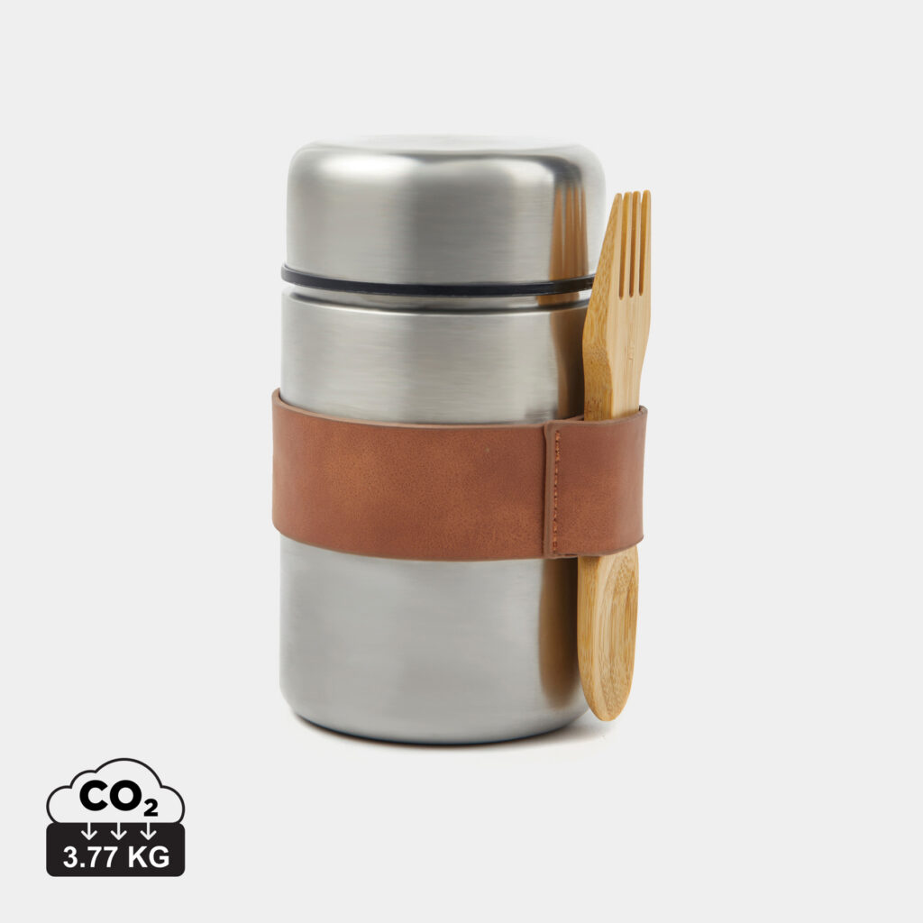
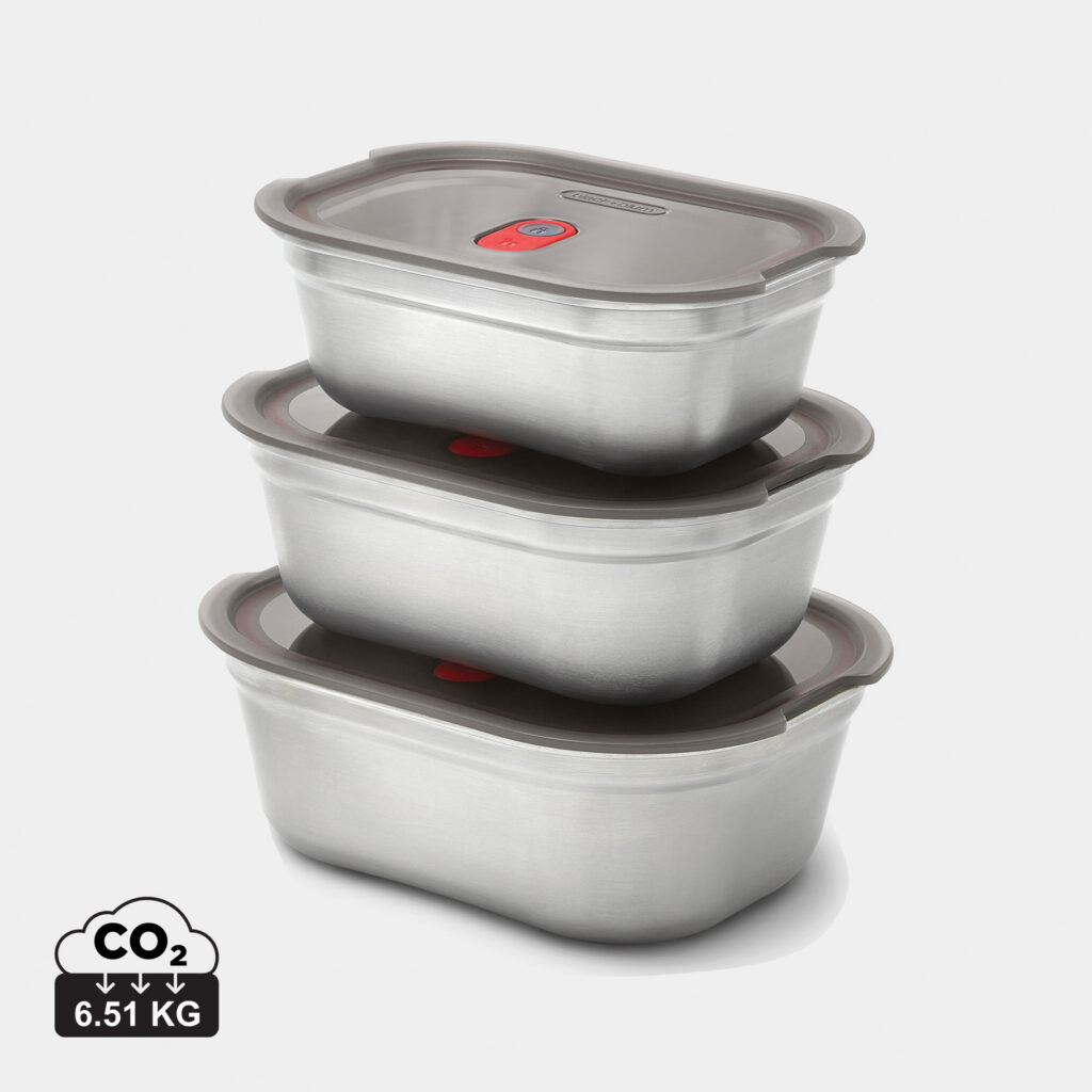
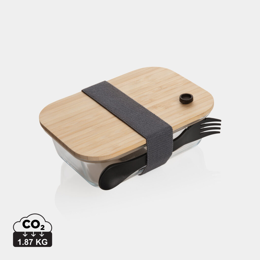
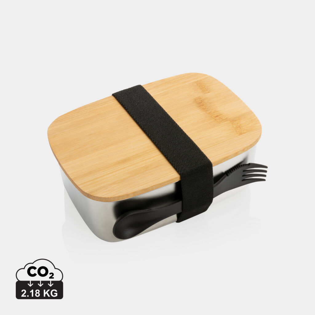
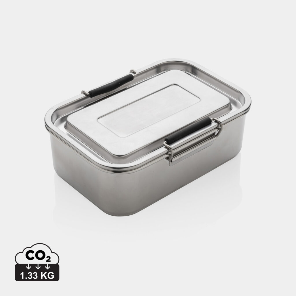
For the color of your lunch box, you can go by your logo, your company or club colors or the occasion. Contrast matters most: on a light lunch box, dark and bold designs are usually easier to see, while on darker models light lettering and logos stand out more clearly.
🤍 Light colors
White, beige or other light lunch boxes offer a good basis for dark and bold logos, names and designs. Several colors can also be told apart well on a light background.
🎨 Colors to match your company or club design
If you want to pick up existing company or club colors, you can match the color of the lunch box to them. Your logo should still stand out clearly from the background. With a blue logo, for example, a blue lunch box in the same or a very similar shade is usually not a good choice.
🌿 Natural shades
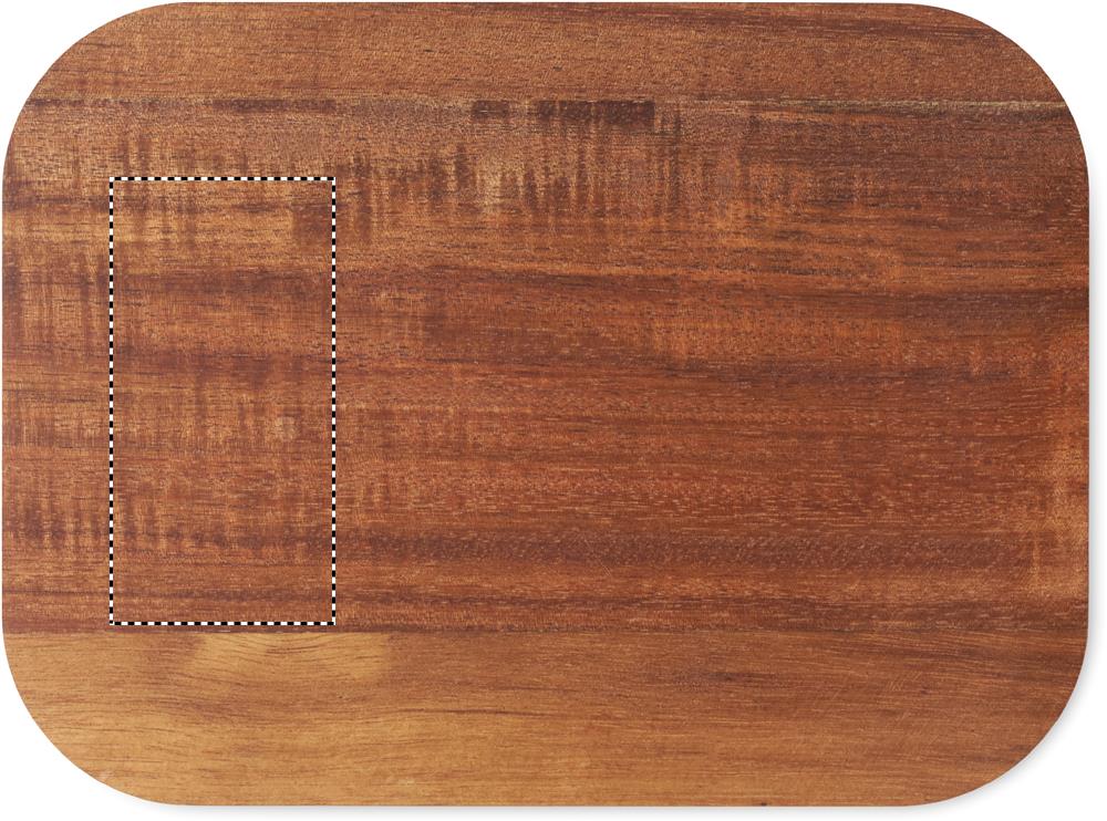
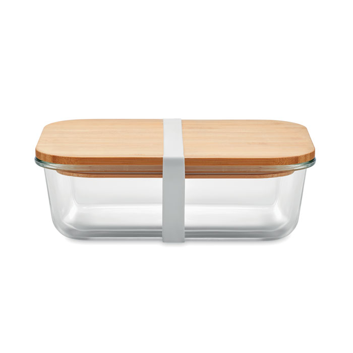
Brown, gray and muted earth or green tones suit an understated design. Especially on models with a bamboo or wooden lid, such colors can be combined with each other.
🔴 Bright colors
Red, blue, green or other bold colors can pick up company, club or event colors. For good legibility, logos and lettering with a clear color contrast are suitable.
🌸 Pastel colors
Mint, pink, light blue and other pastel tones combine well with darker names, lettering or designs. They can be chosen, for example, for schools, kindergartens or campaigns.
👉 We are happy to help you choose the right colors.